Welcome to Tesla Motors Club
Discuss Tesla's Model S, Model 3, Model X, Model Y, Cybertruck, Roadster and More.
Register
Install the app
How to install the app on iOS
You can install our site as a web app on your iOS device by utilizing the Add to Home Screen feature in Safari. Please see this thread for more details on this.
Note: This feature may not be available in some browsers.
-
Want to remove ads? Register an account and login to see fewer ads, and become a Supporting Member to remove almost all ads.
You are using an out of date browser. It may not display this or other websites correctly.
You should upgrade or use an alternative browser.
You should upgrade or use an alternative browser.
48.26 UI Changes - thumbs up or down?
- Thread starter pdk42
- Start date
m-i-l
Member
The biggest issue I have with the new UI is that the Brake Hold icon is hidden behind my left hand. I'm in the habit of checking the Brake Hold is active whenever I stop, and now I have to take my left hand off the wheel to check it. If the designers put all the icons on the right of the screen thinking that the whole world drives on the right, then that's pretty shoddy.
If the designers put all the icons on the right of the screen thinking that the whole world drives on the right, then that's pretty shoddy.
They don't. The LHD cars have the total screen switched left/right ... so potentially the same issue.
EVDRVN
Active Member
Total fail to get more space for FSD features. I would much rather have the choice to have larger maps and media area over the useless car and road lines as I do not and will not have FSD. Why would I want a smaller screen for the things I use the most? Good job Tesla making the new UI fit your needs of more space.
j6Lpi429@3j
Closed
this thread is super confusing for model S owners  the UI is presumably completely different. I don't mind the model S changes. I only noticed some fonts size and location adjustments on the drivers screen. If the big screen changed, i haven't noticed how yet.
Mark-R
Member
Moderator comment - controversial reference removed - against forum rules.
Last edited by a moderator:
navt
Member
Wished they had optimised it for RHD. Menu option should be on the right. Close icon X should be on the right. Windows were flipped, but not the content. One can only wish.

bhav
Member
It's a special kind of stupid when the update makes it both *more* distracting for the driver and yet *more* difficult to reach/see the important things he/she needs to see (e.g. map).
What on earth were they thinking ugh
What on earth were they thinking ugh
Tony Hoyle
Active Member
It's pretty horrid.. the most important information - your speed - is relegated to a mess other information, also speeds..
It somehow manages to have too much whitespace and be too busy at the same time..
They're designing for some kind of ideal future where everyone uses FSD. and you don't care about that information.. which isn't going to happen for years, if ever. Until then we've got to cope with a suboptimal UI for actual driving.
Shrinking the browser window is just annoying. I can't help wonder if it's to break all the sites that were offering streaming of things other than netflix and youtube..
Anfieldgaz
Member
And that's if you can sign in to you tube at allIt's pretty horrid.. the most important information - your speed - is relegated to a mess other information, also speeds..
It somehow manages to have too much whitespace and be too busy at the same time..
They're designing for some kind of ideal future where everyone uses FSD. and you don't care about that information.. which isn't going to happen for years, if ever. Until then we've got to cope with a suboptimal UI for actual driving.
Shrinking the browser window is just annoying. I can't help wonder if it's to break all the sites that were offering streaming of things other than netflix and youtube..
LongRanger
Active Member
LongRanger
Active Member
Seriously, if that’s the direction of UX approach then the car is not what I bought. Who tests this junk ?
Updated earlier today. Just drove to the local 24 hour supermarket and found it easy to get used to the new screen layout.
Car rendering is a lot nicer and the display of what the car is seeing is a lot clearer, though it does display it as if the road is some kind of annotated pool of water (with lane lines and arrows floating about all over the place.) I guess it will be better when the FSD rewrite gets out of beta (I don't have FSD but I'd imagine the general lane, road markings and obstacle identification will be available to all.)
It would be nice to be able to resize it though.
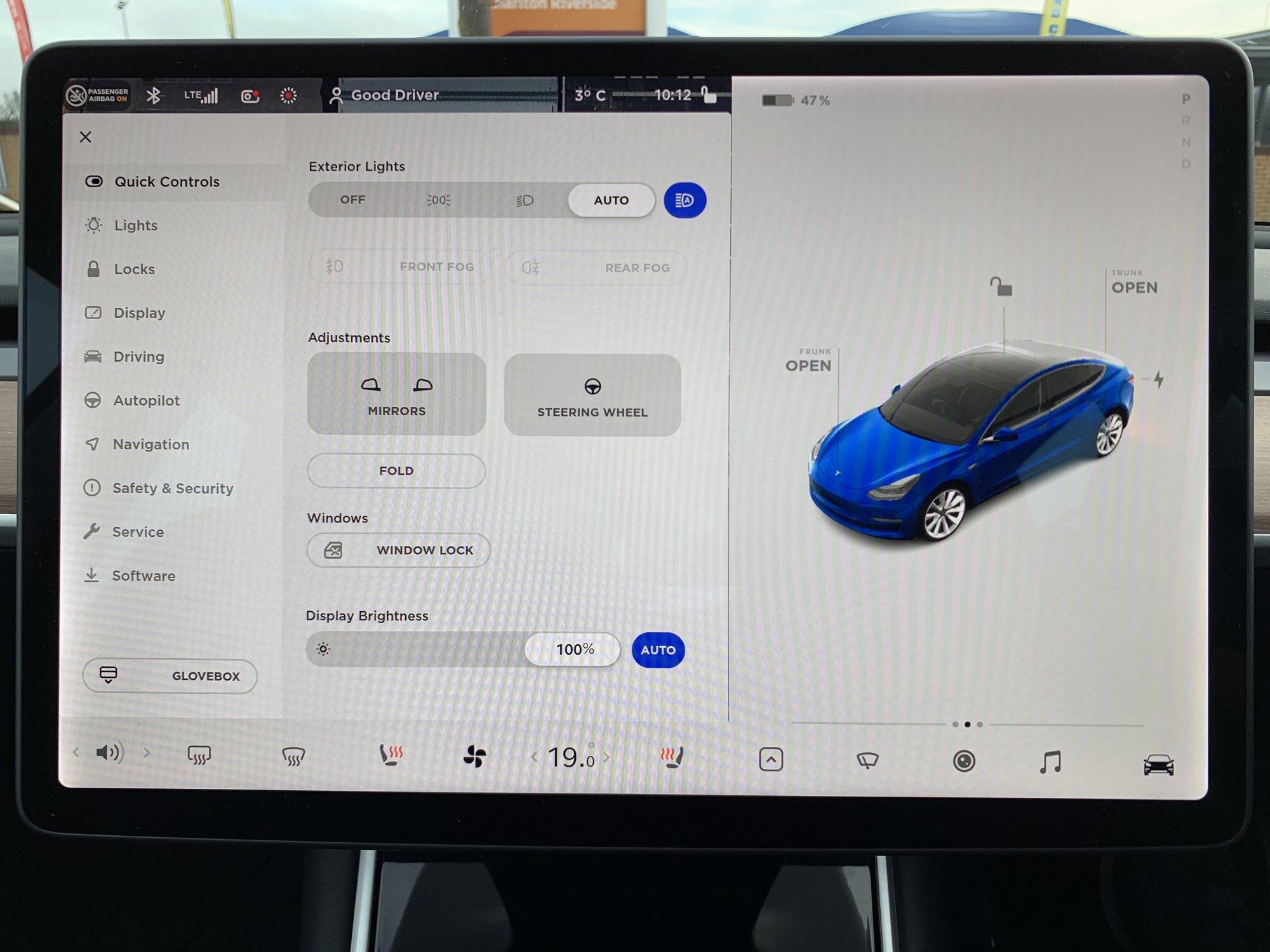
There's some weird UI stuff too like an artist got involved in designing it. The UI doesn't have any real differentiation of what's a button or text.. For example, the Frunk OPEN now looks like you have the Frunk open rather than it been a button to open it. Ok, so it's bold and all capitals... but then the charge port is just the lighting arrow it isn't labelled Charge port OPEN etc.. lots of inconsistencies in the design from a UI perspective. If you're not careful with these piecemeal changes it ends up like Windows where everything looks good on the surface but load up Notepad and you're suddenly in the 90's again!
I've always felt it odd that we have quick access to the wipers, but not to all the lights which are on the car/quick controls...
I too think the X button to close should move to the right for RHD cars as otherwise you always have to stretch to close windows.
I've always felt it odd that we have quick access to the wipers, but not to all the lights which are on the car/quick controls...
I too think the X button to close should move to the right for RHD cars as otherwise you always have to stretch to close windows.
Tony Hoyle
Active Member
Drew57
Active ember
The option of music visible as a single strip below the map is sufficient for me (prefer to listen to music, not look at it). When driving I use voice control to change or for anything else it's safer to go full screen when parked.The biggest UI fail already on in such a big screen is that you can’t have music and map co-resident.
.
Volume position far left is useful for a passenger.... don't all drivers use the scroll wheel?I don't know why the volume up/down needs it's own icon, could be either.side of music.
.
Sparkeur
Member
To be honest, I can take or leave the interface but if I had to give a verdict, I'm not sure my driving experience has been changed for the better. What I really want is a release that ups the game on the automated driving promises.
Similar threads
- Replies
- 835
- Views
- 43K
- Replies
- 93
- Views
- 21K
- Replies
- 38
- Views
- 5K
- Replies
- 9
- Views
- 3K


