


Welcome to Tesla Motors Club
Discuss Tesla's Model S, Model 3, Model X, Model Y, Cybertruck, Roadster and More.
Register
Install the app
How to install the app on iOS
You can install our site as a web app on your iOS device by utilizing the Add to Home Screen feature in Safari. Please see this thread for more details on this.
Note: This feature may not be available in some browsers.
-
Want to remove ads? Register an account and login to see fewer ads, and become a Supporting Member to remove almost all ads.
You are using an out of date browser. It may not display this or other websites correctly.
You should upgrade or use an alternative browser.
You should upgrade or use an alternative browser.
An honest review of the yoke
- Thread starter Bub.com
- Start date
-
- Tags
- yoke steering
Dan D.
Desperately Seeking Sapience
I'll leave aside the yoke itself, some people like it, maybe it's not so bad; I don't know.
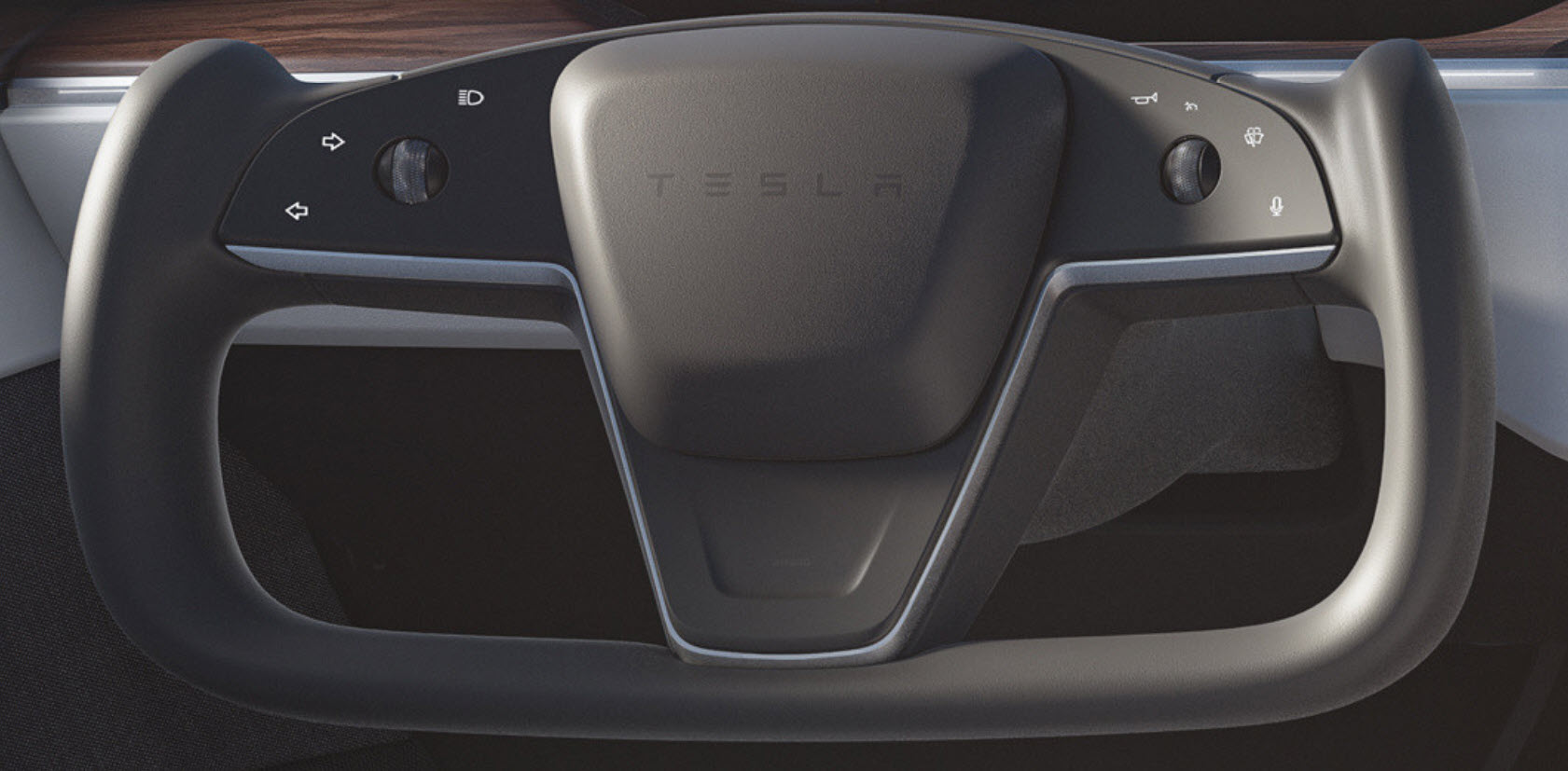
Yoke Buttons
The yoke buttons look to me like a token gesture from people who REALLY didn't want to give you any ergonomic buttons.
Kind of like these people:

My issues (despite having not tried them at all yet)

Yoke Buttons
The yoke buttons look to me like a token gesture from people who REALLY didn't want to give you any ergonomic buttons.
Kind of like these people:
My issues (despite having not tried them at all yet)
- 7 of the buttons are not buttons at all, but touchable areas
- Most of them perform critical functions but are not ergonomic
- They don't move, have no texture, are not raised
- They give non-localised haptic feedback that some users say is not obvious
- They seem to require a certain kind of touch, some people seem to stab at them and they don't always work
- They don't work with certain kind of gloves
- Might be a nuisance with long fingernails, IDK
- Really? Reach over to press flash-high beams?
- All buttons on the right are squished up, encouraging inadvertently pressing the wrong one
- None of them are differentiated in any way
- In some views they can barely be seen
- I think they are lighted, but all the same thin white color
- You have to long-press for some functions, somehow, while turning. Currently there is no 3-flash turn signal
- The good: There is a raised mark between two groups, but early photos didn't have this, it helps to localize those buttons
- The other scroll wheels I have no comment on, they are fine as extra controls
- The horn button could just as easily have been in the middle, why not?
- If you must have buttons, make them real buttons that move significantly, are larger, colored, differentiated, and work with all gloves
- Differentiate the buttons!
- Increase feedback so it is obvious they have been pressed or:
- Flash the buttons when pressed, or while turn signal is active
- I'm sure there are other usability issues, but having not used them I don't know. Maybe someone else can weigh in on their issues
- Adding a turn stalk as well, gives you the choice of hands-on or hands-beside. The column is really doing nothing better without them, why not have stalks on it?
I'm glad to hear it's working. I hope to one day experience it myself. At 57, I'm giving myself until 60. We should see a better Stock return by then and I'll place an order for the Model S.My experience has been the polar opposite of the OP. First week was a bit rough, but after that, got quickly acclimated and felt the wheel and yoke were functionally a wash with the yoke offering better design and aesthetics. However, after a month, I have really become a fan of yoke + stalkless controls in terms of ergonomics and efficiency.
YMMV
FlyF4
Son of a MX
Hmmmm, you would have a hard time flying a military jet with a stickThis has to do with Tesla's new yoke steering wheel. I find myself awkwardly trying to make simple 90 degree turns. However, a more significant turn, such as a legal U turn, is altogether more dangerous.
") I test drove it last week and didn't have any issue, but sure I can understand some people having an issue with it.
I test drove it last week and didn't have any issue, but sure I can understand some people having an issue with it.CyberGus
Not Just a Member
Minion: "You fired the entire marketing staff! How will anyone hear about Tesla?"
Elon: "Don't worry, I've got a plan to keep everyone arguing online for years"
Elon: "Don't worry, I've got a plan to keep everyone arguing online for years"
Some thoughts/observations after a month driving:
They are lit when the car is on--have not had an issue seeing them even if bright mid-day sun
I heard most of these concerns raised 8 years ago when the touch-centric Model S was released--I'd argue this has not shown itself as an issueMy issues (despite having not tried them at all yet)
- 7 of the buttons are not buttons at all, but touchable areas
- Most of them perform critical functions but are not ergonomic
- They don't move, have no texture, are not raised
The provide haptic feedback when pressed. The point is to be able to press the buttons without having to look at the yoke, so not sure localized feedback is necessary. Is does take some time to understand what the car considers a long vs sort press
- They give non-localised haptic feedback that some users say is not obvious
- They seem to require a certain kind of touch, some people seem to stab at them and they don't always work
Tested as this has been raised before--work with latex gloves and thin leather gloves, but not with thick fleece gloves--OTOH the yoke is heated, so maybe not a need to drive wiht thick gloves on
- They don't work with certain kind of gloves
- Might be a nuisance with long fingernails, IDK
Not really an issue, can reach it by extending my left thumb
- Really? Reach over to press flash-high beams?
Has happened once in. 1K mile of driving
- All buttons on the right are squished up, encouraging inadvertently pressing the wrong one
They are--by location:
- None of them are differentiated in any way
- Thumb high
- Thumb low
- Thumb extended
- Thumb wheel
- In some views they can barely be seen
- I think they are lighted, but all the same thin white color
They are lit when the car is on--have not had an issue seeing them even if bright mid-day sun
This is partially correct. Each button had a long and short pressed mapped to it. To turn, you need a single long press and the the turn signal stays engaged until you complete your turn or you cancel it. A short (really soft) press engages your turn signal as long ad you thumb remains in place--I assume this is for lane changes. I would like to see this re-mapped so a short press gives you 3 blinks.
- You have to long-press for some functions, somehow, while turning. Currently there is no 3-flash turn signal
Probably something to do with the airbag--if you press on the right side of the yoke wiht your palm (as you might press in the center of a steering wheel) the horn will also sound.Some ideas:
- The good: There is a raised mark between two groups, but early photos didn't have this, it helps to localize those buttons
- The other scroll wheels I have no comment on, they are fine as extra controls
- The horn button could just as easily have been in the middle, why not?
I've driven with a touchscreen for 8 years now, so I guess I am used to this. I can see this being disconcerting, but I think folks underestimate their ability to adapt
- If you must have buttons, make them real buttons that move significantly, are larger, colored, differentiated, and work with all gloves
They are, by location
- Differentiate the buttons!
In use, it is obvious is you have hit or missed a button as something immediate happens, you get the haptic buzz and some action immediately happens (turn signal is lit, horn sounds, voice command box posts up).
- Increase feedback so it is obvious they have been pressed or:
- Flash the buttons when pressed, or while turn signal is active
In the last week or so, I have really come to appreciate the ergonomics of the the yoke + stalkless controls. The yoke forces a 3/9 o'clock hand position, which means the control buttons stay in know portions, which facilitates muscle memory and being Abel to do things without having to look. Anyone that has used a gaming controller will be familiar with the concept. I find it an improvement to have controls always available under my thumb while still retaining a firm grip on the yoke.I don't know. Maybe if I used it I'd like it, but probably not. Ergonomically it seems like a prototype design, that somehow got made anyway. Those designs are always a bit odd and don't function well in the real world with novices, potholes, gloves, hairpin switchbacks, emergency signals etc.
- I'm sure there are other usability issues, but having not used them I don't know. Maybe someone else can weigh in on their issues
- Adding a turn stalk as well, gives you the choice of hands-on or hands-beside. The column is really doing nothing better without them, why not have stalks on it?
Dan D.
Desperately Seeking Sapience
Thanks for the detailed answer. I don't see anything as dangerous per se about the yoke buttons, just that I entirely question the design, and yes many of my answers did come from some of your posts.Some thoughts/observations after a month driving:
I heard most of these concerns raised 8 years ago when the touch-centric Model S was released--I'd argue this has not shown itself as an issue
The provide haptic feedback when pressed. The point is to be able to press the buttons without having to look at the yoke, so not sure localized feedback is necessary. Is does take some time to understand what the car considers a long vs sort press
Tested as this has been raised before--work with latex gloves and thin leather gloves, but not with thick fleece gloves--OTOH the yoke is heated, so maybe not a need to drive wiht thick gloves on
Not really an issue, can reach it by extending my left thumb
Has happened once in. 1K mile of driving
They are--by location:
The bump in the wheel help you tell between thumb high and thumb low, the other two are hard to confuse and they have pretty bit hit boxes. Again the idea is to be able to do this with wihout having to look--kinda like using a gaming controller
- Thumb high
- Thumb low
- Thumb extended
- Thumb wheel
They are lit when the car is on--have not had an issue seeing them even if bright mid-day sun
This is partially correct. Each button had a long and short pressed mapped to it. To turn, you need a single long press and the the turn signal stays engaged until you complete your turn or you cancel it. A short (really soft) press engages your turn signal as long ad you thumb remains in place--I assume this is for lane changes. I would like to see this re-mapped so a short press gives you 3 blinks.
Probably something to do with the airbag--if you press on the right side of the yoke wiht your palm (as you might press in the center of a steering wheel) the horn will also sound.
I've driven with a touchscreen for 8 years now, so I guess I am used to this. I can see this being disconcerting, but I think folks underestimate their ability to adapt
They are, by location
In use, it is obvious is you have hit or missed a button as something immediate happens, you get the haptic buzz and some action immediately happens (turn signal is lit, horn sounds, voice command box posts up).
In the last week or so, I have really come to appreciate the ergonomics of the the yoke + stalkless controls. The yoke forces a 3/9 o'clock hand position, which means the control buttons stay in know portions, which facilitates muscle memory and being Abel to do things without having to look. Anyone that has used a gaming controller will be familiar with the concept. I find it an improvement to have controls always available under my thumb while still retaining a firm grip on the yoke.
I'm glad that you have no trouble differentiating the buttons by location. I would be less generous. I have trouble pressing Volume Mute and Next Track on my wheel when I'm turning even though I know where they are. Once I'm turning I cannot use the same thumb position cues, so I'm glad none of my steering wheel buttons are critical features.
txturbo
Member
Having the Plaid for a week now, and I must say the yoke serves no useful purpose.
I followed my nephew as he drove the car, and I could see him swing the car wide as he turned a corner, struggling with the yoke. But, unfortunately, I could also see him inadvertently hit the turn signals and wipers.
Yes, you get used to it. But why? What benefit? Is this so I can have a good view of the center display "Mind of Car"? Who cares.
The other thing that I find annoying is using the 5-way scroll wheels, they are too small in diameter. To push them to the left or right requires too much downward force at the same time to keep your thumb from sliding off, making them hard to operate accurately. As I place my thumb on the left side of the left wheel to engage, it almost always causes the right turn signal to activate.
After a week, I still need to look at the buttons to activate the turn signal, forcing me to take my eyes off the road. I guess it's a good thing that the car is so safe in a crash. And why the hell put left and right turn signals on the left side?
The horn is something that most people rarely use. Typically when you do need it, it's a panic situation. Now I will need to look down to find it, again taking my eyes off the road. At least my wipers will fire along with the horn!
One thing: if you press your palm on the right side of the yoke, you'll also honk the hornThe horn is something that most people rarely use. Typically when you do need it, it's a panic situation. Now I will need to look down to find it, again taking my eyes off the road. At least my wipers will fire along with the horn!
Aggmeister2010
Active Member
The Yoke is overengineered and underengineered at the same time. My big 3 drawbacks are:
1) No stalks whatsoever. This is a mistake, now all that stuff has to be in a menu or some other button on the front of the wheel. Bleh.
2) In an emergency that requires panic maneuvers, you have far less 'material' to grab for.
3) PRND are now a function of the screen, which feels odd and.....well let's just hope that they have better luck with crashing on the new version.
I'm not in the market for a Plaid because I think spending $135k on a car that looks 90% identical to one from 2012 is a tall ask - but if I was, I wouldn't buy one until I could get a normal round steering wheel.
Cal1
Member
The solution for those of you really challenged by this design has been around for years. Really stylish too! Seems strange to spend this much time on their design. If you don't like it don't buy it. Hating on it isn't going to change anything. I hate air suspension systems but still bought the car.
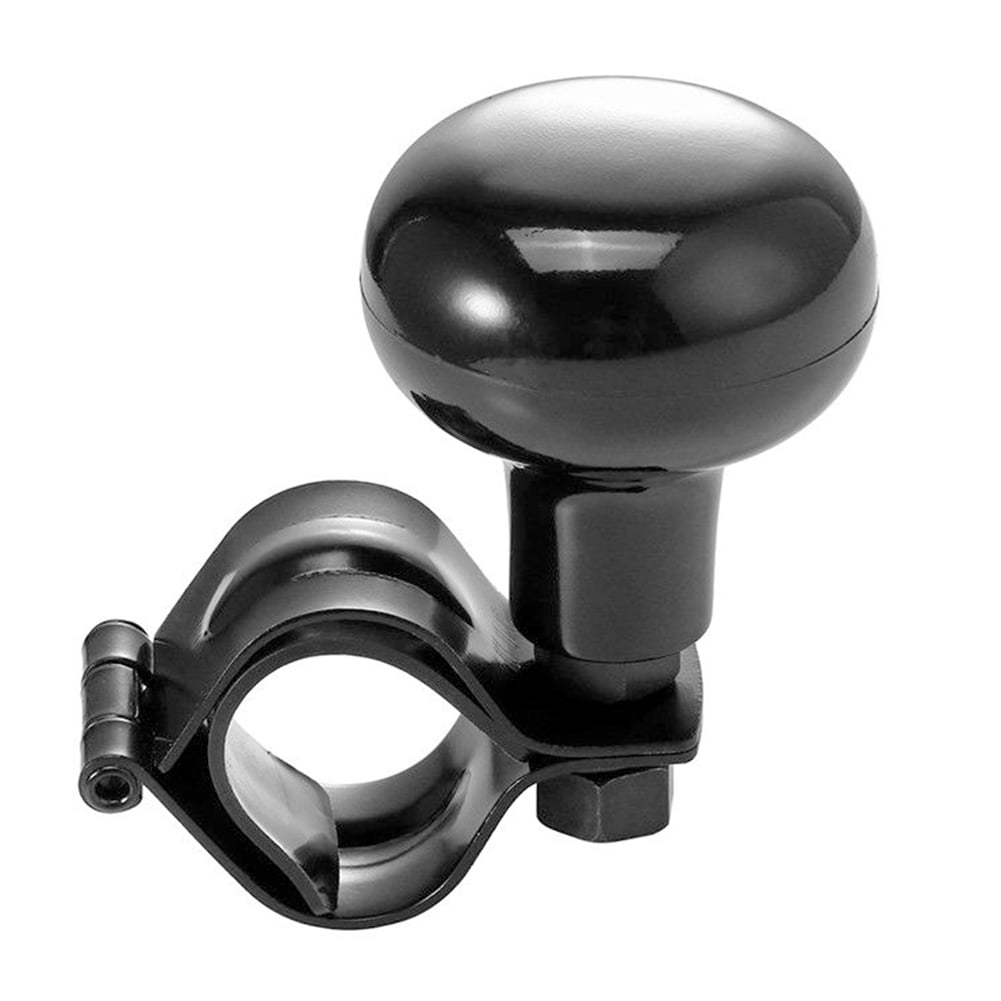
Lessen Turning Radius Auto Universal Save Effort Steering Wheel Helper Knob - Walmart.com
Buy Lessen Turning Radius Auto Universal Save Effort Steering Wheel Helper Knob at Walmart.com
www.walmart.com
bishoppeak
Member
Necker Knob! I remember those from when I was a kid!The solution for those of you really challenged by this design has been around for years. Really stylish too! Seems strange to spend this much time on their design. If you don't like it don't buy it. Hating on it isn't going to change anything. I hate air suspension systems but still bought the car.
Lessen Turning Radius Auto Universal Save Effort Steering Wheel Helper Knob - Walmart.com
Buy Lessen Turning Radius Auto Universal Save Effort Steering Wheel Helper Knob at Walmart.comwww.walmart.com
D
Dan_Foster
Guest
I must make a three point turn (or five point if someone is parked on the street) along a close cast-iron fence line (not mine, the school’s—across a narrow road) to get in and out of my driveway. The grocery store parking lot where we shop is nearly always crowded, too small, and filled with people who are clearly driving for the first time since their lobotomy. The number of times I must go forward and reverse to clear the way of these and many other idiots is maddening.
So could someone PLEASE address direction selection (formerly known as ‘shifting gears’ which Tesla don’t do) using the touch screen? On my 2015 Model S, that stalk gets flicked A LOT. I can’t imagine having to run my hand up or down the side of the screen every time I must avoid someone backing into me in a parking lot.
Why is the direction selector not on the right scroll wheel?! (By rocking to the left and right, which is currently not assigned to any function.) Seems like a huge missed opportunity.
I do a 3-pt turn at ~1:40 in this video. This was a couple of weeks ago, and shifting has gotten a bit smoother/quicker--I'd say its about equivalent to having the console-mounter shifter I've had in prior cars. I also thing mapping shifting to the right thumbwheel would be good--not sure if they are getting around to that or have rejected the idea for some reason.I must make a three point turn (or five point if someone is parked on the street) along a close cast-iron fence line (not mine, the school’s—across a narrow road) to get in and out of my driveway. The grocery store parking lot where we shop is nearly always crowded, too small, and filled with people who are clearly driving for the first time since their lobotomy. The number of times I must go forward and reverse to clear the way of these and many other idiots is maddening.
So could someone PLEASE address direction selection (formerly known as ‘shifting gears’ which Tesla don’t do) using the touch screen? On my 2015 Model S, that stalk gets flicked A LOT. I can’t imagine having to run my hand up or down the side of the screen every time I must avoid someone backing into me in a parking lot.
Why is the direction selector not on the right scroll wheel?! (By rocking to the left and right, which is currently not assigned to any function.) Seems like a huge missed opportunity.


DWtsn
Member
So you didn't like the yoke and you filed a complaint with the NHTSA? Did you do this when your GPS 1990 Garmin told you to make a left turn and you couldn't because you were on an overpass or there was a "No Left Turn" sign? That doesn't seem a little "over the top" to you? I have, like others, in preparation for my MSLR driven my current vehicle and limited my "hand space" to only that of a yoke (based on the yoke from Tesla pics and the yoke in what I currently fly) and it hasn't been much of a problem to adapt. Let-alone something I would consider contacting the Federal government about! To each their own I guess.3 days with my Plaid, which is amazing. But the yoke ruins it.
I just posted this to the NHTSA:
This has to do with Tesla's new yoke steering wheel. I find myself awkwardly trying to make simple 90 degree turns. However, a more significant turn, such as a legal U turn, is altogether more dangerous. First you must twist your arms upside down to execute the turn, or you need to rotate grips but the wheel is only designed to be gripped while straight/upright. This causes a very real threat of missing your hold on the wheel. Then as you try to controllably/slowly straighten the vehicle the steering wheel rips through your hands before you can complete the turn. God forbid anyone attempts a hasty 3 point turn with a car approaching. In addition, I am a six foot tall male and my knees actually come in contact with the wheel as the lower outside corners of the trapezoidal shape protrude down and out. If I am gripping the outside of the wheel, at 9 and 3, my hands can also contact my knees. This is with the wheel tilted/moved up to its highest position. Then there's the turn signals which are much too easy to engage accidentally or engage incorrectly (touch left when you mean to touch right). The roll wheel which controls radio volume and track fwd is mm from the turn signals which are activated simply by touch, not depressing a button, which means inadvertently activating them happens commonly. To see if the turn signals are activated your eyes must find small blinking arrows at the bottom of Teslas 'videogame' display - what the car's cameras are detecting such as other cars, trucks, stop signs etc - the needlessly distracting display cannot be turned off. All of this made worse on a temptingly fast car. This wheel design is made for a track, not for consumer driving. People will die from this design, all in the name of "cool". Tesla has made other flashy design errors while trying to attract attention such as the model x's falcon wing doors, but they didn't pose danger. This one most certainly does.
Aggmeister2010
Active Member
So you didn't like the yoke and you filed a complaint with the NHTSA? Did you do this when your GPS 1990 Garmin told you to make a left turn and you couldn't because you were on an overpass or there was a "No Left Turn" sign? That doesn't seem a little "over the top" to you? I have, like others, in preparation for my MSLR driven my current vehicle and limited my "hand space" to only that of a yoke (based on the yoke from Tesla pics and the yoke in what I currently fly) and it hasn't been much of a problem to adapt. Let-alone something I would consider contacting the Federal government about! To each their own I guess.
I mean, you could drive your 90s car without a Garmin in it.
The steering wheel is a bit more….critical.
lbowroom
Plaid, white on black, CF, 8/27/21, Track Pack
Pretty sure I could manage with a box end wrench fitted on the spline in a pinch. Rub some dirt on it, it’ll be fine.
Bit of duct tape never hurtsPretty sure I could manage with a box end wrench fitted on the spline in a pinch. Rub some dirt on it, it’ll be fine.
Similar threads
- Replies
- 1
- Views
- 1K
- Replies
- 8
- Views
- 3K
- Replies
- 3
- Views
- 1K
- Replies
- 143
- Views
- 7K