


Welcome to Tesla Motors Club
Discuss Tesla's Model S, Model 3, Model X, Model Y, Cybertruck, Roadster and More.
Register
Install the app
How to install the app on iOS
You can install our site as a web app on your iOS device by utilizing the Add to Home Screen feature in Safari. Please see this thread for more details on this.
Note: This feature may not be available in some browsers.
-
Want to remove ads? Register an account and login to see fewer ads, and become a Supporting Member to remove almost all ads.
You are using an out of date browser. It may not display this or other websites correctly.
You should upgrade or use an alternative browser.
You should upgrade or use an alternative browser.
Anyone else dislike the new UI?
- Thread starter mlkmade
- Start date
hugh_jassol
Member
speaking as one of the seemingly few people who haven't gotten the new update yet, what's the easiest way to keep declining it when it shows up?
Just don't click install
crackers8199
Active Member
Just don't click install
won't it automatically install it at some point though?
Huskyf
Member
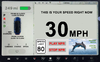
When you choose the homelink profil the display disapear after what's the problem her ?I share the same concerns as many others on this thread. But one issue that I’ve not seen discussed is how the new smaller backup view is further compromised by the Homelink drop down menu. It now blocks the top 20% of my backup view image, making it more difficult for me to see children playing in our cul de sac as I back up. This really needs to get fixed. See pic below for example.
View attachment 625285
Needsdecaf
Active Member
Pre 48.26/30: "GM"
With 48.26/30: "gm" <=== People complaining that now they're completely blind (funny--no problems with using their relatively tiny phone screens) and they have no idea what this "gm" company does
I think it's more to do with the fact that it looks like I made it in about 5 minutes on Word Press in 2001.
UncleCreepy
Member
After a week or two with the new UI I still don't like it.
The headlights indicator is right next to the left turn indicator. Both are green. That doesn't make it easier to grasp information at a quick glance.
Why does the AP indicator, gear indicator AND the programmed speed have to turn blue when AP is on? This is redundant information, plus it doesn't make it easier to see if the high beams are on as there is too much blue stuff. I don't want to have to spend more time than necessary looking at the screen.
Starting Netflix frequently results in a frozen screen or reboot, while closing it now takes several seconds before it disappears from the screen. It used to be instant.
Browser: the X and the back button are now so frickin close together that I frequently close the whole window instead of going back.
Personally I can still read the speedometer just fine, but I appreciate why other folks don't like it.
The thin regen line may not be crucial for driving, but can we just have one or two more lines on the screen to actually make it visible? The current one pixel is a joke.
I'm not entirely sure why it is better to have the camera button on the home screen. The only time I ever need the cameras is when I'm in reverse, but then they come on automatically.
The one thing I like is that if I open a window that hides the map, I now see an icon on the left side of the screen showing where to turn next while navigating. To my knowledge, that is new. Or maybe I haven't noticed it before.
All in all, this is the first update that I regret having. If I could go back to the former UI, I'd do it in a heartbeat.
I'm not entirely sure why it is better to have the camera button on the home screen. The only time I ever need the cameras is when I'm in reverse, but then they come on automatically
I use the camera sometimes when driving "through" a parking space so that I can line up my back bumper with the line. I like to park that way so that the front end of the car is as far back as possible, without intruding on the parking space behind. In a "regular" car with a backup camera only, you have to drive past, then put the car in reverse to line it up so precisely. That said, the icon was perfectly fine before this update. It doesn't deserve to be where it is.
qdeathstar
Completely Serious
qdeathstar
Completely Serious
I look forward to building a UI that will appease the people.
you should make people get in a line and you can give each of them their own ui.
I can agree with your statement.I think you have summed up the interface change perfectly. If you an Autopilot driver you will like the changes, if you are a diy driver then not so much.
Pied
Member
Just found this thread. I hate the new UI as well. Why is it gray text on gray background?!?
LindsayUKRoss
New Member
I agree. I dont want to look at anything but relevant info in normal driving e.g. speed, range, speed limit. The only time the visualisation comes in is manoeuvring at low speeds in tight spaces (I think I used to do better with just mirrors - dont really trust the camera perspectives / accuracy).I don’t understand the need for the visualization. Seems gimmicky. If you don’t have FSD, you don’t need it. Once FSD is real, you don’t need it. You should be watching Netflix or sleeping. Seems like a developer mode that is shown to the consumers for the wow factor.
I loved the big map area to see alternatives when heading into traffic or diversions.
In general the screen controls could be a lot easier to use. Most are needlessly small requiring focus away from the road to navigate your finger to the exact spot. The touch areas could easily be twice as big and not limited to size of the icons. Manual controls would become muscle memory / feel so not needing to distract do much.
Visual ease is a downside for me too as I need reading glasses but not for distance. I now cannot see the range or gear without putting on glasses. I thought that they had been removed for some mystifying reason. Grey is a dumb colour for the large number of older drivers who can afford a Tesla. More than customising screen areas, I think this group would like a options to increase visibility of icons and text font
TheChafing
Member
I finally broke down and installed this yesterday, because I was tired of the car nagging me every time.
Holy crap this is bad. Like, what moron thought it was a good idea to make literally every useful piece of information on the screen smaller, harder to read, and farther from the driver, and then take all that valuable space they saved, and cover it with a useless screen saver? Seriously, WTF?
Is there any way to roll back to the previous version?
substance12
Member
I submitted my accessibility related concerns to the feedback email and it didn't go through. i think chatting with a rep is probably better. From what I remember, Elon had 2 tweets about this. one was the UI rehaul responding to the S/X screenshot. the other was someone saying they wanted a full screen visualization... which is the opposite of what many of us think is important. Granted the response Elon gave would actually be helpful.
Reddit has a few posts about design iterations. here's one i thought was pretty good.
https://www.reddit.com/r/teslamotor..._a_bit_miffed_at_the_new_ui_looking_so_cheap/
Reddit has a few posts about design iterations. here's one i thought was pretty good.
https://www.reddit.com/r/teslamotor..._a_bit_miffed_at_the_new_ui_looking_so_cheap/
Only thing that annoys me with the new UI is that the battery icon is not lining up with the icons on the right (navigation) side. Hope there will be an update where we get a notification bar like on a phone or tablet, so the temperature, time and camera icons can move more toward the driver.
Attachments
Similar threads
- Replies
- 1
- Views
- 125
- Replies
- 130
- Views
- 9K