As someone who doesnt have FSD or plan to get it, I am pretty frustrated with the design changes. Why did they make all the GLANCABLE relevant information so much more smaller and harder to read locations?
Also now it just looks like my car is floating in a giant white space while driving. It doesnt even look like its movingm its very jarring...The model of the car is now very low quality with no anti-aliasing and jaggy edges all over. It looks terrible.
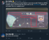
Why are there 2 different #s for the speed I'm going ? I dont understand why they thought this was good.
Also now it just looks like my car is floating in a giant white space while driving. It doesnt even look like its movingm its very jarring...The model of the car is now very low quality with no anti-aliasing and jaggy edges all over. It looks terrible.
Why are there 2 different #s for the speed I'm going ? I dont understand why they thought this was good.