


Welcome to Tesla Motors Club
Discuss Tesla's Model S, Model 3, Model X, Model Y, Cybertruck, Roadster and More.
Register
Install the app
How to install the app on iOS
You can install our site as a web app on your iOS device by utilizing the Add to Home Screen feature in Safari. Please see this thread for more details on this.
Note: This feature may not be available in some browsers.
-
Want to remove ads? Register an account and login to see fewer ads, and become a Supporting Member to remove almost all ads.
You are using an out of date browser. It may not display this or other websites correctly.
You should upgrade or use an alternative browser.
You should upgrade or use an alternative browser.
Anyone get the holiday update yet…..?
- Thread starter djillusion
- Start date
Had a chance to play with V11 on the X and I don't echo the same concerns a lot of other people have. Ignoring the lack of attention to detail with a lot of the white spacing with words and icons; I like it.
Things I like:
Things I don't like:
Things I like:
- General UI is more streamlined, I particular like the Spotify UI
- Color icons are nice, though they look a bit dated
- Map orientation moved from top right to top left, closer to driver
- Ability to edit waypoints, in addition to just adding them
- Less overall UI clutter
Things I don't like:
- Charging/supercharger icon on main map menu has moved to a subtab accessible after tapping the nav input box
- Not a huge deal, and I see why they've moved charging here. The charging icon on the main map menu was ambiguous and more of a "power user" feature. As a non-Tesla enthusiast, it totally makes sense that charging would appear after tapping the nav input box
- Trip options was moved to the expanded menu (I preferred them to be in a button inside the search box)
- IMO, contrast between window panes should be darker. Right now, everything blends together
- Removal of battery visualization (historically seen when you tapped the charge icon in the top icon bar)
- Tapping the charge icon takes you top a new "Charging" page that doesn't provide any information on charging
- Removal of seat heater controls from action bar; now you must click the temperature which pulls up the climate panel
- I think I'd get use to this, and it's not as big of a deal as everybody has complained about
- No changes or customization to the center instrument console
ContrarianDC
Member
 Still stuck in 10.6.1...
Had a chance to play with V11 on the X and I don't echo the same concerns a lot of other people have. Ignoring the lack of attention to detail with a lot of the white spacing with words and icons; I like it.
Things I like:
- General UI is more streamlined, I particular like the Spotify UI
- Color icons are nice, though they look a bit dated
- Map orientation moved from top right to top left, closer to driver
- Ability to edit waypoints, in addition to just adding them
- Less overall UI clutter
Things I don't like:
Overall, I can see the direction Tesla is trying to go with their UI. Something that makes more sense for the general Tesla population. I can also understand why a lot of people on the forums don't like it. Anyways, I like the update and I wouldn't read too much into what other people are complaining about.
- Charging/supercharger icon on main map menu has moved to a subtab accessible after tapping the nav input box
- Not a huge deal, and I see why they've moved charging here. The charging icon on the main map menu was ambiguous and more of a "power user" feature. As a non-Tesla enthusiast, it totally makes sense that charging would appear after tapping the nav input box
- Trip options was moved to the expanded menu (I preferred them to be in a button inside the search box)
- IMO, contrast between window panes should be darker. Right now, everything blends together
- Removal of battery visualization (historically seen when you tapped the charge icon in the top icon bar)
- Tapping the charge icon takes you top a new "Charging" page that doesn't provide any information on charging
- Removal of seat heater controls from action bar; now you must click the temperature which pulls up the climate panel
- I think I'd get use to this, and it's not as big of a deal as everybody has complained about
- No changes or customization to the center instrument console
Wanted to add a WTF category...I guess you can no longer set the charge rate from your car and it has to be done on your phone?
Wanted to add a WTF category...I guess you can no longer set the charge rate from your car and it has to be done on your phone?
What! If true, that's crazy. The more I hear the less I like the sound of this new update.
I have a "Legacy" Model X (early 2021, and already a legacy) and am not receiving an update (yet) because I am in the FSD Beta testing program. I want v10.8 (of FSD Beta), but I am not sure I want all the other stuff now, especially because the Legacy Models S and X apparently don't get a lot of the better features anyway. If I were to get this update I'd get all the worst of the features and few of the best. Boo!
I suppose I can refuse the invitation to update, but how long can that last? At some point you pretty much have to update, right? Then it all happens anyway. Might as well rip the band-aid off now and get it over with, I suppose. But for the moment, having a Model X with FSD Beta is good, because we are (temporarily) immune from this latest update. (Ha, ha.)
Just have to hope that the 20s-something junior executive who approved all these screen display changes is fired and better heads prevail for future updates.
")
In a fit of beer weakness I went ahead and installed this last night. It's fine. There's a separate menu item for charging instead of the widget, on the main vehicle menu tabs.
Screen response seems snappier - I wonder if there was a lot of zombie code in the old (don't say legacy it's a trigger word apparently) build that was dragging it down. I like dark mode a lot, auto-brightness was too dim and too slow to react in the old "night" mode, and auto brought up the day mode which was way too bright for dusk/dawn or transitions in/out of dark garages. UI for theatre/gaming seems less antiquated and games seem to load a little faster. Garage door opener worked the first time and more quickly than usual too.
The seat heat location is my only real complaint. That's an easy to reach button on every other car and it should be an option to stick to the app launcher or something if you so choose. Really, that's my only complaint overall. Other than fixed buttons on the bottom bar for the vehicle and HVAC, everything else ought to be configurable with whatever goofy feature you use most, whether it's farts or heated seats or the suspension or etc. There's no reason for there to be a mandatory volume control sitting there when you have several different ways to change it or mute it on the steering wheel, for instance. Just give us a bunch of quick access buttons to choose from for actual vehicle functions as opposed to 5 different audio streaming services
But, overall, it's fine. The new instrument panel font is nice enough. Still wish there was a more in-depth vehicle status submenu for things like battery temp, state of charge down to a couple decimal places, but I really enjoy seeing vital stats on an instrument panel and Tesla's overall is pretty good IMO.
Oh, and comfort suspension in autopilot is a nice touch. I like that too
Last edited:
Drrobmiller
Member
X Fan
Active Member
I like it. it takes a little bit to survey what they’ve done and figure it out but once done it’s easy.
btw1: for my x, Charging can be accessed from either upper left via icon or through main control screen.
Seat heating is the only clumsy access.
btw2: sound quality via TIDAL is SO much better. Even better than my USB FLACs.
AND: for flac users….album pictures have returned.
btw1: for my x, Charging can be accessed from either upper left via icon or through main control screen.
Seat heating is the only clumsy access.
btw2: sound quality via TIDAL is SO much better. Even better than my USB FLACs.
AND: for flac users….album pictures have returned.
I like it. it takes a little bit to survey what they’ve done and figure it out but once done it’s easy.
btw1: for my x, Charging can be accessed from either upper left via icon or through main control screen.
Seat heating is the only clumsy access.
btw2: sound quality via TIDAL is SO much better. Even better than my USB FLACs.
AND: for flac users….album pictures have returned.
Do you have a charge slider? I know you can access the menu through the top icon, or main vehicle menu. I don't have any slider there.
Seat heating never really bothered me...I just leave it on all the time lol. Auto-heat would be nice though!
My girlfriend and I were driving home from LA yesterday and logged a solid 7 hours. She likes the interface for the reasons I mentioned above. We did both notice that the album art from Spotify is missing on the IC more frequently. This didn't seem to be the case with the previous SW version.
X Fan
Active Member
Yes….re seat heater Naples fl winter folks don’t need it more than 1-2 daysDo you have a charge slider? I know you can access the menu through the top icon, or main vehicle menu. I don't have any slider there.
Seat heating never really bothered me...I just leave it on all the time lol. Auto-heat would be nice though!
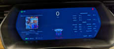
Yes….re seat heater Naples fl winter folks don’t need it more than 1-2 days View attachment 749248
LOL, in true Tesla fashion...I'm missing the top block with the car.
That should be Auto setting in seat heat. I love that in our 3. No more noticing my butt and back are really getting overheated.Is the Auto seat available on the X. We updated the 3 and I am using that now. Seems to work well and I have not had to take it out of auto.
Yes, I can't stand the bottom row and the unbalanced look. Maybe there is some fix to this, I've tried to add icons to the bottom row, but it appears to have limited number of icons and doesn't stretch the bottom row for a balance look. It's completely lopsided to the left. It is terrible looking.Hey @verygreen, I am a newbie to TMC and saw your post. I received the update earlier this evening and had it installed.
Not sure if you looking for feedback, but I am very disappointed. Tesla screwed around with the entire bottom row on the center screen.
Items that I am disappointed to see (so far):
-Colored icons (I can live with it, just not happy)
-Reconfigured entire bottom row on center screen. Introduced Categories called “My apps” and “Recent Apps” across the bottom row. In addition, the icons do not stretch across the entire bottom row, resulting in a huge blank space on the bottom right. (I am furious about this).
-Enlarged font in menus -> it makes the menus look childish. Tesla did something similar with the driver console previously.
Yes, I can't stand the bottom row and the unbalanced look. Maybe there is some fix to this, I've tried to add icons to the bottom row, but it appears to have limited number of icons and doesn't stretch the bottom row for a balance look. It's completely lopsided to the left. It is terrible looking. I have an 2017 S with upgraded intel chip.Hey @verygreen, I am a newbie to TMC and saw your post. I received the update earlier this evening and had it installed.
Not sure if you looking for feedback, but I am very disappointed. Tesla screwed around with the entire bottom row on the center screen.
Items that I am disappointed to see (so far):
-Colored icons (I can live with it, just not happy)
-Reconfigured entire bottom row on center screen. Introduced Categories called “My apps” and “Recent Apps” across the bottom row. In addition, the icons do not stretch across the entire bottom row, resulting in a huge blank space on the bottom right. (I am furious about this).
-Enlarged font in menus -> it makes the menus look childish. Tesla did something similar with the driver console previously.
Is the Auto seat available on the X. We updated the 3 and I am using that now. Seems to work well and I have not had to take it out of auto.
Need to have auto temp selected for the auto seat heaters to work.
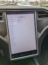
Quick click through of the UI:
 www.instagram.com
 www.instagram.com
Also my sweet charging screen:
Login • Instagram
Welcome back to Instagram. Sign in to check out what your friends, family & interests have been capturing & sharing around the world.
www.instagram.com
Escargot Garage on Instagram: "V11 legacy update, part two: taskbar, routing, and charging. . #tesla #teslamodelx #teslamodels #modelx #models #v11"
1 likes, 0 comments - escargotgarageDecember 28, 2021 on : "V11 legacy update, part two: taskbar, routing, and charging. . #tesla #teslamodelx #teslamodels #modelx #models #v11"
www.instagram.com
Also my sweet charging screen:
Attachments
it's there, but of course for reasons unknwon Tesla does not want you to see it.Still wish there was a more in-depth vehicle status submenu for things like battery temp, state of charge down to a couple decimal places,

Attachments
...Also my sweet charging screen:
I am no expert and don't have this software version yet, but that charging screen you show;...my gut is telling me that that will be fixed in a future update.
Were you actually charging when you took that photo? If so, yeah, that's not right...
Similar threads
- Replies
- 31
- Views
- 1K
- Replies
- 18
- Views
- 1K
- Replies
- 36
- Views
- 2K