Some of the discussion regarding meters and the differences got me wondering how close the data from Tesla and my utility (PEPCO) actually were. Full discussion below, but it appears that Tesla consistently reports a lower net usage than PEPCO. The amount varies from almost 0 to a bit over half a kWh, but, on a daily basis, it is always positive. In fitting the data, it seems that there is a constant daily difference of about 0.24 kWh plus a difference of just under 1% of the net use for the day. The discrepancy is not huge, but it does come out to just over 10 kWh per month (about $1.50 based on PEPCO rates.)
I obtained the Tesla data using the local API to query the TEG. The TEG provides data on 4 meters - site, battery, load, and solar - and each provides an amount imported and exported (load exported is always 0, and solar imported is virtually 0 - ~0.003 kWh avg. daily.) I confirmed that Site Import - Site Export = Load Import - Solar Export + Solar Import - Battery Export + Battery Import. In other words, the Tesla data balances, so that there is no missing Energy in their data. As such, I used Site Import - Site Export to represent the "Tesla Usage".
For PEPCO, I pulled the Green Button data, which, in our area, includes hourly usage data. Because PEPCO's meters provide only a single net usage number, PEPCO does not provide separate generation and use numbers that I could compare to the Tesla data. To double-check the Green Button data, I compared it to the two bills we have received and confirmed that the numbers match, rounded to the nearest kWh (all billing is done in whole kWh amounts.)
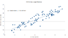
The attached graph shows that the data matches very well. However, what is notable (though difficult to see) is that the PEPCO number always represents higher usage than Tesla.
For the second chart I used the regression tool in LibreOffice, which provides a best fit of 0.240 kWh + 0.00960 * Tesla net usage. I did also try fitting all of the other data sets to see if they had a better correlation but found nothing else came close (other than fitting to the PEPCO Net Usage, which provides, not surprisingly, virtually the same fit and correlation of 0.238 kWh + 0.00952 * PEPCO net usage.) The chart shows that, as
I obtained the Tesla data using the local API to query the TEG. The TEG provides data on 4 meters - site, battery, load, and solar - and each provides an amount imported and exported (load exported is always 0, and solar imported is virtually 0 - ~0.003 kWh avg. daily.) I confirmed that Site Import - Site Export = Load Import - Solar Export + Solar Import - Battery Export + Battery Import. In other words, the Tesla data balances, so that there is no missing Energy in their data. As such, I used Site Import - Site Export to represent the "Tesla Usage".
For PEPCO, I pulled the Green Button data, which, in our area, includes hourly usage data. Because PEPCO's meters provide only a single net usage number, PEPCO does not provide separate generation and use numbers that I could compare to the Tesla data. To double-check the Green Button data, I compared it to the two bills we have received and confirmed that the numbers match, rounded to the nearest kWh (all billing is done in whole kWh amounts.)
The attached graph shows that the data matches very well. However, what is notable (though difficult to see) is that the PEPCO number always represents higher usage than Tesla.
For the second chart I used the regression tool in LibreOffice, which provides a best fit of 0.240 kWh + 0.00960 * Tesla net usage. I did also try fitting all of the other data sets to see if they had a better correlation but found nothing else came close (other than fitting to the PEPCO Net Usage, which provides, not surprisingly, virtually the same fit and correlation of 0.238 kWh + 0.00952 * PEPCO net usage.) The chart shows that, as