For those of you who have experience with an X or an S, and are now (or also) driving Model 3, do you miss the energy graph when on roadtrips?
Welcome to Tesla Motors Club
Discuss Tesla's Model S, Model 3, Model X, Model Y, Cybertruck, Roadster and More.
Register
Install the app
How to install the app on iOS
You can install our site as a web app on your iOS device by utilizing the Add to Home Screen feature in Safari. Please see this thread for more details on this.
Note: This feature may not be available in some browsers.
-
Want to remove ads? Register an account and login to see fewer ads, and become a Supporting Member to remove almost all ads.
You are using an out of date browser. It may not display this or other websites correctly.
You should upgrade or use an alternative browser.
You should upgrade or use an alternative browser.
Do you "miss" the Energy Graph?
- Thread starter Birdman325
- Start date
Yes. The large center console trip energy graph is the main thing I have on screen in my Model S when road tripping. I really hope they add at least a smaller version for the Model 3.
I don't miss the smaller on the dash energy graph at all.
I don't miss the smaller on the dash energy graph at all.
marusan
Member
Not being a current S/X owner, but a frequent passenger of them, I can already tell I'll miss this.
Somewhat related, I wonder if anyone has ever proposed being able to "skin" the Model 3 display as a feature for tech-savvy drivers, perhaps as a part of the driver profile. Personally, I'm not a huge fan boring Helvetica fonts, all the wasted space (who needs that enormous car icon that only has a few buttons on it?), etc. Obviously, drivers should be able to share their skins with others, and Tesla would benefit from some free development to improve the UI.
Somewhat related, I wonder if anyone has ever proposed being able to "skin" the Model 3 display as a feature for tech-savvy drivers, perhaps as a part of the driver profile. Personally, I'm not a huge fan boring Helvetica fonts, all the wasted space (who needs that enormous car icon that only has a few buttons on it?), etc. Obviously, drivers should be able to share their skins with others, and Tesla would benefit from some free development to improve the UI.
Krugerrand
Meow
Just finished over 3,600 mile trip. Energy graphs are so 2012.
The 3 is quite accurate in determining if you can make it or not. Nav tells you what you’ll have left when you arrive and constantly adjusts as you cover miles. If you start to use too much it’ll tell you to keep your speed below a certain amount to reach your destination. If you ignore the warning, it eventually reroutes you to a closer charger.
I cleared my B trip before I started so I was aware of my average Wh/mile. 256 I averaged, which included a LOT of head and crosswinds - like hundreds of miles in a row - some mountain climbs and spirited driving.
SageBrush
REJECT Fascism
The Model 3 reports consumption since last charge and by a 'B' trip meter, in addition to a constantly updating estimate or remaining charge until a destination is reached. The car also has a power meter line under the speedometer that can be thought of as an instantaneous consumption meter, albeit unscaled unless someone bothers to make a sticky.
Personally, I am more than fine with the data displayed.
Personally, I am more than fine with the data displayed.
I mostly agree.Not at all. They're interesting but not essential to determining range on a trip.
The only thing I miss about the energy graphs is whether I'm matching it's prediction. The other graphs of usage over the past 30 miles aren't as helpful.
SpiceWare
Member
Yes. It doesn't have to be large, I think it'd work well as another card at the bottom left:
- swipe from left brings up odometers
- swipe from right brings up energy graph
- swipe from right twice for tire pressure
silentsnow31802
Member
I do not miss the graph itself but I do miss the estimated range that graph shows when set to average and last 30 miles. This in my experience has given the most accurate charge left display. If they could just display that number on the dash instead of ideal range that would be great.
insaneoctane
Well-Known Member
I don’t have my 3 handy right now to check but the two useful bits of information are there as I recall. The predicted arrival battery percent is at the bottom of the nav instructions and the limited power and regen are dashes on the power line below the speed.
The Wh/mi chart is fun to look at but more distracting than useful. These days I keep the binacle sides empty except for nav.
The Wh/mi chart is fun to look at but more distracting than useful. These days I keep the binacle sides empty except for nav.
davedavedave
Member
the only think I want to see from the small energy graph is the limited regen triangle warning light. or know when or how much regen i have. but then again, i can just feel it when i let up off the gas.
Actually there’s a green bar under the speedo that indicates your regen level. Also shows power when you’re accelerating.
davedavedave
Member
For those of you who have experience with an X or an S, and are now (or also) driving Model 3, do you miss the energy graph when on roadtrips?
Had it on my Priuses, and I do miss it.
sduck
Mr. Duck
cpa
Active Member
I like the energy graph on our S. The line shows the estimated usage from the battery, and steep declines or inclines can indicate in advance when the road is gaining or losing elevation. The comparisons between the initial estimate and the ongoing estimate are helpful to me, as I will likely not remember what the initial reserve was going to be.
Moreover, much to the annoyance of a certain, unnamed member of this site, I can easily read the font size on the energy graph with my aging eyeballs. The font size on the navigation blurb is too small to be viewed clearly. Since my distance vision is 20/15, I do not need glasses to drive, and I do not want to keep removing sunglasses and putting on my transition lenses just to read a screen.
So, yes, it would be a nice feature if our 3 had an energy graph. Failing that, it would be helpful if Tesla increased the font size, or allowed an option for us to increase the font size.
Hi all,
What has been everyone’s experience with the accuracy of the estimated trip endpoint percent battery capacity? Do the Model S and Model 3 nav system estimates adequately take steep hill climbs into account (e.g. 6000-8000 ft.)? I’ve found that EVTripplanner underestimates rated miles consumed in these circumstances, sometimes by as much as 15-20 miles.
Thanks in advance!
Oliver
e-FTW
New electron smell
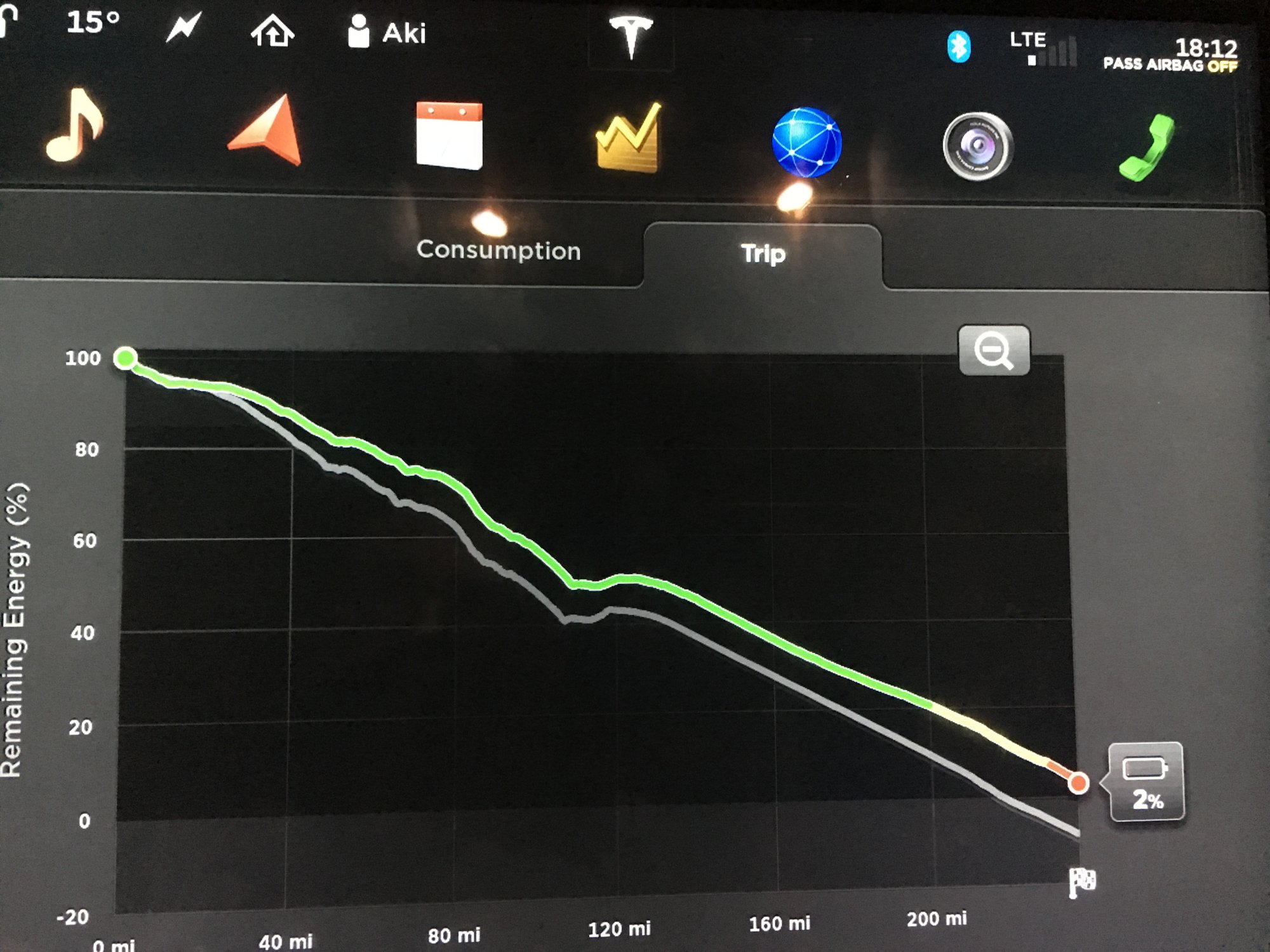
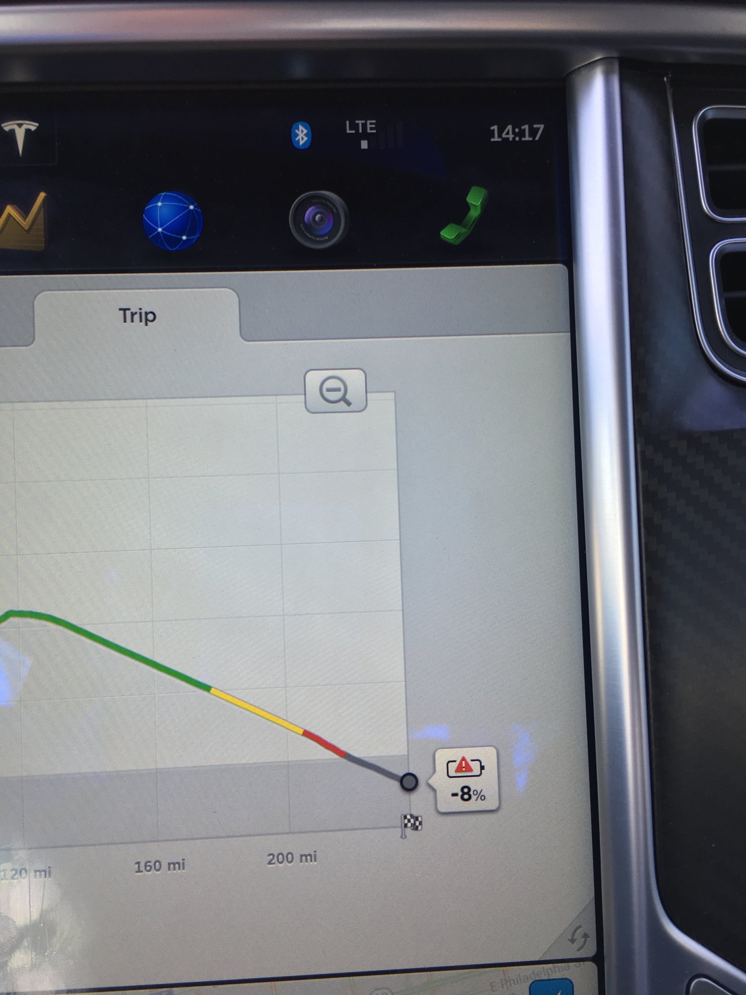
For the visual amongst us, here is what that screen looks like, if you have not driven an S/X. The changing contour of the line reflects predicted consumption based on elevation changes:

While driving, it is easy to adjust speed to make your destination, even though the prediction when setting off was rather grim:

While driving, it is easy to adjust speed to make your destination, even though the prediction when setting off was rather grim:
I’m still waiting for my Model 3; does the current firmware version still not have the equivalent of the S/X energy usage graph?
If so, I’m surprised Tesla has not implemented it yet. I have found it useful over my nearly 5 years of Tesla ownership. I would think it would not be difficult for Tesla to include in the 3 since they have the code already; tweak some parameters and add it to the 3 firmware.
If so, I’m surprised Tesla has not implemented it yet. I have found it useful over my nearly 5 years of Tesla ownership. I would think it would not be difficult for Tesla to include in the 3 since they have the code already; tweak some parameters and add it to the 3 firmware.
Similar threads
- Replies
- 4
- Views
- 247
- Replies
- 1
- Views
- 112
- Replies
- 7
- Views
- 2K
- Replies
- 2
- Views
- 184


