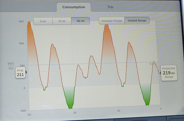
Sorry if this is a silly question, but what exactly does the energy graph on the right of the speedometer tell you?
Normally, the orange bar goes up a bit when accelerating (rarely above 75, though) and it turns green when regen braking.
Is this simply the amount of kw above or below your average (if so, which average)?
In other words, my average might be around 300kw, but this graph always hovers around 0kw and when accelerating might go up to usually less than 75kw.
Tried to search for this, but couldn't find anything. Maybe it's too self explanatory and I'm just missing it.
Screenshot below was taken from an image online - this is not my car.