Welcome to Tesla Motors Club
Discuss Tesla's Model S, Model 3, Model X, Model Y, Cybertruck, Roadster and More.
Register

Energy graph UI offset

This site may earn commission on affiliate links.
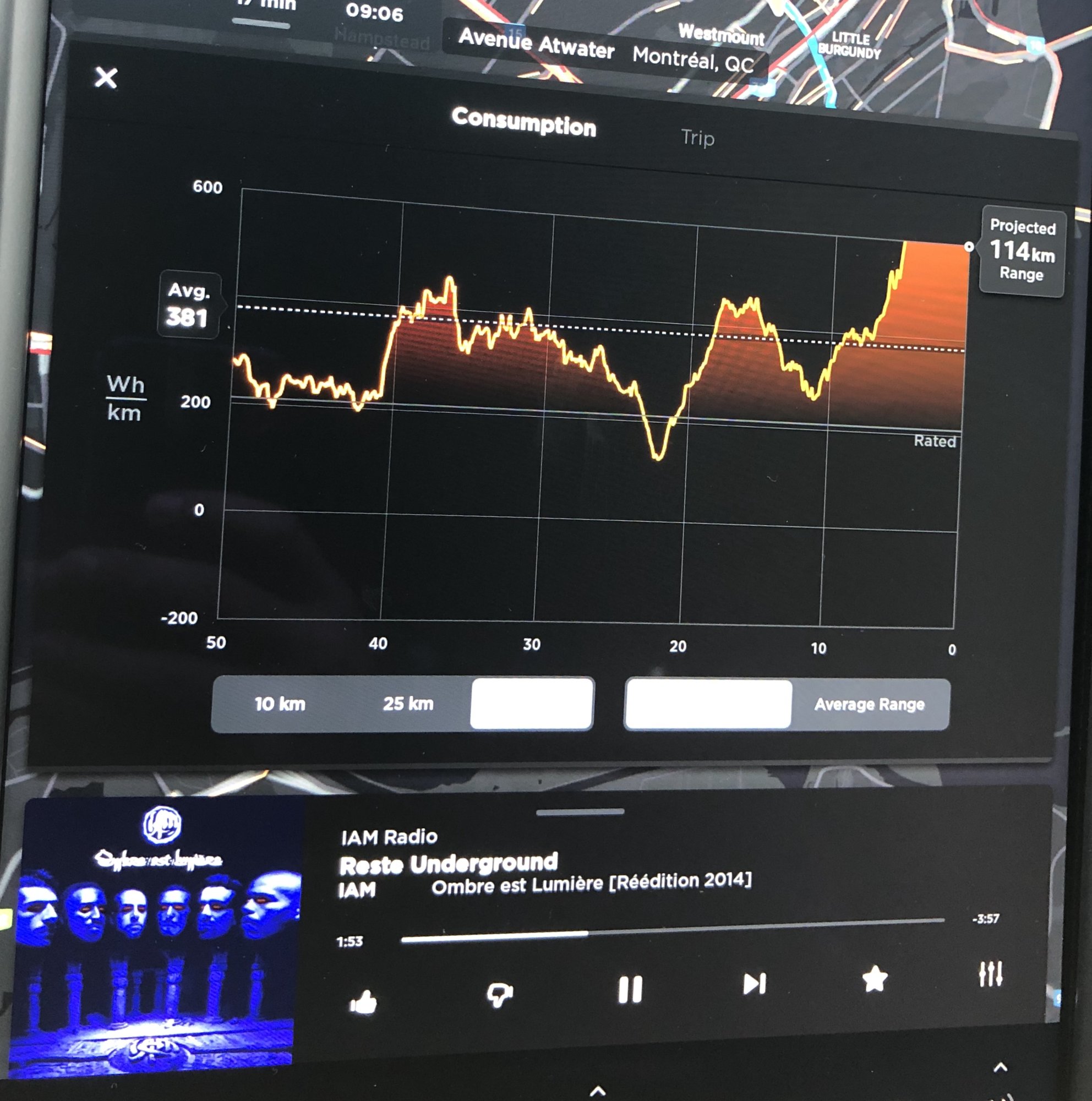
I had my X for a week now, getting used to all the telemetry inside of it and while trying to understand the energy graph and how it actually display my driving behaviors, I noticed that it is often, if not always, offset up thus making part of the graph not visible. Shouldn't the whole graph be centered at all time? Is there a way to fix this?
IMG_2753.jpeg
 
I'm not going to do the math, so I can't say for sure that configuration makes sense, but in the US, where it's Wh/mi, the lowest number is always -300 and the highest is always 900. The graph effectively looks the same, but I don't think my energy usage has ever been quite that high on the graph with the 30 mi avg (not sure what equivalent avg you're looking at, but guessing 50km). Unfortunately, there's no really good point of comparison, because the "Rated" line there is probably different than the "Rated" line here (since ours is based on EPA, yours is likely based on something else).
 
I couldn't stand it, I did the math to better understand your graph:
1 Mile = ~1.6 kilometers
1.6 * 600 = 960
If that as the right math, your graph allows for display of higher usage than mine, in which case you are really using a a lot of power. Perhaps you have a P100D with 22 inch wheels? Perhaps you spend a lot of time standing still or moving at slow speeds with the HVAC system running?
 
:D
I love the fact that the graph got you guys so confused. I'm going to switch to wh/mi for my way back home and snap some additional pictures.

How much I'm actually using is irrelevant for me at the moment, I've had the car for less than a week. I have only a 100D with 19" winter tires right now. But I've been pushing the car a lot just to feel it and enjoy the instant torque.

What's I'm looking for is why this graph do not automatically center around the actual min and max values displayed. This would be so much user friendly IMHO. So I was wondering if this was normal, maybe a software bug that a reset could solve, maybe a known issue, etc.

So I guess I have my answer: the graph Y axis is fixed and I should go lighter on the acceleration pedal :p

Thanks!
Yes, the axis is fixed, having it be another way could certainly be considered an enhancement, but having the fixed axis provides a point of reference so you don't have to think about the graph beyond just looking at it. I don't suppose you need to go lighter on the accelerator, but you should probably get out on the open road sometime if you want to see the peaks and troughs fit in the graph.
 
Thanks. I'm pushing the car a lot and have only been driving in the city so far. Also, keeping the car at 70°F when it is around 10°F outside certainly don't help :)
I'll report back when my driving goes back to normal :D
 
I don't believe that there is a way to change the graph offset, as mentioned it's fixed. I have the same issue with the smaller graph on the dash as well. I find that it's pretty easy to get the usage off the graph if you are pushing the car - especially in the cold and on a hill. I have a small enclosed utility trailer that can get my Wh/Mi over 1,000 easily on my 75D when maintaining highway speed up inclines. It's terribly sad seeing my range half but the car handles it with ease from a performance stance.

If anyone happens to find a way to get the graph to be dynamic please do share.
 
  • Like
Reactions: Bogobec