


Welcome to Tesla Motors Club
Discuss Tesla's Model S, Model 3, Model X, Model Y, Cybertruck, Roadster and More.
Register
Install the app
How to install the app on iOS
You can install our site as a web app on your iOS device by utilizing the Add to Home Screen feature in Safari. Please see this thread for more details on this.
Note: This feature may not be available in some browsers.
-
Want to remove ads? Register an account and login to see fewer ads, and become a Supporting Member to remove almost all ads.
You are using an out of date browser. It may not display this or other websites correctly.
You should upgrade or use an alternative browser.
You should upgrade or use an alternative browser.
Feedback on the "new look"
- Thread starter David29
- Start date
Yes, we could do that but I am guessing that would look like a bit of a mess, as you would have semi-translucent text and icons overlaying other text and icons.Can the red bar be made translucent so stuff behind it is still visible? Or is that too weird?
I would be curious to know what other iPhone users are experiencing when using the text editor.
HankLloydRight
No Roads
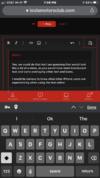
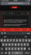
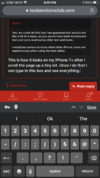
This is how it looks on my iPhone 7+ after I scroll the page up a tiny bit. Once I do that I can type in this box and see everything.Yes, we could do that but I am guessing that would look like a bit of a mess, as you would have semi-translucent text and icons overlaying other text and icons.
I would be curious to know what other iPhone users are experiencing when using the text editor.
edit: In the photos below, you can see the blue caret at just under the red footer bar. I just used the edge of the screen to scroll up a tiny bit to see the caret in full and then typing was fine after that and typing into a line break did scroll correctly so I could see the text being typed, unlike in the video above this post.
Attachments
Thanks, I really appreciate you taking the time to make that. I am going to submit it to our developers to look into.
One other thing, which admittedly is minor.
Before the update, sliding my cursor over the notification "bell" would pop up a box with a list of notifications. It was unnecessary to click the mouse to see that list. I could then simply click on an item of interest and the post would appear.
But since the update, the pop-up list no longer appears. I have to click on the bell to see the list of notifications. I know, it is only one extra click, but the automatic pop-up was convenient and saved a second or two and a mouse click. Please restore that feature if you can!
Full disclosure: the pop-up always worked on my desktop PC, but not on my Microsoft Surface tablet. Both devices run Windows 10, so I do not know why it worked on one but not the other. I assumed it was something to do with the respective mice, but have not changed the PC mouse or any related settings. I use the PC much more often than the tablet, so I'd prefer that auto pop-up to work again. Thanks!
Just to clarify: First, I do not quite believe that the text font is not lighter. It is certainly gray, not a solid color.Actually, the new design light theme is higher in contrast than the old one. A couple members have already complained that it is too constrasty for their liking.
I think most of your issues would be solved by simply making the font larger which you can do in your account preferences here: https://teslamotorsclub.com/tmc/account/preferences
However, when I get a chance, I am going to play with the font weights, and probably also adjust the default font size.
The issue of the unread thread titles not being bold enough is really not about it not being bold enough. It is virtually the same difference as we had on the old site. The main difference is we used to have a red dot next to the unread threads on the thread list. We will be adding that back shortly so this issue should be resolved.
Second, the size is fine. Making it larger is not the issue.
And third, I did not make any comment about the listings of new (unread) vs. previously read posts. But now that someone brought it up, the headings for previously read posts are very light, as well. About the same as the text i am typing here, I would say. In that context, a list, the lighter font is logical and tolerable, but not for the body of a post.
Thanks. Yeah, this has been mentioned a few times. It is not high priority, but we may look into how to restore that behavior.Before the update, sliding my cursor over the notification "bell" would pop up a box with a list of notifications. It was unnecessary to click the mouse to see that list. I could then simply click on an item of interest and the post would appear.
But since the update, the pop-up list no longer appears. I have to click on the bell to see the list of notifications. I know, it is only one extra click, but the automatic pop-up was convenient and saved a second or two and a mouse click. Please restore that feature if you can!
The color of the text is hex #141618Just to clarify: First, I do not quite believe that the text font is not lighter. It is certainly gray, not a solid color.
Second, the size is fine. Making it larger is not the issue.
And third, I did not make any comment about the listings of new (unread) vs. previously read posts. But now that someone brought it up, the headings for previously read posts are very light, as well. About the same as the text i am typing here, I would say. In that context, a list, the lighter font is logical and tolerable, but not for the body of a post.
That is certainly not grey, though neither is it 100% black #000000. As far as I know, It is not standard practice actually to use #000000 black as text color online. I personally wouldn't mind making it darker, but you are the only member so far who has mentioned wanting it darker.
OK, so one of the devs got back to me saying that it looks like you are using Safari and that there are a number of rendering issues on Safari overall due to it's lack of adherence to modern standards. He is looking to see if there is anything he can do to improve it.
Ooohhh: can we get into a lengthy debate about the best black to use for text?The color of the text is hex #141618
View attachment 645071
That is certainly not grey, though neither is it 100% black #000000. As far as I know, It is not standard practice actually to use #000000 black as text color online.

Ya, I should probably go home...
Haha, I have read a couple articles on that. Unfortunately it is largely subjective. Higher contrast is always more readable (when on a white background), but also more eye straining, so it is a matter of finding a balance between the two.Ooohhh: can we get into a lengthy debate about the best black to use for text?
Ya, I should probably go home...
I can tell you one thing for sure, the blacks in the dark style are way too dark. Overly high contrast on a dark background tends to cause distortions along the edges of non-black elements in the page. So I will be adjusting that when I get a chance, but I will try to maintain good contrast for text in doing so.
qdeathstar
Completely Serious
OK, so one of the devs got back to me saying that it looks like you are using Safari and that there are a number of rendering issues on Safari overall due to it's lack of adherence to modern standards. He is looking to see if there is anything he can do to improve it.
ok, well Google Chrome takes up 65 percent of the market share of browsers. Safari is second at 20 percent. I’d say those two are the modern standard. With obviously a large nod to chrome....
Sure, but I think he was basically saying that it is a poor standard for various reasons that concern him as a developer. Anyway, it needs to work on Safari, regardless.ok, well Google Chrome takes up 65 percent of the market share of browsers. Safari is second at 20 percent. I’d say those two are the modern standard. With obviously a large nod to chrome....
These should all be working now. Thanks.Not sure if that's the right place - but here's bug, needs fixing: all the links in this post are broken
List of DaveT posts
View attachment 644528
OK, I surrender. I wish I had an image of how the old pages looked. I guess it all must be my imagination!Thanks. Yeah, this has been mentioned a few times. It is not high priority, but we may look into how to restore that behavior.
The color of the text is hex #141618
View attachment 645071
That is certainly not grey, though neither is it 100% black #000000. As far as I know, It is not standard practice actually to use #000000 black as text color online. I personally wouldn't mind making it darker, but you are the only member so far who has mentioned wanting it darker.
Thanks for taking the time to respond to my solitary complaint.
Someone who actually works here can probably give you a better answer, but here are my observations/thoughts:I dislike that in the iOS mobile view when clicking on a thread it always reverts to the first page, rather then the last.
Am I doing something wrong here?
When they did the new launch, one thing that didn't carry over for me was remembering where in a thread I had last read through. Whenever I clicked on a thread to read the latest posts, it always took me to page 1. However, as I started viewing threads in the updated forums, it once again started remembering where I left off.
So my theory is that the data of where each person last read was lost in the update. Slightly inconvenient, but certainly not the end of the world.
YMMV
I am not sure how the update may have affected data of where each user last read a given thread. @doug might have a better idea of that than me. But Kevy Baby's explanation is basically what I would say.Someone who actually works here can probably give you a better answer, but here are my observations/thoughts:
When they did the new launch, one thing that didn't carry over for me was remembering where in a thread I had last read through. Whenever I clicked on a thread to read the latest posts, it always took me to page 1. However, as I started viewing threads in the updated forums, it once again started remembering where I left off.
So my theory is that the data of where each person last read was lost in the update. Slightly inconvenient, but certainly not the end of the world.
YMMV
I dislike that in the iOS mobile view when clicking on a thread it always reverts to the first page, rather then the last.
Am I doing something wrong here?
I am not sure how the update may have affected data of where each user last read a given thread. @doug might have a better idea of that than me. But Kevy Baby's explanation is basically what I would say.
I didn't notice any loss of last read information during the upgrade. But I did notice a change of behavior. In the old version if you clicked a link to a thread that had no unread posts it took you to the last post in the thread, in the new version it takes you to the first post in the thread.
I personally prefer the old behavior, but it isn't really a big issue. (You just have to click the page number, type in the last page number, and go, so maybe it is a big issue, I just don't run into it very often.)
Similar threads
- Replies
- 83
- Views
- 3K
- Replies
- 14
- Views
- 1K
- Replies
- 7
- Views
- 443
- Article
- Replies
- 18
- Views
- 5K