Welcome to Tesla Motors Club
Discuss Tesla's Model S, Model 3, Model X, Model Y, Cybertruck, Roadster and More.
Register

Firmware's impact on range (graph)

This site may earn commission on affiliate links.
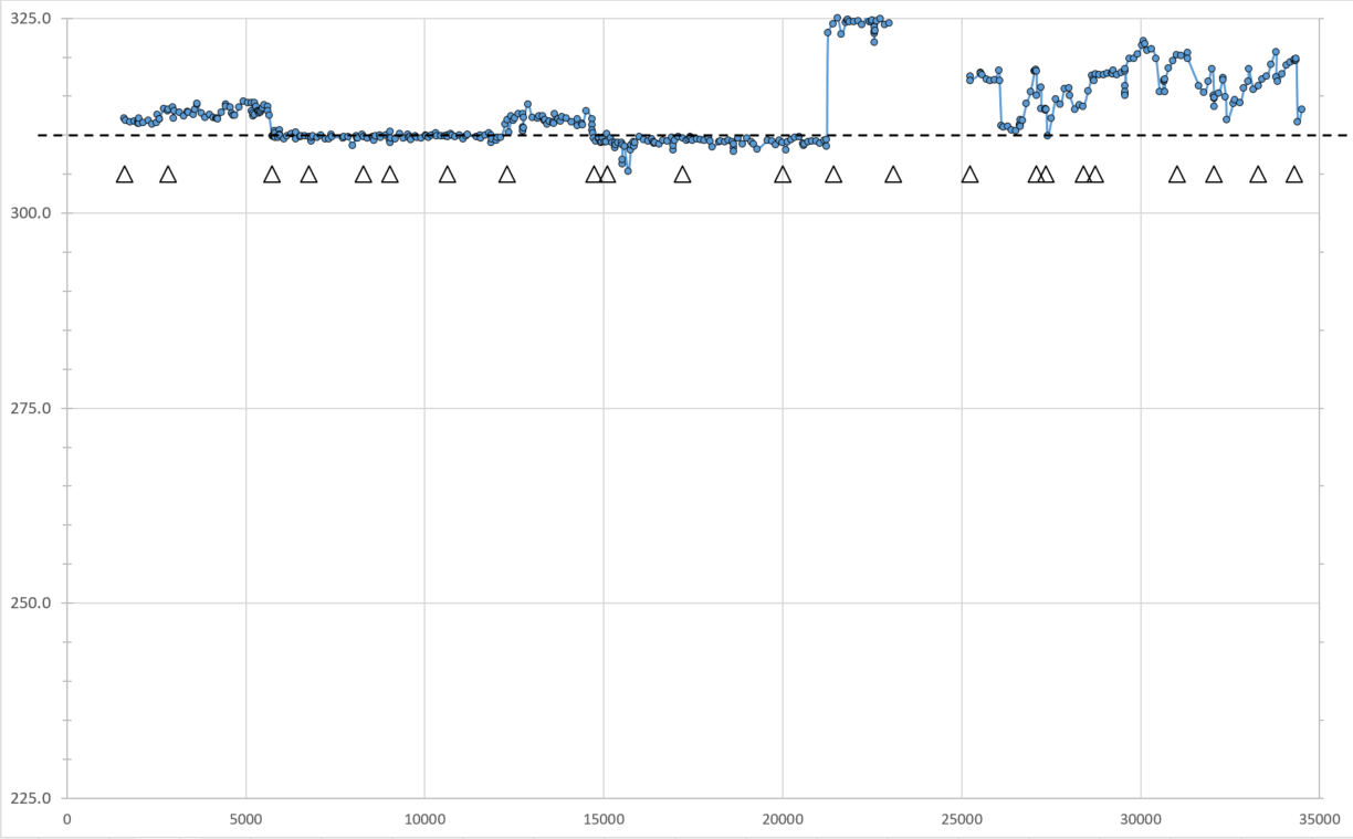
It sure appears that Tesla's latest firmwares are all over the map with range. I wanted to see my battery degradation as a function of mileage and then I superimposed my firmware updates. In summary, my observations:
  • NOTE:
    • The dashed line is at the 310-mile mark
    • The triangles represent new firmwares
    • X-axis is odometer (covers about 18 months of driving), Y-axis is extrapolated range at 100% SOC
  • You can see that around 22K miles, I got the firmware update to give me 325 miles. But it only lastest about 3 firmwares
  • The uncertainty to this plot (and thus my extrapolated range) has jumped around significantly ever since the 325 mile firmware...just look at how consistent it was BEFORE 25K miles!
  • I wasn't able to collect data from 23K to 25K due to an issue on my end
  • With Tesla's wild ride of firmwares and resulting range, I can't really tell if I have any battery degradation...But after 35K miles I appear to be above 310. While I've got issues with my battery losing range for no apparent reason after my commute, it still has the ability to "start" above 310 miles.


battery_range_degredation2.png
 
Maybe the moral of the story is that the range indicators fluctuates, so worrying about your range is a dubious task?

Although I would tend to agree, tracking range in the real world is virtually impossible; the graph certainly indications some correlation between updates and range. Around the 25000 mile mark, the graph appears to be what one might expect, but it's almost so linear prior to that, that it's a bit hard to believe unless you literally did the exact same drive every single day without fault. Southern California, of course, doesn't have much of a temperature fluctuation but strong range fluctuations could certainly be related to traffic conditions, travel to a different state with varying temperatures and/or altitude, different users, etc. Long story short, there isn't enough data here to argue that without a doubt there is a correlation but it is certainly interesting and plausible none the less.
 
FWIW- There is quite a bit of actual data behind the chart that isn't immediately obvious. Each of the dots represents not just "one" reading of extrapolated 100% SOC range, but rather the average of dozens of measurements throughout the day. Therefore, the exact drive shouldn't be required to expect to see a relatively linear relationship.
 
FWIW- There is quite a bit of actual data behind the chart that isn't immediately obvious. Each of the dots represents not just "one" reading of extrapolated 100% SOC range, but rather the average of dozens of measurements throughout the day. Therefore, the exact drive shouldn't be required to expect to see a relatively linear relationship.

My point is that it's an average of dozens of guesses during the day. And your charts show explicitly that they are guesses, as they change with releases and that the overall algorithm seemed to change after the big jump, to take out some leveling that seemed to be occurring.

Battery SoC is always an educated guess, as well as max charge. And even the educated disagree.
 
  • Like
Reactions: insaneoctane