Welcome to Tesla Motors Club
Discuss Tesla's Model S, Model 3, Model X, Model Y, Cybertruck, Roadster and More.
Register

Model X more efficient than the Model Y

This site may earn commission on affiliate links.

Darmie

Super Member
Supporting Member
Jan 13, 2016
3,173
2,250
Santa Fe TX.
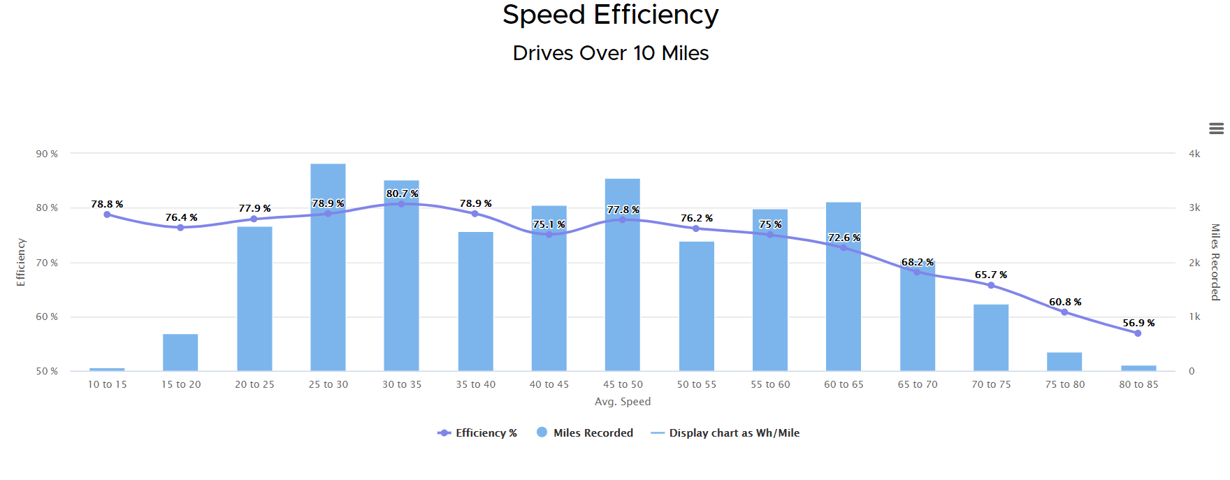
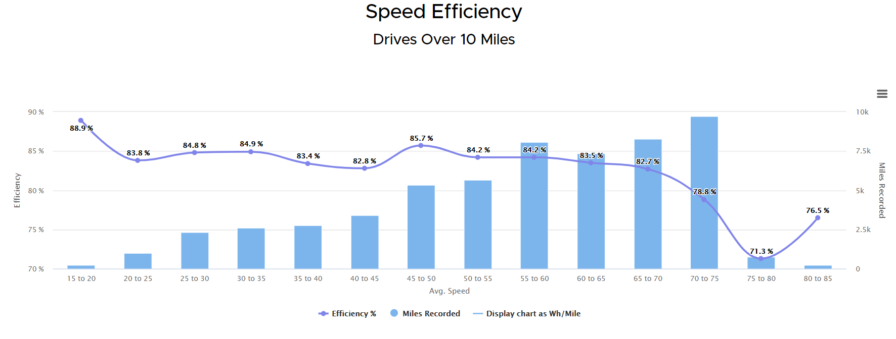
While on Teslafi today I was looking at the speed efficiency of our Model X. It looks like the sweet spot for best speed efficiency is about 50mph. What was really interesting is how terrible our Model Y is at speed. I thought I would share these two graphs. Keep in mind there is nothing scientific about this.

Model X graph
1633098636503.png


Model Y graph

1633098716543.png

It's as if the Model Y just keeps taking a nose dive.
 
The Efficiency percentage is calculated relative to the base constant derived from the EPA range. I would think the X has a bigger constant than the Y, so even if it has a higher efficiency %, it might still consume more than the Y.

Are you comparing those graphs from driving the same types of roads at the same exterior temperatures? That also has a significant impact. For me, the speed efficiency doesn't mean squat, the efficiency relative to outside temp is more important.
 
You beat me to it


Useless number.

Ok maybe that's a little harsh. I'll just say i personally don't find much value in it. And that's coming from a person who spends a lot of time manually computing, tracking, and pondering real world observed efficiency vs Rated efficiency
 
Last edited:
  • Like
Reactions: Rocky_H
With all that said about the efficiency % not being the proper value to chart, it does seem like the X is less negatively affected than the Y when going faster. That is interesting. Maybe it's because it's a brick instead of a wedge shape so it's less efficient from the start :p
 
The Efficiency percentage is calculated relative to the base constant derived from the EPA range. I would think the X has a bigger constant than the Y, so even if it has a higher efficiency %, it might still consume more than the Y.

Are you comparing those graphs from driving the same types of roads at the same exterior temperatures? That also has a significant impact. For me, the speed efficiency doesn't mean squat, the efficiency relative to outside temp is more important.
I would say no. I have over 70,000 miles on the X and only 49,000 on the Y. The X has been driven from Texas to the New England on 2 different occasions.

With all that said about the efficiency % not being the proper value to chart, it does seem like the X is less negatively affected than the Y when going faster. That is interesting. Maybe it's because it's a brick instead of a wedge shape so it's less efficient from the start :p
That was my take away when I first saw the difference. Interesting to me (which appears) that the Model X is more efficient at speed.

What's really hilarious about these data points is that you can see I never have been faster than 85mph.
 
"more efficient at speed" is the wrong phrasing I think... takes a lesser hit when going at speed it probably a better way to put it, based on what we're looking at. I'm saying that's because the X takes a bigger hit from the get go... but that's just speculation, for fun.
 
  • Like
Reactions: Darmie
being able to lower at speed is a real efficiency gain. So is being longer with a more gradual transition (the longer the lozenge, the better the aero, generally). The X spoiler/wing setup might actually help keep flow less turbulent as it detaches too. Y also has pretty wide tires (255's or 255/275's) for its weight compared to X.

I would put my money on the difference being overall drag at higher speeds is just better on the X though.
 
Useless number.

Ok maybe that's a little harsh. I'll just say i personally don't find much value in it
I find the Teslafi metric of efficiency quite helpful. Ok, we can squabble over using the term efficiency, but it is a way to look at the car’s performance in a normalized manner. The OP comparison of the model X vs the model Y is in no way trying to argue which uses more energy, but the relative effect of speed impact for the 2 cars.

I have always found Teslafi’s Efficiency vs temp chart as very useful to understand that on average I can get near the full rated range when it is 70 F outside, but only 80% of that when it is 30 F.

What's really hilarious about these data points is that you can see I never have been faster than 85mph
No, it’s not saying you’ve never gone over 85 mph. It’s saying that a drive, from Park to Park has never averaged over 85. By the time you average in any time on secondary roads, stop lights, etc, I’d say you’ve got some high speeds to have 80-85 mph in that mix.

For whatever it is worth, here is my same speed chart for my model X.
C14263A2-C64D-424F-8A46-57B92AC53A2B.jpeg


While I said I find the outside temp chart to be of interest, this flat behavior makes no sense to me. The chart for my model 3 makes a little more sense, with decreased range at higher speeds.
 
Yeah, I am also kind of rolling my eyes at how supposed "efficiency" is being represented as a %. The relevant efficiency metric would be a consumption figure of energy / distance, like Wh/mile, and I am certain the Model Y is not better in that regard.
I guess if you know what your car's number is (this is actually a favorite topic of mine), the graphs basically boil down to the same thing: if you know your car is 'supposed to' have a Rated consumption of, say, 320 Wh/mi, then every data point shown as a percentage of that is effectively reporting Wh/mi: A data point of "95% efficiency" is in fact exactly 304 Wh/mi. If that makes you feel better. I'm guessing not. :) Honestly the whole endeavor seems very vulnerable to being skewed by outlier data points that throw things off badly and complicate the graph to where you can't make any very interesting determinations one way or another. See next comment.

I find the Teslafi metric of efficiency quite helpful.
Fine. I'll admit there could be *something* to the concept, but the various graphs people are sharing don't seem to converge on an obvious finding. If I averaged fleetwide all time data, what would I expect to get? Kind of a turtle-back shaped broad hump? 'You almost get Rated at moderate speeds, less at the extremes'? I guess these graphs could help substantiate that common sense assumption. But honestly, what do you do if your curve doesn't have this characteristic shape? Is this discovery actionable?

I guess that's more of a philosophical question about these apps generally- are they just for fun or do we really learn meaningful things from the reports and make meaningful changes based on them?