Welcome to Tesla Motors Club
Discuss Tesla's Model S, Model 3, Model X, Model Y, Cybertruck, Roadster and More.
Register

Ongoing annoyance with "button" states on the touchscreen

This site may earn commission on affiliate links.

TEG

Teslafanatic
Moderator
Aug 20, 2006
22,104
9,503
I don't know if others feel this way, but I find it annoying the way some "buttons" denote action they will do and some denote the current "toggle" state of the item.

Take for instance this screen:
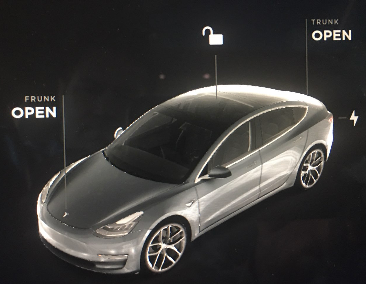
screen1.png


One way I can interpret the above is:
"My Frunk is OPEN!"
&
"My Trunk is OPEN"
&
"My car is locked and I should press the unlock button to unlock it!"

But that would be wrong.

Is it just obvious to everyone else that "Frunk OPEN" means "Open the Frunk" ? And the unlock button is the current "state", not what it will do if you press it to lock the car?

I wish the above said:
"OPEN the Frunk"
"OPEN the Trunk"
"LOCK the Car"
Instead of what it has there now...
 
I have never really thought about it, TBH, but yeah I can see what you are talking about. I dont remember if this annoyed me at the beginning or not either. I am so used to it now, I dont even think about it.

Maybe I will ask my wife (who basically almost never drives my model 3, and still drives her ICE vehicle) to look at that screen and tell me what information she thinks it is giving her.

The last time my wife has even sat in the driver seat in my car was sometime in november ish of 2020, and that was just for me to show her the new interface that was rolled out. The last time she has actually driven my model 3 was probably sometime last march (2020). Her car is a BMW X3. I mention all this because its relevant in that, although we have a tesla in the house, she is not by any means an "experienced tesla owner", so can look at something like this with somewhat fresh eyes as it were.

I took her out to the car this morning, had her get in on the drivers seat as if she was going to drive, and asked her "when you look at the representation of the car on the screen there, what is it telling you?"

She looked at it puzzled for a moment, then said "Well, I know that the car is unlocked because of the lock icon above the roof of car, and I know personally that the trunk and frunk are closed, but when I first look at this, it looks like the car is telling me the trunk and frunk are open. Its confusing".

We had a discussion about what would make it better. She originally thought that putting its current state, like the lock is, would be better. In that case, in @TEG screenshot it would say Frunk CLOSED / Trunk CLOSED. My rebuttal to that was that, then, it is telling current state but for a new owner its not clear that they need to do something to change that current state.

She agreed with me on this, and after a couple of minutes I suggested "how about if it had the word "To" in front? So, in @TEG screenshot, it said "To Open Frunk / "To Open Trunk". When you touched it to open it, then the word "TO" would be removed and it would say "Frunk OPENED / Trunk OPENED".

Because they both are not powered, you cant simply leave the "To" there because you cant touch it "To close trunk / To close frunk".

In any case, she agrees with @TEG and then said "Thanks, now I cant unsee that, and its going to bother me every time i get in the car..." ROFL.

I think adding "TO" in front like I mentioned might be the best choice, in the manner I mentioned above.
 
Last edited:
  • Like
Reactions: Gasaraki
Some people are color blind, so I don't like using red/green for indicators like that.

I liked when old UI designs had buttons looks like buttons. But modern (Apple inspired) UI is "flat" and they don't want anything to look "fake 3D" anymore.

Yeah, a simple extra word here or there would really help.

When I see "Frunk Open" I quick read that as "Frunk is Open".
A quick read on "Open Frunk" would be "Open the Frunk".

I had some similar issues with the Phone app as mentioned here:
That one included some suggestions.

I am sort of weary of being critical because the "Tesla can do no wrong" people can show up and say I am just being an idiot for not intuitively loving their brilliant UI.
 
The last time my wife has even sat in the driver seat in my car was sometime in november ish of 2020, and that was just for me to show her the new interface that was rolled out. The last time she has actually driven my model 3 was probably sometime last march (2020). Her car is a BMW X3. I mention all this because its relevant in that, although we have a tesla in the house, she is not by any means an "experienced tesla owner", so can look at something like this with somewhat fresh eyes as it were.

I took her out to the car this morning, had her get in on the drivers seat as if she was going to drive, and asked her "when you look at the representation of the car on the screen there, what is it telling you?"

She looked at it puzzled for a moment, then said "Well, I know that the car is unlocked because of the lock icon above the roof of car, and I know personally that the trunk and frunk are closed, but when I first look at this, it looks like the car is telling me the trunk and frunk are open. Its confusing".

We had a discussion about what would make it better. She originally thought that putting its current state, like the lock is, would be better. In that case, in @TEG screenshot it would say Frunk CLOSED / Trunk CLOSED. My rebuttal to that was that, then, it is telling current state but for a new owner its not clear that they need to do something to change that current state.

She agreed with me on this, and after a couple of minutes I suggested "how about if it had the word "To" in front? So, in @TEG screenshot, it said "To Open Frunk / "To Open Trunk". When you touched it to open it, then the word "TO" would be removed and it would say "Frunk OPENED / Trunk OPENED".

Because they both are not powered, you cant simply leave the "To" there because you cant touch it "To close trunk / To close frunk".

In any case, she agrees with @TEG and then said "Thanks, now I cant unsee that, and its going to bother me every time i get in the car..." ROFL.

I think adding "TO" in front like I mentioned might be the best choice, in the manner I mentioned above.
You really don't need to add the To. Just make it

OPEN Frunk
OPEN Trunk
'Locked Icon': UNLOCK Doors

then change to:

Frunk OPENED
Trunk OPENED
'Unlocked icon': LOCK Doors

Not everything needs to be spelled out like "Press here to UNLOCK". Since most of the screen interface can be interacted with, people should know that touching the words will do something.
 
I think the early iPhones were "magically intuitive" doing "less is more" with few buttons and few instructions, but "guesses" what might work tended to be right.
Fast forward to now with so many functions and gestures upon gestures, it has a learning curve and needs training instead of just trying things to figure it out.
 
Last edited:
Lucid's phone app:

lucid-open-png.862813
Cool. Can you show some more pics of the App? (Someone needs to have a Lucid Air registered to start the App).

I would be interested to see how the App and the Navigation shows the location and cost of the CCS chargers when making an itinerary.
Can you select an arrival and departure SoC like for the ABRP, or does Lucid decide for you like on Tesla?
 
Last edited: