Welcome to Tesla Motors Club
Discuss Tesla's Model S, Model 3, Model X, Model Y, Cybertruck, Roadster and More.
Register

Petition to demand "camera on top, media player on bottom" be retained in UI

This site may earn commission on affiliate links.
Having both Version 8 and Version 9 42.2 on two different Model S vehicles allows for careful examination. Compare the distance from the metal trim to the top of each camera image. These are not the large backup window that can appear when in Reverse. These are the images when pressing the camera icon. 1.5 inches from the top with Version 8 and 1.875 inches for Version 9 with the media window using 1/2 of the screen. The difference is less than 1/2 inch. The Version 8 window shows 3G. Shutting off Wi-Fi helped stop the update from arriving.

Version 8.jpg Version 9.jpg
 
Last edited:
What are they then?
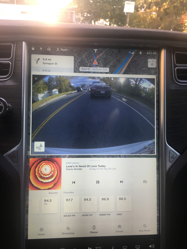
I updated my post with the details. They are the rear camera images that occur when selecting the camera icon. The Reverse "gear" full-screen backup image showing the car diagram below the camera view is similar with both versions.

It is important to mention that the Reverse "gear" image may not be on the top if you have the camera icon active. For years the Reverse "gear" backup camera image can disappear while still in Reverse if you make selections with the screen. In my humble opinion, this is one error that Tesla should fix. While in Reverse, ideally the full screen image of the backup image on the top and the vehicle sensor diagram on the bottom should remain fixed on the screen until the shifter is taken out of Reverse. Until that issue is addressed, please be safe and don't make changes that cause the backup image to disappear while in reverse. Optionally, you can bring up the manual rear camera view to avoid it from disappearing.
 
Last edited:
someone help me understand. why do I need maps running all the time front and center on the screen in the most prime real estate and all other things that I care about relegated to parts of the screen blocked by my right arm that i have to turn my head to see? I've had my car for 1.5 yrs. I've used the navigation about 8 times. OTOH, I use media player, ON TOP, every. single. day. I use energy, on the top or bottom as I see fit with media player in the other slot, every. single. day. Why do I have to have the entire UI and way I interact with the car, which i was comfortable with, suddenly changed on someone's whim? Why did I need my web browser broken even more, so that it simply does nothing now? It's literally a blank app that actually does nothing. But I can resize a blank white window. And why, for th love of god, do I have to look down, zero in on the right place to touch, and then TOUCH THE SCREEN TWICE, in two different places! just to turn off the AC?! FFS, is this some high school coder's summer project or is this a freaking six figure car? I mean, just wow.
 
If you press and hold the fan, it turns off the hvac. Or if assigned to right scroll wheel, a press of that also turns off hvac.
And why do we have to always re-learn how to use our cars? I did not ask for the update and I should not have to accept them without knowing exactly what is included with the update before it is downloaded to my vehicle. This is my car that I need to rely on and know how to operate day in and day out. Updates should be optional. Changing someone's dash and controls is not an update. It is highly arrogant to assume anyone wanted to lose the functions that came with their cars, and hiding them under different tabs and folders and then insisting the car's OWNER has to learn how to use it again is not acceptable.
 
Many of us use this layout; camera on all the time, and media player (or energy app) on, no map needed.

Messages from Tesla indicate that they are breaking this in "version 9" of the software by forcing the map to cover half the screen and only allowing one other app to be up at a time.

This is a petition from Tesla Model S owners.

Tesla: Don't make this change -- it constitutes damage to our cars, by removing valuable functionality. We demand that Tesla retain the ability to have the camera and media player apps up simultaneously, and we request that they maintain this in future versions of the software. If you do not retain this functionality, we demand permanent warranty support for cars running the older (full-functionality) version of the software.

Anyone who agrees, please add your name and whatever other identifiying information might be useful. We can also discuss how best to send this message to Tesla (who are notoriously poor at listenting to customers).

Nathanael Nerode
Tesla Model S owner since 2013
This is hilarious. Do other car companies get petitioned?
 
I think this is just temporary. Big task was to port the code to S and X from 3. After it’s quirks are ironed out, they will add missing features back to S X.
They should have not removed the features. They coded an interface optimized for the M3 then pushed it onto the MS/X... it’s suboptimal for the large vertical screen.

Next update may change our instrument cluster to only display wood grain to finish the transition. +$250 if you want it to show carbon fiber.
 
I visited the Brea Mall Tesla store on Halloween evening and enjoyed sitting in Model 3. The touchscreen was very familiar because it is the same as our Version 9. It's the Model 3 owners who have a right to be upset when they display their rear camera. While the camera is visible, the media controls are not visible. They view the camera or the media, but not both. Yet, there is room for a 1/4 media window to be located under the camera window. The other issue is limited control screen size. The Model 3 owner must swipe up and down on each of the control screens to see the items that can't fit on the wide screen. Shouldn't they have an option for smaller controls that fit on their mini-screen?

The Model S and X owners have the tall center screen to enjoy the camera and media at the same time. The larger screen allows for all the controls to be visible without scrolling or swiping up and down. While some are not pleased with the changes, look at the advantages. The Model S and X screens feature the most convenient size and display more functions and information than the smaller Model 3 screen.
 
Well, I upgraded to .42..... It's not good enough.

It's a complete waste to have NAV in the background. The camera floating is choppy and irritating. You can clearly tell that because in the media player, the track view is the first thing to come up when your hit USB, there is a huge delay directly proportional to how big of a collection you have until you can actually select a song.

I know where I am most of the time, I don't get NAV to tell me
 
If you press and hold the fan, it turns off the hvac. Or if assigned to right scroll wheel, a press of that also turns off hvac.
Not in my case, it seens; for me a press of right scroll wheel assigns it to auto or manual fan speed control, but no control over the power of the whole system or the AC. I do appreciate you pointing out the long press option though. It's not a good idea to do that while driving, unfortunately.
 
  • Like
Reactions: 3mp_kwh
Haha.

In their defense, prior to V9, you couldn't run nav, the camera and the media player on the screen at the same time, so this isn't really a step back (a little step back, I guess since the camera is about an inch lower).

But it's a missed opportunity: it would be great if I could have the camera on top, the shrunken media player at the bottom and the nav centered between the two (or rather biased towards the bottom so you get to see more of the road ahead than behind).


I actually really like the shrunken media option, but it's a shame I'll never use it since it'll move the camera down to low for me.
There are a lot of drivers who only need nav on rare occasions. Not all of us are lost or doing a road trip. I would like nav to disappear completely except when I ask for it. Otherwise I've bought a very large screen which I can only use a part of. It should be my choice, not Tesla's.
 
There are a lot of drivers who only need nav on rare occasions. Not all of us are lost or doing a road trip. I would like nav to disappear completely except when I ask for it. Otherwise I've bought a very large screen which I can only use a part of. It should be my choice, not Tesla's.

I hear you. I, too, would prefer if I could choose whichever app I wanted to be on top and whatever app I wanted to be on bottom, like I used to be able to do.

Having the background be the map (as Tesla is determined to make it now) instead of a solid color (as it used to be) is not a big deal to me, and I don't think it's really a step backwards. It could actually be a step forward for those rare times I do want three apps showing at once as I've never been able to do that before. Unfortunately, the way they've implemented it, it's not really possible in the configuration I'd prefer.

Camera on top, media on bottom is fine for me, when I want that configuration (the vast majority of the time)
18953649-FB3-D-4-AA9-AAAB-D5-AE6771-F85-E.jpg

The times I do want to use the map (not even NAV, just having they maps up so I can view traffic patterns), I'd like camera on top, map on bottom. But that's not possible as of now. As I mentioned, with the maps as the background and the a condensed media player, V9 does have the added feature of displaying 3 apps at once. Which is great, except is never use it because it doesn't allow me to keep the camera at top when the media player is condensed:

5-BBD9136-2663-45-DC-AC8-E-405-D1-A1-F36-AD.jpg


Allowing the camera to truly go to the top would negate that 3/8" difference in camera placement between v8 and v9 (currently used to display the street name while navigating) that Mark Z measured above. Allowing that plus a condensed media player at the bottom would open up the middle of screen for the maps/NAV in the background. I'd drive around with the camera on top, maps/NAV in the middle and condensed media at the bottom nearly 98% of the time if it were possible!

While .42 is a significant step forward from the original v9 release, I do hope and pray they continue to hear our complaints to improve this. I'm befuddled as to why Tesla is so determined to have the NAV occupy the top of the screen which is easiest for the driver to see when the dash screen also shows the NAV. I mean, I know it's done because the Model 3 only has one screen, but why market the two screens for the S and X as selling points if you're hellbent on having their UI's optimized for the single screen 3?
 
Not in my case, it seens; for me a press of right scroll wheel assigns it to auto or manual fan speed control, but no control over the power of the whole system or the AC. I do appreciate you pointing out the long press option though. It's not a good idea to do that while driving, unfortunately.

Change your scroll wheel assignment using the menu button below it.
 
Change your scroll wheel assignment using the menu button below it.
I already did that; like I said, I can only control fan speed, not AC on/off. I can turn the whole thing off by scrolling fan all the way to zero though; forgot to mention that. Still, would be good not to have to tap twice to get to a perpo button. Easy to put a power button on the main screen like I've had all this time to now...
 
I already did that; like I said, I can only control fan speed, not AC on/off. I can turn the whole thing off by scrolling fan all the way to zero though; forgot to mention that. Still, would be good not to have to tap twice to get to a perpo button. Easy to put a power button on the main screen like I've had all this time to now...
It used to be when you clicked and the fan was selected as the shortcut, it would turn the fan completely off.....
 
  • Like
Reactions: raphy3