Welcome to Tesla Motors Club
Discuss Tesla's Model S, Model 3, Model X, Model Y, Cybertruck, Roadster and More.
Register

Restore old music player in Holiday Update 2022

This site may earn commission on affiliate links.
Hi all,

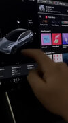
I’ve be hesitant to update to the new 2022 holiday update because I don’t like the new music player. I’ve been looking around to learn more, and I saw a video that was showing how you can restore the old music player if you swipe to a different card, I attached a screenshot below. Then I’ve also seen people saying that it isn’t possible, so I’m confused. The guy in the video had the music player full screen, so maybe it’s that? Please let me know so I can understand and make the decision to update. Thanks for the help!
 

Attachments

  • 5C7CD3BE-170D-47FD-A5FE-197197E2F4AF.jpeg
    5C7CD3BE-170D-47FD-A5FE-197197E2F4AF.jpeg
    292.4 KB · Views: 383
  • Like
Reactions: astrobill
Hi all,

I’ve be hesitant to update to the new 2022 holiday update because I don’t like the new music player. I’ve been looking around to learn more, and I saw a video that was showing how you can restore the old music player if you swipe to a different card, I attached a screenshot below. Then I’ve also seen people saying that it isn’t possible, so I’m confused. The guy in the video had the music player full screen, so maybe it’s that? Please let me know so I can understand and make the decision to update. Thanks for the help!

That puts the media player controls back on the large screen window (which ha been covered here by a few people now already) but does not let you shrink the media player down to the spot it was before, floating with JUST the controls and album art at the bottom of a still visible map.

If you are used to the controls sitting on bottom of the map on your screen, the new update currently makes that impossible. The card being visible or not simply dictates where the play / pause etc buttons appear, it does not change whether you can have the media controls in a bar at the bottom of the map screen like you could before.
 
Upvote 0
Pretty sure you can’t “not update”.

Sure you can. There are people still rolling around on software versions a couple years old. Of course, you then risk that if you need anything at all from tesla in the service department they will tell you that you have to upgrade the car or not get serviced, since warranty coverage requires allowing updates when available.
 
Upvote 0
That puts the media player controls back on the large screen window (which ha been covered here by a few people now already) but does not let you shrink the media player down to the spot it was before, floating with JUST the controls and album art at the bottom of a still visible map.

If you are used to the controls sitting on bottom of the map on your screen, the new update currently makes that impossible. The card being visible or not simply dictates where the play / pause etc buttons appear, it does not change whether you can have the media controls in a bar at the bottom of the map screen like you could before.
Oh ok. Thanks for the help!
 
Upvote 0
If you are used to the controls sitting on bottom of the map on your screen, the new update currently makes that impossible. The card being visible or not simply dictates where the play / pause etc buttons appear, it does not change whether you can have the media controls in a bar at the bottom of the map screen like you could before.

this is probably my least favorite part of the holiday update. having the music docked at the bottom left corner of the screen leaves the album art and first portion of the song/album/etc blocked by the wheel and my arm while driving.

i like having the option to put it there in instances where i might want the full map, but i really wish they'd give the option to minimize it on the map side like you used to be able to.

also, it's MADNESS that they haven't fixed the SXM preset / favorite issue. it has been months.
 
  • Like
Reactions: Zigzagmolly
Upvote 0
@TAKV Gaming
You're not the only one who's confused. The new setup is bizarre.

Now, it seems as if one has to use *both* parts of the music player. When one selects a source in the mini-player, it looks like one then has to switch over to the right side to select from among, say, TIDAL playlists or whatever, because the mini-player doesn't really show those.

Am I wrong? Am I missing something? I just accepted the update and played around with this and gave up trying to make it work cleanly. It's a complete mess. They essentially split one unified function into two different panels.

And I agree that people's arms cover it when they're driving so one can't down and see the thing easily.

The only slightly positive thing is the mini-player side at least restores the channel art to the full size it was a few updates ago, although, oddly, they didn't make the same change on the right side uniformly.

Once again, yet another Tesla "holiday update" is one step forward, two steps back. The inability to restore the music player to the right side, bottom only, and instead forcing it to be a "card" is a massive fail.
 
Last edited:
Upvote 0
THERE WAS NO REASON TO MOVE THE MUSIC PLAYER !

Yeah, the new mini music player IS AWFUL! My right hand on the steering wheel completely blocks the window.

Who's idea was this ? Who even asked for this ? They moved the side view camera from here because of the same issue, now they put the music player there ?? Short memory Tesla.
Why would I want the player closer to me, when my left scroll wheel did everything I need, and now the player controls are further from the passenger ?
Its great they brought back a version of cards, but if I’m gonna lose the music player while looking at card info, what good are cards…..
Tesla, stop screwing around with things that are fine.
 
Upvote 0
I think the new music player setup is OK, but need some refinement. I do think the location makes it hard to see while my right hand is at 3 o'clock, but the new location is also easier to operate for the driver. I've only used it for a day so far, but I can deal with it. My guess is at some point next year, Tesla will allow the music player to minimize on the map side like it did before, when it's not active on the driver side. That would probably be the best compromise.
 
Upvote 0
This update basically contradicts all the explanations for the original V11 update, that pissed off so many owners Last year.

The excuse then, for eliminating ‘cards’, was that the driving visualization space had to be freed up because
more emphasis and space was needed there, as FSD features expand. Well so much for that, they just put the audio control banner in that location, and if you notice the driving visualization is now scrunched up and you can’t see the blind spot areas or traffic behind any more.
All along, we‘ve been told that side mirror blind spot warning wasn’t necessary because blind spot was to be monitored in the driving visualizer. Now that’s blocked with the audio banner, something that remains up 100% of the time for most people.
Furthermore, the side view camera display was moved from that location not long ago because it was blocked by the drivers hand on the steering wheel. Now they put the audio control banner there, where you can’t see the song, artist , station or album art because the driver hand blocks it !
The excuse for moving Homelink back then was the map screen looked clutter and its icon was too small.
so they gave us a nice big button on the bottom left of the screen.
Now homelink is back where it was, and too small to see or find .

And to top it all off, when the new ‘cards’ are closed, an additional icon is added to the dock, FURTHER CLUTTERING IT !,
which also was supposed to be a reason for V11, to un-clutter the dock!
Who wanted another icon, just put the little dots back that indicated ‘cards’ are available. Why a stupid icon ?

The radio was perfectly FINE. Homelink was fine. Stop making stupid changes and Contradicting yourself TESLA !

Use OTA updates for improvement to important things, not constantly making changes and ruining the experience .
 
Last edited:
Upvote 0
The space below the driving visualization should be for temporary display and pop-up only :

Seatbelt notification
Homelink Notification and activation
Wiper popup
Headlight popup
Climate popup
‘Cards’

Just think how easy, consistent, intuitive and handy that would be. But no, some dweeb had to screw it up. Damn I’m getting sick of this.
 
  • Like
Reactions: crackers8199
Upvote 0
I think the new music player setup is OK, but need some refinement. I do think the location makes it hard to see while my right hand is at 3 o'clock, but the new location is also easier to operate for the driver. I've only used it for a day so far, but I can deal with it. My guess is at some point next year, Tesla will allow the music player to minimize on the map side like it did before, when it's not active on the driver side. That would probably be the best compromise.
I like the MiniPlayer away from under the map. If you don’t like it under the vehicle graphic just swipe it down and it appears above the music screen where you can leave it. Horses for courses.
 
Upvote 0
That would satisfy everyone I suppose or maybe it will just require a bit of time to get used to the new position. I prefer it where it is now. But have RHD vehicle which may make a difference.

it's not a matter of "getting used to the new position." it's blocked by your arm while driving most of the time.

this is the whole reason they moved the blind spot camera, but god forbid Tesla tws or even think about the impact of a software change before just rolling it out...
 
  • Like
Reactions: Zigzagmolly
Upvote 0