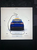
Many buttons on Tesla screen seem not to be located intuitively or well designed. Here’s just one example, the front trunk button is on the same end of the car as the trunk button. Also, you have to carefully watch which button you press to avoid hitting the wrong one by accident, since two are so close together, or miss the buttons altogether.
The screen is huge but the buttons are small, why, to save space? Also the buttons which you’re searching for are gray and blend into the background while the picture of the vehicle which you’re not looking to press on is in color, isn’t that backwards?
Seems like Tesla needs a code writer with some ergonomics training!