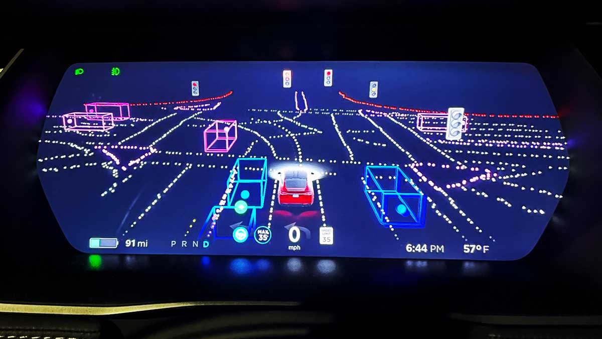
Welcome to Tesla Motors Club
Discuss Tesla's Model S, Model 3, Model X, Model Y, Cybertruck, Roadster and More.
Register

Software update 2020.48.26.x update, font size problems

This site may earn commission on affiliate links.
It's readable but a bit small ;)
New IC font.jpeg
 
  • Informative
Reactions: MorrisonHiker
I wonder if they changed the font size to make room for visualization that will come with FSD? Makes no sense to shrink it if you are not going to utilize the new free space.
Nope, it's a completely pointless change. Those icons and text labels are located under the left and right widgets, so any potential space saved would not be used for FSD visualizations anyway.
 
I definitely want to sit this one out if possible. I don't like the driving visualization taking up so much of the screen with much dead space, and don't like the speedometer being off centered in addition to it being smaller. And really don't want any more "stuff" in there that I never use (games or more farts :rolleyes:)

I'm on 48.5 (Model 3), and it's been nagging me to update to 48.12 for couple of weeks now (hasn't actually been downloaded, I leave wifi disconnected at all times.) What I am concern with is what effects it might have if I skip several updates. Namely I don't want to risk the car getting factory reset as some have occasionally reported. Does each update contain all previous updates? Meaning if I continue to ignore 48.12, will it eventually prompt me to go straight to 48.2x from my current 48.5?
 
  • Like
Reactions: astrobill
I completely agree and came here to post the same thing.

The new @tesla UI in 2020.48.26 is a total UX disaster. A big step backwards in usability and appearance. Everything is crammed together, the information hierarchy is all wrong, there are numerous anti patterns with colour usage and moves important icons out of eyeline

The speedometer is the most important part of this section; Not the car graphics. Shrinking it down and moving it off centre is a huge step backwards. I found it very difficult to pick up in my normal driving eyeline. It is also NOT on the same level as Autopilot speed and status. The hierarchy here is all messed up.

Moving the battery to a monochrome display makes it hard to see. (This also touches on the use of colour point I made) Green is good, yellow is be aware and red is you need to charge. Grey is too neutral. Having it next to the region/power lines also pushes them off-centre.

There is a ton of dead space on the screen now on the upper left. All of this lends itself towards the really cramped feeling the cluster of icons has. The previous iteration was balanced. This is like someone (drunkly) threw UI elements at a dartboard

Whoever had the great idea to colour the “D” icon blue blue and put it right next to the headlight icon needs to review that decision. In your peripheral vision, it looks like your high beams are on as it is universal that high beams are shown as blue.

The auto hold icon (H) that comes on when you’re stopped in drive is an important safety confirmation that used to show at the top of the screen. It’s now hidden beneath my steering wheel at the bottom of that strip of icons on the side.

All of this to say, I love my car, I love the ability to get OTA updates but this one feels rushed out, tries to solve problems that don’t exist and causes me to take my eyes off the road way more than I’m comfortable with. I don't mind the larger car and road visualisation area, my problem exists with all the crap around that circled below.

IMG_1678.jpeg
 
My belief is that this UI redesign is a scaffolding for newer features coming next year. Yes, product managers sometimes will create UI redesigns just for change sake (to make it feel “fresh”), but more often it comes as a pre-cursor to a roadmap that requires it.

I like aspects of the new redesign, and others I don’t. I expect to see two things in 2021 just based on my experience in the software industry:
  1. Refinement of the redesign
  2. New features that explain the reason for the change
 
  • Like
Reactions: Transformer
Definitely smaller, but for my surgically corrected late 30s eyes I actually prefer the updated layout. To me the smaller font allows quick glances allowing a more natural scan of information blocks.

I do agree that having a setting which would allow font size to be changed would be a good idea.
 
  • Like
Reactions: Kweber!