Completely agree that allowing driver functions in the app tray will solve 90% of the issues with V11. Why do you think they released the entertainment customization before the driver customization (if they ever do that)?From reading many of the comments here and elsewhere, it seems many people are simply ignorant of where the new settings are located, not that they're necessarily harder to activate. Now, an argument could be made that the UI should be more intuitive, but I would counter that the customization possibilities going forward outweigh the minor annoyance of having to relearn the new locations. I'm just hopeful that Tesla doesn't drag their feet. They could make some people happier by simply including more settings-oriented apps.


Welcome to Tesla Motors Club
Discuss Tesla's Model S, Model 3, Model X, Model Y, Cybertruck, Roadster and More.
Register
Install the app
How to install the app on iOS
You can install our site as a web app on your iOS device by utilizing the Add to Home Screen feature in Safari. Please see this thread for more details on this.
Note: This feature may not be available in some browsers.
-
Want to remove ads? Register an account and login to see fewer ads, and become a Supporting Member to remove almost all ads.
You are using an out of date browser. It may not display this or other websites correctly.
You should upgrade or use an alternative browser.
You should upgrade or use an alternative browser.
Sorry, I actually like the new UI :)
- Thread starter surfrasch
- Start date
AustinPowers
Total Smeghead
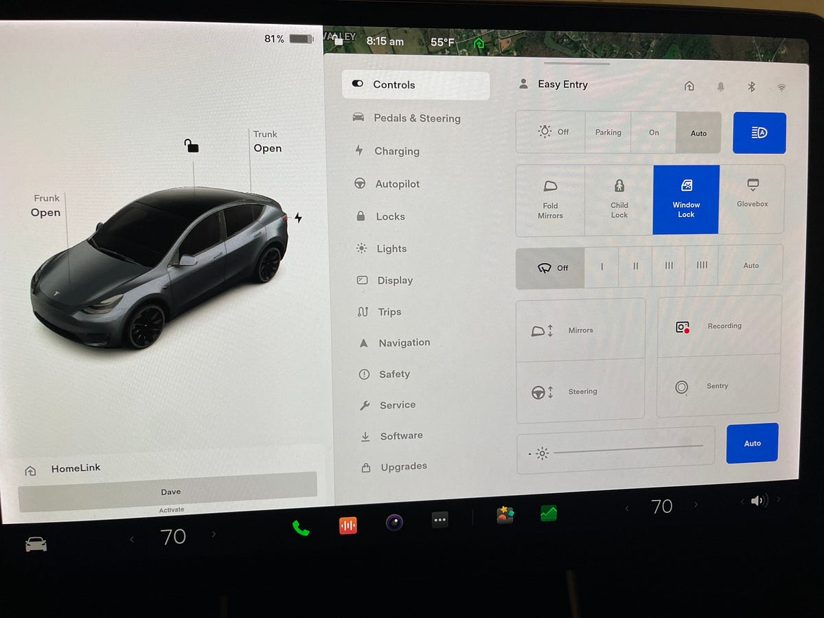
May I ask, how do you access this screen?Yes, but not everyone wanted or needed all those settings on the bottom bar. And it's a huge exaggeration to think 2 taps vs 1 is going to make any meaningful difference to a system that takes a lot longer than 2 seconds to do its job. Sure, the wipers were out front, but it still required more taps than the current setting, so where was the advantage? Also, the defrost icons were almost all the way to the right. How was that convenient? Most drivers would have to look to the bottom right to accurately select them.
Here's the smaller climate settings bar that comes up when tapping to the left or right of the temp icon:
View attachment 757358
There's no need to always launch the full climate settings window and the defrost buttons are pretty much at your fingertips. All it takes is a quick glance to the bottom and back to the road rather than glancing to the end of the screen for the old buttons.
No matter how much I try, I can't get this to show up.
Incidentally, lack of documentation is another major flaw in the Model 3 imho.
I would use voice commands as much as possible, but since there is zero info what commands you should use it is trial and error (and mostly error for that matter). Why can't Tesla provide a section in the owners manual about voice commands, which ones to use for which function? Serious oversight, especially when other manufacturers provide such information as standard.
It could be they were overconfident with their new configuration. Or they are gauging feedback. Either way, like you said, they could easily add new apps that'll make people happy.Completely agree that allowing driver functions in the app tray will solve 90% of the issues with V11. Why do you think they released the entertainment customization before the driver customization (if they ever do that)?
Last edited:
redmunds
Member
For you guys saying 2 taps is no big deal- here is a response from a professional UX designer, explaining how this is completely the wrong approach:
Is Tesla’s v11 update… bad design?
The mistake even the best design teams get wrong, and how it can be avoided.medium.com
Did you read the article? The author's own summary seems to be the opposite of your "completely the wrong approach" summary:
"Overall, it’s my opinion that despite these hiccups, the new v11 UI provides substantial benefits, both to the development team and to the many new drivers going through the process of learning the interface"
jabloomf1230
Minister of Silly Walks
Monty Python has entered the chat.When I was young I walked uphill both ways to school. I’ll manage an extra tap
May I ask, how do you access this screen?
No matter how much I try, I can't get this to show up.
Incidentally, lack of documentation is another major flaw in the Model 3 imho.
I would use voice commands as much as possible, but since there is zero info what commands you should use it is trial and error (and mostly error for that matter). Why can't Tesla provide a section in the owners manual about voice commands, which ones to use for which function? Serious oversight, especially when other manufacturers provide such information as standard.
Press one of the arrows (< >) at either side of the temp readout. If that does not work, I'd do a two-thumb reset.
SanCarlosJeff
Member
Did you read the article? The author's own summary seems to be the opposite of your "completely the wrong approach" summary:
"Overall, it’s my opinion that despite these hiccups, the new v11 UI provides substantial benefits, both to the development team and to the many new drivers going through the process of learning the interface"
Also these two from the article:
- There’s more to Usability than Learnability. You need to consider the long-term Ergonomics, too. These matter to existing users — a lot — so be sure to understand the difference, or risk angering your users.
- Users see the process of learning something as effort they are expending in order to get something in return: namely reduced effort, longer-term. Making users expend effort upfront in exchange for working harder long-term feels like a raw deal — or worse, a betrayal.
TexasTezla
Member
Yes, having read over so many comments over the last few weeks about v11, ranging from sentiments like 'without heating controls and tire pressures always visible, the car is now a deathtrap' down to a more reasonable 'I just prefer it as before', it is clear that Tesla are on the right tracks. Personally I love the new UI but it would be good to get even more customization on the bottom bar, for those life and death moments when tire pressure shows 1psi less than 30 minutes ago or perhaps while transporting vital transplant organs on the back seat and a set temperature MUST be maintained...it could be handy to just see if heat seaters are on. I get that. Here's to more customization!Did you read the article? The author's own summary seems to be the opposite of your "completely the wrong approach" summary:
"Overall, it’s my opinion that despite these hiccups, the new v11 UI provides substantial benefits, both to the development team and to the many new drivers going through the process of learning the interface"
FYI....I'm joking...kind of...
TexasTezla
Member
But the overall summary already takes these 2 comments into consideration and the result is the writer thinks the new UI provides SUBSTANTIAL benefits.Also these two from the article:
- There’s more to Usability than Learnability. You need to consider the long-term Ergonomics, too. These matter to existing users — a lot — so be sure to understand the difference, or risk angering your users.
- Users see the process of learning something as effort they are expending in order to get something in return: namely reduced effort, longer-term. Making users expend effort upfront in exchange for working harder long-term feels like a raw deal — or worse, a betrayal.
This is a good article that summarizes well what we've been discussing. He basically said the new interface was logically organized for new users to get up to speed easier and quicker with the downside of angering the old:UX is not actually rocket science, it's really quite well understood nowadays, and professional designers have a lot of guidelines that they use, that were learned from years of experience, experimentation, and practice.
For you guys saying 2 taps is no big deal- here is a response from a professional UX designer, explaining how this is completely the wrong approach:
Is Tesla’s v11 update… bad design?
The mistake even the best design teams get wrong, and how it can be avoided.
Designers at Tesla almost certainly didn’t want new drivers to be faced with this much difficulty, so they reorganized the interface into clearer, more logical groups: a settings menu, an app menu, and so on. This means that moving forward, it would be easier for new drivers to get up to speed. Upfront effort was reduced.
He also said Tesla should have spent more time considering the older users' habits and expectations with regard to the UI to also keep them happy. Here, I would disagree with regards to the effort it takes to learn the new configuration:
Unfortunately, this also meant that existing drivers would be faced with figuring it out again. They’ve effectively been given a learning assignment to continue using the thing they were already using. This isn’t inherently bad, though. Often, people will tolerate being asked to learn a new way of doing things, provided they can see how it will help them save substantial effort or discomfort as time goes on.
In this case, though, the new ways of doing things didn’t help. Despite the effort they were putting in to learning them, many functions required more effort than they did before. It was like being asked to take a course on how to make less money — spending more effort for a negative payoff.
Then he summarizes ways in which Tesla could set things straight with this idea being the most effective, IMO:
- They can allow for custom one-touch shortcuts to settings in the bottom bar, alongside app shortcuts. This can provide easy access to the same settings that were previously just a tap away, with customizable icons and placement.
Last edited:
SanCarlosJeff
Member
The complete sentence is: "Overall, it’s my opinion that despite these hiccups, the new v11 UI provides substantial benefits, both to the DEVELOPMENT TEAM and to the many NEW DRIVERS going through the process of learning the interface." Installed user base is conspicuously absent.But the overall summary already takes these 2 comments into consideration and the result is the writer thinks the new UI provides SUBSTANTIAL benefits.
TexasTezla
Member
Well considering that a few hundred vocal opponents of the new UI does not make an important majority, I guess Tesla prefer to think about the hundreds of thousands or millions of drivers coming on line now and in the near future. The younger generation that likely prefer the new layout.The complete sentence is: "Overall, it’s my opinion that despite these hiccups, the new v11 UI provides substantial benefits, both to the DEVELOPMENT TEAM and to the many NEW DRIVERS going through the process of learning the interface." Installed user base is conspicuously absent.
sleepydoc
Well-Known Member
Actually, that's not totally accurate. From the article:This is a good article that summarizes well what we've been discussing. He basically said the new interface was logically organized for new users to get up to speed easier and quicker with the downside of angering the old:
He also said Tesla should have spent more time considering the older users' habits and expectations with regard to the UI to also keep them happy. Here, I would disagree with regards to the effort it takes to learn the new configuration:
Then he summarizes ways in which Tesla could set things straight with this idea being the most effective, IMO:
"On the flip side, the designers at Tesla neglected to adequately address UI Ergonomics. Despite the v10 learning curve, these frustrated owners knew the myriad shortcuts of the old system. Learnability becomes less important to users the more they use something. Instead, these drivers cared about Ergonomics — the long-term day-to-day efficiency and comfort of their environment.
For the team at Tesla to really get this right, they would need to ensure every widely-used interaction from the old interface had a way of being done in the new interface — with the same amount of effort or less. This is something they failed to do. Instead, these drivers were being asked to spend effort learning the new way, and they were going to be upset if they didn’t get some benefit in return."
So it's not just 'angering the old,' and it's and it's not that people have to learn something new. That's what a lot of people fail to understand - There may be a marginal improvement in learning but there's a long term ergonomic loss. We're leaning something new that is in general no better and often times worse. There were some aspects of V10 that were not totally intuitive or could have been improved, but after you learned the shortcuts it was actually very usable.
Last edited:
Oh that sucksPity that for the German language version voice commands other than music search is pretty useless.

The English version works very well. Hopefully they will get the German version working as well.
sleepydoc
Well-Known Member
Actually, the other Tesla owners I've talked to at work aren't happy, either. They're just not as vocal. So there are vocal opponents and a silent majority. Then a few sycophants tying to convince us that a turd sandwich is delicious.Well considering that a few hundred vocal opponents of the new UI does not make an important majority, I guess Tesla prefer to think about the hundreds of thousands or millions of drivers coming on line now and in the near future. The younger generation that likely prefer the new layout.
TexasTezla
Member
Silent majority...please provide proof of this nonsense....apart from your pals at work...Actually, the other Tesla owners I've talked to at work aren't happy, either. They're just not as vocal. So there are vocal opponents and a silent majority. Then a few sycophants tying to convince us that a turd sandwich is delicious.
TexasTezla
Member
Trying to convince you...why would I bother trying to do that? That would be like trying to convince my old Dad to carry a smartphone! Waste of time! I care not one jot if you like v11 or not! All I care about is that I like it along with, until we hear otherwise, many others. That seems to oddly stick in your craw?Actually, the other Tesla owners I've talked to at work aren't happy, either. They're just not as vocal. So there are vocal opponents and a silent majority. Then a few sycophants tying to convince us that a turd sandwich is delicious.
"Despite the v10 learning curve, these frustrated owners knew the myriad shortcuts of the old system. Learnability becomes less important to users the more they use something. Instead, these drivers cared about Ergonomics — the long-term day-to-day efficiency and comfort of their environment."Actually, that's not totally accurate. From the article:
So it's not just 'angering the old,' and it's and it's not that people have to learn something new. That's what a lot of people fail to understand - There may be a marginal improvement in learning but there's a long term ergonomic loss. We're leaning something new that is in general no better and often times worse. There were some aspects of V10 that were not totally intuitive or could have been improved, but after you learned the shortcuts it was actually very usable.
Here he's talking about users of the old UI. I didn't mean old as in age if that's what you're thinking (my fault for not being clearer). I meant existing users.
AustinPowers
Total Smeghead
Tried it, to no avail. Did a complete reset, still nothing. Maybe Germany is on a different version of V11Press one of the arrows (< >) at either side of the temp readout. If that does not work, I'd do a two-thumb reset.
Every Model 3 driver I know or have simply met and talked with recently while charging absolutely hates the new version 11. I have yet to meet a single person who has anything positive to say about it. If there was a majority who liked it the new way I am sure by now I would have met at least one. Not the case.Silent majority...please provide proof of this nonsense....apart from your pals at work...
Like I have said many times now, I have never had a problem with Tesla updating the UI. After all they have done it many times since I bought my car three years ago. The gripe I have with V11 is that it makes so many things less user friendly and more complicated for me without providing any noticeable benefit. None whatsoever.
Every update before V11 provided more benefits than drawbacks for me. This time it's the complete opposite.
Sure, it's not the end of the world in any way, but it's just a damn nuisance.
If I could at least find a single positive aspect among all the changes for me, but I simply can't. Everything that mattered to me the most in terms of usability has been changed for the worse. And for that I can now arrange some games or multimedia apps I never use on the bottom screen, and the left side of the screen is even more useless than before. Well, thanks for nothing.
Similar threads
- Replies
- 7
- Views
- 1K
- Replies
- 3
- Views
- 214
- Replies
- 4
- Views
- 741
- Replies
- 4
- Views
- 271