Welcome to Tesla Motors Club
Discuss Tesla's Model S, Model 3, Model X, Model Y, Cybertruck, Roadster and More.
Register

Tesla Maps Suck.

This site may earn commission on affiliate links.

SabrToothSqrl

Active Member
Dec 5, 2014
4,577
4,150
PA
How a map should look:

Screenshot 2022-08-19 at 09-31-34 Google Maps.png

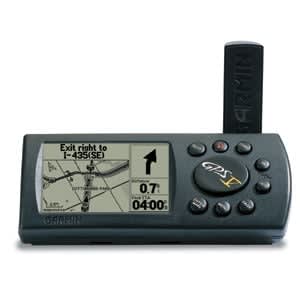
How tesla's crap looks:

Screenshot 2022-08-19 at 09-31-58 Find Us Tesla.png

Even if I could get past the infuriating micro-fonts and icons of this UI, why is something as simple as map so hard for tesla?

it is 100x easier to find something on the Google map. did Tesla lose its' ability to use color?

do the 12 year olds developing this stuff only use black and white screens?

WHY is this so horrific?!
 
When you look at your phone or computer, you can give that 100% of your attention. Colors can be used etc. When you are driving, the map is only a rough context. The important thing is the instructions, often given by voice, and otherwise the actual planned line you will follow. That is provided in color, over a bland background. It makes the important thing pop out. Different use cases, different presentations.
 
We get no choice on maps. The maps are present all the time. We cannot turn them off. We can't change the scale and have the scale we desire remain. The maps always return to the fixed scale. There is no legend on the maps to indicate that one unit = so many miles or kilometers. The Supercharger listing screen eclipses about one-third of the left-hand side of the map when visible. It makes no sense to list Superchargers that are 180 degrees opposite from the direction that I am driving--especially when they are 60 miles away.

I speak only for myself, but I never use directions unless I am going someplace new or someplace distant that might possibly be cutting my range too close.

We can choose fixed north or direction up. Hurray!

Yes, squirrel, Tesla maps have a lot of room for improvement.
 
  • Like
Reactions: Falcon73
I don't buy any of that. I can view the google, bing, and apple maps and decipher much more information much more quickly than the tesla grayscale crap.

they were much better 7 years ago when I got my first S. now they are 100x harder to view at a glance and a major hassle.

My Garmin Mark 5 (I think that was the name) back in 2004 was just as black and white as this nonsense.

Tesla is on a 50 shades of grey kick for no good reason. Is someone allergic to color?
They've removed any and all color from the entire system. Might as well be on a black and white TV.

My 2009 Tahoe was better.

My 2012 Wrangler was better.

Anyone have any shots from the 2015 version? These maps not only look horrific, but are much harder to use.
 
  • Like
Reactions: Falcon73
Found it!

Tesla maps, brought to you by 2004 Garmin.


I wonder whatever happened to my little Garmin.
 
Could it be due to patent infringement? maybe nobody can make maps look exactly like the other company... just a wild guess..
I wish Tesla would just pay Google n used their maps altogether with an extra layer on top for superchargers...

Future wish: make an App store like cellphones where user can download whatever app or maps they want :)
One can dream haha
 
I think colors are back on the map. Maybe they have been for a while, or never actually went away 100%. I had the wrong glasses on, and I put my nose right next to the screen to find a city park (while stopped, of course). If you look really, really closely, you can see the park outlines are slightly green. They're not visibly green if you sit back enough to see out of the car, but they are green. I always thought they removed the color for some technical reason related to performance. Now I have no idea why they would use a shade that's, for all intents and purposes, indistinguishable from the rest of the grey.
 
  • Funny
Reactions: SabrToothSqrl
Considering how big the map is, the amount of information it shows isn't that significant.

There should be a way to show icons such as chargers all the time without having to push the button to show chargers or Navigate Charging.

If there was a way to keep the icon controls in the upper right always on there it wouldn't be as bad.