Welcome to Tesla Motors Club
Discuss Tesla's Model S, Model 3, Model X, Model Y, Cybertruck, Roadster and More.
Register

Tesla Software updates - Australia

This site may earn commission on affiliate links.
Think it's also worth noting while Tesla had a head start on EVs they didn't on automation.

The first Roadster and Model S had no cameras.
That came later with the initial one camera licensed MobileEye system, before Tesla decided to go in its own direction with multiple cameras and its own hardware.
 
  • Like
Reactions: johnchidgey
I would actually give credit, where its due.
I am happy to do that, but giving them credit in one area, doesn’t excuse their failings in others. As others have said, the basic infotainment is a UI mess, the display lacks good contrast, the speedo is too small. While I have worked in the software industry my whole life, and admit to being swayed by the latest and greatest, my wife doesn’t like driving the Tesla, and wants a different brand of ev when it is time to replace her ICE car. We looked at a Hyundai Ioniq 5, and we were both impressed at how much more usable it is to operate.
 
  • Like
Reactions: Benzz and Wol747
This caught me out too with a recent change, the "secret" is the top nav bar appears if you tap the very top (just above the Netflix app display area) and then you'll see the magical x to close the app.
Thank you, and that rather makes my point.
Any UI - on any device - should be written so that everything works the same from the users’ perspective. The various infotainment (ghastly word, BTW) sites are all different and -as you just told me - get changed with no guidance.
It’s like back in the mid eighties, when software outside the scientific and commercial roles was being coded and much of it was primitive from today’s ideas.
If Tesla is a software company I would give it a 6/10 on the UI - there’s so much of it that could be excellent with a little structural planning and a lot less concentration on frippreries like light shows and farts.
 
  • Like
Reactions: paulp
If Tesla is a software company I would give it a 6/10 on the UI - there’s so much of it that could be excellent with a little structural planning and a lot less concentration on frippreries like light shows and farts.
I agree to the most part, specially on the UI side, however I do not believe the frippreries like light shows and farts affect the UI design as much. The programmer who creates the light show might be great at that type of work but lousy at UI design as that takes a different kind of thought process. Where the only user input to the lightshow is one start button. As a software company they seem to have concentrated on the people who program the code but have skipped over hiring the ones who are great at UI design and standards. Programming the frippreries like light shows and farts are a task for a single programmer, and dont actually take that much time, where a good UI design would need a team and would have to follow established standards and possibly build upon them.
The other side of software company that they are seriously lacking is a testing department, as the flaws that they push out to customers often are the kind that you notice within first few minutes after the update meaning that no-one actually looked at it before pushing it out to customers. However this seems to be more of a norm lately as similar things come from larger software companies like Microsoft and Adobe, where they push updates out that literally break everything they touch.
 
The other side of software company that they are seriously lacking is a testing department, as the flaws that they push out to customers often are the kind that you notice within first few minutes after the update meaning that no-one actually looked at it before pushing it out to customers. However this seems to be more of a norm lately as similar things come from larger software companies like Microsoft and Adobe, where they push updates out that literally break everything they touch.
It's not so much testing as the overall organisational culture and commitment to software quality. If you're looking for bugs during testing, it's too late. With regards to the overall commitment to quality, the 2021 holiday release which was clearly buggy and a UI mess but released anyway so that everyone could get a light show tells you everything you need to know.
 
  • Like
Reactions: Wol747
Apropos my post in the Sydney to Darwin thread, I worked out how to stop the heater turning on automatically, if you just want fresh air coming in without any active heating or cooling:
  • Turn the desired cabin temperature down to “LO” (the lowest setting below 15°C)
  • This will turn the AC on if it wasn’t already on - manually turn it off again
  • Choose recirculate or not according to preference
I had a return trip Sydney to Newcastle yesterday, I forced the resistive heater off on the trip up as per above, and let it operate in default mode on the way back (set the cabin temp to 21°C manual, AC off, but the resistive heater still came on):
  • Trip up: 137 Wh/km
  • Trip back: 157 Wh/km
Road completely dry both legs, no rain. You decide!
 
It's not so much testing as the overall organisational culture and commitment to software quality. If you're looking for bugs during testing, it's too late. With regards to the overall commitment to quality, the 2021 holiday release which was clearly buggy and a UI mess but released anyway so that everyone could get a light show tells you everything you need to know.
I agree that this is all about their overall organizational culture and commitment to software quality, however I do not believe the end of the year update was pushed with sole intention for everyone to get that lightshow. I believe the lightshow was added to that update as a sweetener, however as they had previously promised to get v11 out before the end of the year, they pushed it our regardless of it being usable or not. The main focus on the v11 release was the new UI and that most definitely was not ready. (It is possible their Christmas bonuses depended on pushing this out)
Similarly many of their sub programs and gimmicks that you can launch such as the Mars landscape, or Santa or Rainbow road are not correctly implemented into the UI as often you will find there is no way to exit or disable those gimmicks after launching them. I have had a few occasions where I cant exit one of those if my kid triggers it and I will have to pull over and reboot the car or force power off as sometimes it remains even after the steering wheel buttons reboot during drive (that rainbow road music was very distracting if you cannot turn it down or off when volume controls don't work on it). This leaves me to believe that the gimmicks are programmed by different person or team than the UI and those people don't talk to each other and there is no company policy to verify that their work can interface with each other either. Some updates fix those issues and others cause the issues to pop up again, so have now made it a point to ensure my kid does not trigger any of those when I drive as I don't know if current update versions work as expected or not regarding this.
It could be that all the good programmers are on critical systems such as drive software and battery controller firmware and the ones that cant make the cut for priority systems get left to do UI and gimmicks unsupervised.
 
  • Like
Reactions: Wol747
Up to 20.5 today. 16.3 only lasted 2 days so it must be bad. 16.3 also installed itself without permission on both my model s
16.3 has been good for me. Was on 16.2 for a long while and it was driving me nuts for kicking me out of autopilot for the rest of my drives for not being attentive. As soon as I updated to 16.3 problem fixed. 200km drive & no autopilot sin bin episodes. Seems 16.3 has still been getting pushed out at a high rate, although 20.5 has just overtaken its rate of installs today.

1657425508565.png
 
  • Like
Reactions: Priit and Leeroy
20.5. Chime when the traffic light you are waiting for turns green. I’d put this in the useful column..

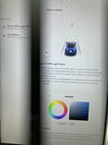
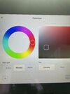
Plus the ability to change the colour of your car on the dash. The people that did the fart app have obviously been redeployed.
 

Attachments

  • 8ABE9833-3AF6-4934-AF01-ADBD7A9E62F3.jpeg
    8ABE9833-3AF6-4934-AF01-ADBD7A9E62F3.jpeg
    419 KB · Views: 46
  • 6FC1B994-D73A-4CEF-AD53-8DBAD86912FC.jpeg
    6FC1B994-D73A-4CEF-AD53-8DBAD86912FC.jpeg
    333.1 KB · Views: 53
  • Funny
Reactions: paulp and Vostok
Got a notification that a new update was ready yesterday and I assumed it was yet another bi annual nothing burger bug fix for my 2014 Model S AP1.
OMG was I wrong, it was V11 (for older vehIcles) and is a big change to the UI.
Lost my defrost and seat heater buttons from the bottom row replaced by a bunch of colourful app buttons including Toy Box. Who needs quick access to Toy Box!?
Just spent half an hour putting the defrost and seat heater buttons back but can’t put the temperature control back in the centre like it was before. Other changes I have noted are the charge screen and steering and pedals now have their own dedicated menu and ther is now a single bong when TACC engages.
would love to get rid of the recent apps section to make space for what I want but looks like I’m stuck with it. Strange big and small Climate apps will take a while to work out.
Took it for a short drive and only used TACC not Autopilot and seems the same.
when I got home it started to download new maps which it’s doing now.
Nice bright colours, more customisation, but bizarre choices for some things. Initial impression I give it a 7 out of 10.
 
20.5. Chime when the traffic light you are waiting for turns green. I’d put this in the useful column..

Plus the ability to change the colour of your car on the dash. The people that did the fart app have obviously been redeployed.
I think the chime is only for FSD cars is that right? Would be handy for non FSD cars that have visualisations turned on. Shame. Changing car colour on the dash has been there for quite a few months now.
 
There are several people who warn about the "green" chime: because it bongs instantly it's easy to press the GO pedal when you hear it - even when it's seen a green that's not yours!
I do wish - and this is another bit of poor UI programming - if they are going to show the brake lights on your car icon - they'd make them oversize. Many of us are getting on a bit and on the "S" it's often impossible to see if they are red or not. Same with traffic light icons - next to useless for my eyes.
I’d sooner have larger aircon buttons so that I can actually land my finger on them whilst driving on roads that are not super smooth, which is all roads. Polestar have done a much better job of sizing the critical buttons you need whilst driving without distraction.
 
There are several people who warn about the "green" chime: because it bongs instantly it's easy to press the GO pedal when you hear it - even when it's seen a green that's not yours!
I do wish - and this is another bit of poor UI programming - if they are going to show the brake lights on your car icon - they'd make them oversize. Many of us are getting on a bit and on the "S" it's often impossible to see if they are red or not. Same with traffic light icons - next to useless for my eyes.
I just took the car for a drive and even my wife who is the tesla’s harshest critic was pleasantly surprised. I think they have spent a bit of time getting this right. There is a fractional delay, so if you are quick off the mark there is no sound, if you do delay the sound is very subtle, just enough to register but not enough to annoy.

Oh, and you do need to enable it in the autopilot screen, it is off by default.
 
  • Informative
Reactions: Flatbat
I’d sooner have larger aircon buttons so that I can actually land my finger on them whilst driving on roads that are not super smooth, which is all roads. Polestar have done a much better job of sizing the critical buttons you need whilst driving without distraction.
Quite.
This is part of which I whinge about regarding the UI: I can picture the coders sitting in front of 32" UHD monitors congratulating themselves on how pretty their display looks....
All the various apps' and car facilities' should have identical interaction icons etc: and as important for a moving vehicle the button icons have to be large and identifiable. It's not a coding issue: we are years beyond having to write each icon and button - standard "Close", "Play", "Back" buttons large and clear should be the norm.
Some of the "fine print" is to anyone with even 20/20 vision completely indecipherable, and the actionable buttons on the entertainment apps are a complete pain to hit as you say on "normal" roads.
 
  • Like
  • Helpful
Reactions: paulp and positiv
I prefer to lay off the Bong's when driving too!
The BMW X5 eDrive45 I drove for a week (when holidaying in Noosa) last week was extremely graceful with its version of AP, some of the things I noticed:

1. It’s like Tesla’s free version of AP
2. It’s doesn’t bong on and off
3. When one indicates you take over to change lanes
4. Once changed lanes within 5 seconds it auto reengages

Absolutely brilliant…much better than how free Tesla AP handles it.

I also noticed it’s much nicer at moving the car within the lane without feeling like your fighting the steering wheel to then just have AP disengage.

This X5 only has 80km of full electric but in hybrid mode it achieved about 4-5litres per 100km, it’s really quite impressive…and it’s ultra smooth/quiet, no rattles etc.

This makes me quite excited about the iX, I’ll be test driving the iX as soon as possible.