Wol747
Active Member
>>I suggest you grab a cocktail or coffee and spend 30 minutes learning the new TeslaOS before you need any of it features. Learning the new UI is the least you could do in lieu of RTFM. Spend another week driving it to learn where the features moved to. Actually make a point to use all the old & new features. THEN post complaints here and let Tesla Support know via Bug Reports.<<
I've never had a car that needs that sort of ongoing learning of changes and I don't think it is going to help Tesla one bit.
I'm a techie as much as anyone but not when we end up with a vehicle that requires such attention.
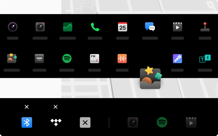
And that's ignoring the fact that the little icons along the bottom are not exactly intuitive nor large enough to be useful when driving.
I've never had a car that needs that sort of ongoing learning of changes and I don't think it is going to help Tesla one bit.
I'm a techie as much as anyone but not when we end up with a vehicle that requires such attention.
And that's ignoring the fact that the little icons along the bottom are not exactly intuitive nor large enough to be useful when driving.