I'll look into this and see what @doug thinks. You are right. The threads that I tested were not ones that I participated in so I didn't realize it was doing that. Adding a 'go to first unread' button into mobile is just a matter of figuring out where to put it. Changing the stock behavior, as per your other suggestion, of course is more complicated.I suggest adding a "go to last unread" selection like the desktop version, or quite honestly, moving both mobile and desktop to always navigate to the newest post. I mean, who ever wants to start over?
Welcome to Tesla Motors Club
Discuss Tesla's Model S, Model 3, Model X, Model Y, Cybertruck, Roadster and More.
Register
Install the app
How to install the app on iOS
You can install our site as a web app on your iOS device by utilizing the Add to Home Screen feature in Safari. Please see this thread for more details on this.
Note: This feature may not be available in some browsers.
-
Want to remove ads? Register an account and login to see fewer ads, and become a Supporting Member to remove almost all ads.
You are using an out of date browser. It may not display this or other websites correctly.
You should upgrade or use an alternative browser.
You should upgrade or use an alternative browser.
TMC Navigation Update
- Thread starter danny
- Start date
-
- Tags
- Site Feedback
In case you're still interested in feedback...
Current

Better

Best

Current
Better
Best
JRP3
Hyperactive Member
In case you're still interested in feedback...
Current
View attachment 206358
Better
View attachment 206359
Best
View attachment 206360
I think your "Better" would be best. I like the fact that the TMC logo bar goes away when scrolling, gives more screen space, and I know what forum I'm on. It looks as if your "Best" would have a double space bar always in place because of the logo.
Wouldn't have to, but I get your point.It looks as if your "Best" would have a double space bar always in place because of the logo.
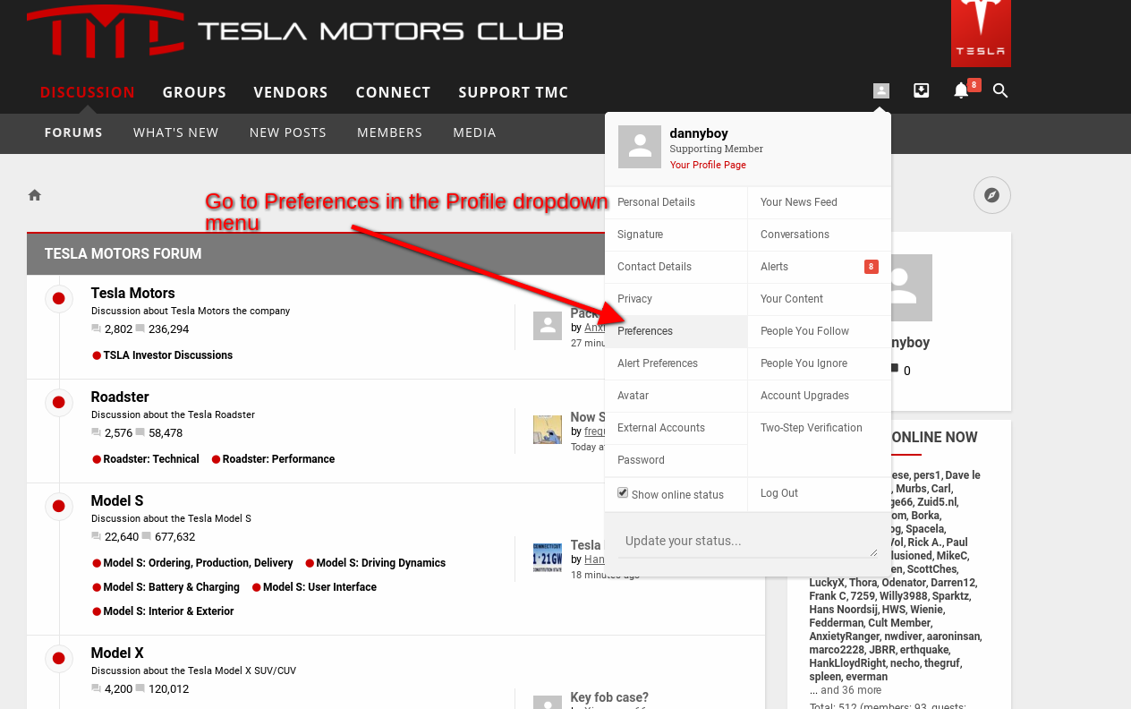
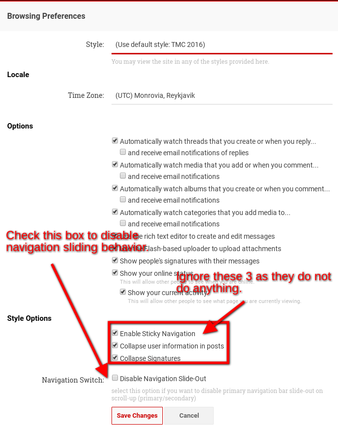
There are still some minor issues to address, but we did just update navigation and it now includes the option to turn of the sliding mechanism such that only the 2nd row follows you down the page. In addition, the alerts/conversation/etc icons jump to the 2nd row when this happens so you still have access to them. To turn this on please follow these instructions:


Please report any bugs/issues.
Thanks.
Please report any bugs/issues.
Thanks.
HankLloydRight
No Roads
JRP3
Hyperactive Member
There are still some minor issues to address, but we did just update navigation and it now includes the option to turn of the sliding mechanism such that only the 2nd row follows you down the page. In addition, the alerts/conversation/etc icons jump to the 2nd row when this happens so you still have access to them.
That seems to have cured my disappearing nav bar issue. Thanks.
HankLloydRight
No Roads
Ok, but I think people mentioned this before... the intuitive thing to do to open threads is click on the thread title, especially on mobile since it's large and easy to "click". But I don't know ahead of time if a thread "last unread" flag has timed-out. So how would I know to click there, instead of the obvious place being the thread title to get to the last unread post?
So wait, I don't get it then.. if the avatar icon always takes you to the last unread post (even if it timed-out), why doesn't the thread title do the same thing? What's the purpose of the time-out then?
Why would anyone, ever, want to go to the first post if they haven't read a watched thread in 30 days or more?
I have the same situation as @HankLloydRight on mobile. Tapping the avatar to the left brings up my profile "popup", it doesn't take me to the latest unread - at least as far as I can tell. Maybe those are threads that I've read within the last 30 days? If so, that's inconsistent and a little confusing.
I can't find any threads I haven't participated in.
You've got it right. This definitely seems to be a strange aspect of the interface, and since @danny doesn't typically participate in the vehicle threads, might explain why he couldn't reproduce it.
I suggest adding a "go to last unread" selection like the desktop version, or quite honestly, moving both mobile and desktop to always navigate to the newest post. I mean, who ever wants to start over?
Ok, I'm going to continue to bring this up, because it's extremely frustrating on mobile whenever I hit a watched thread that I've participated in, that has the main title link "timeout".
Danny and Doug -- you keep saying that you aren't making changes just because "you want them that way"... but I continue to fail to see any logic in the thread title "30 day timeout" to go to the first post in the thread. If there is logic behind this decision, which seems universally unpopular, PLEASE explain it. As I said above, "Why would anyone, ever, want to go to the first post if they haven't read a watched thread in 30 days or more?"
As demonstrated:
- One can not tell looking at the Watched Threads list which threads have timed-out
- Clicking on the avatar doesn't work if you've participated in the thread
- Clicking on the "little red dot" is impossible on mobile
- It's extremely unintuitive and inconsistent for the Thread titles to not always go to "last unread post" and change behavior based on some arbitrary 30 day limit
- Adding a "Go to first unread" on mobile clutters up an already crowded page
- Adding a "Go to first unread" link still means one has to click twice to get to the last unread for threads that have timed-out, but only once for newer threads (still inconsistent)
- If I'm already looking at the "Watched Threads (unread posts)" page, why would anyone, regardless of thread age want to go to the first post?
- Click on the tiny number link for the last page of the thread (and it's very hard to do this)
- Scroll to the bottom of the page
- Start scrolling backwards looking at the date/time of EACH POST to find the post that revived the thread
- If there were a lot of new posts, I get to the top of the last page, and then have to repeat this exercise going backwards one page at a time, and continue searching bottom up for the "last unread post"
- When I finally find the "first unread post" I can start reading the thread
- Click on thread title, takes me directly to the first unread post
When Xenforo was first installed, this 30-day timeout was explained that the high-water marks were only temporary, and/or stored in cookies, so it was a limitation of the software. But as already demonstrated by the "red dot" and the "avatar" (as long as you didn't participate), neither of these hold true -- the forum keeps track of "last unread post" just fine.
So once again, I ask that the thread titles always go to "last unread post" regardless of thread age.
And if you can't or don't want to do that, PLEASE explain why leaving it this way makes any sense at all.
Thanks.
p.s. Tapatalk would be a dandy fix for this problem
we did just update navigation and it now includes the option to turn of the sliding mechanism such that only the 2nd row follows you down the page. In addition, the alerts/conversation/etc icons jump to the 2nd row when this happens
That's an excellent feature. I think "Disable navigation slide out" should be selected by default for all users. This feature is far superior to the current default setting. I love how the rarely used top menu items (Groups, Vendors, Conference) disappear when you scroll down and the 4 icons on the top right move to the second row. Excellent implementation!
@danny / admins, I believe TEG may have brought this to your attention but just wanted to make sure you were aware of a navigation request that we were discussing over in the Roadster forum. Thx in advance for your assistance.

JRP3
Hyperactive Member
Not sure if this is a site problem or an issue on my end but even though I have my ad blocker turned off for TMC I am now getting the message requesting that I turn it off and I'm not seeing ads.
Have you tried running the site in an incognito tab or other browser? That would help us determine the source of the issue.Not sure if this is a site problem or an issue on my end but even though I have my ad blocker turned off for TMC I am now getting the message requesting that I turn it off and I'm not seeing ads.
JRP3
Hyperactive Member
@danny / admins, I believe TEG may have brought this to your attention but just wanted to make sure you were aware of a navigation request that we were discussing over in the Roadster forum. Thx in advance for your assistance.
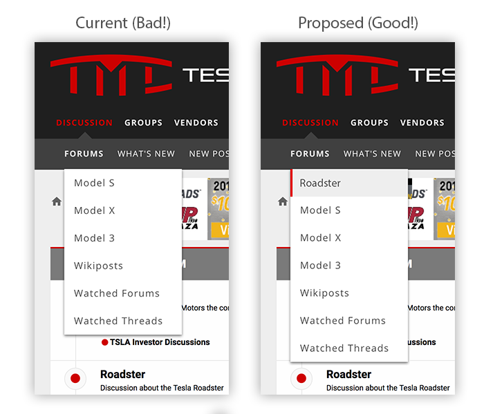
Bumping this request. @danny, can your Roadster brethren get some site nav love pls?Looks like "Roadster" is also missing in the slide out modal menu after clicking the hamburger.
Huge thx @danny! Really appreciate you saving us the extra click! Tested the full responsive design changes and both the main nav layout and hamburger look/work great! Just updated the thread in the Roadster forum so expect more love to come your way. Thx again!
JRP3
Hyperactive Member
Is that what broke the site in Firefox? Still can't post without quoting and then editing a post.
I can't imagine the two have anything to do with each other.Is that what broke the site in Firefox? Still can't post without quoting and then editing a post.
Is anyone else experiencing something similar in Firefox?
JRP3
Hyperactive Member
I can't imagine the two have anything to do with each other.
Is anyone else experiencing something similar in Firefox?
Yup, there's a thread about it. For me the only way I can post is to use the reply button at the bottom of a post, which doesn't let me enter text, but posts the quoted post, and then I go back and edit the post to type in. Been happening for a few days.
Firefox not showing message entry box
Similar threads
- Sticky
- Article
- Replies
- 119
- Views
- 10K
- Replies
- 22
- Views
- 876
- Replies
- 68
- Views
- 2K
- Replies
- 248
- Views
- 18K
- Replies
- 3
- Views
- 3K


