Precondition your screen and don't leave you wipers frozen to the screen when driving as you would have no way of clearly any obstruction.How do you do that in a frozen winter without triggering the wipers and potentially burning the wiper motor out?
Welcome to Tesla Motors Club
Discuss Tesla's Model S, Model 3, Model X, Model Y, Cybertruck, Roadster and More.
Register
Install the app
How to install the app on iOS
You can install our site as a web app on your iOS device by utilizing the Add to Home Screen feature in Safari. Please see this thread for more details on this.
Note: This feature may not be available in some browsers.
-
Want to remove ads? Register an account and login to see fewer ads, and become a Supporting Member to remove almost all ads.
You are using an out of date browser. It may not display this or other websites correctly.
You should upgrade or use an alternative browser.
You should upgrade or use an alternative browser.
Wiki [UK] V11 UI Changes and Features
- Thread starter MrBadger
- Start date
ShadowSix
Member
Removing one click seat heating is nuts! Another example of Tesla's obsession with automating EVERYTHING, as I noticed there is now an option to allow the car to manage your heated seats for you. Just bonkers.
kelvin 660
White SR+ with LFP battery
Electronic fuses so you won't burn out the motor!ow do you do that in a frozen winter without triggering the wipers and potentially burning the wiper motor out?
Simonix
Member
. I thought it was going to be click on the temperature value to get the quick menu and then click on the cog to get the full menu!?
If you tap on the arrows either side of the temp readout, it brings up the small quick menu, if you click on the temp number itself, it brings up the big hvac screen.
I think the basic driving controls are improved. Use of bolder fonts for battery level, TACC speed etc and the new thinner font for the actual speed somehow makes it stand out as well. Moving the map compass to the right means it's far easier to reach as a driver. The power/regen bar is clearer, but it kind of defeats me as to what action I might take based on that. Having Spotify, Radio and Energy as my pinned apps definitely reduces the number of clicks, and I can slide them back out of the way more easily than before.
I guess time will tell how well the auto seat heaters work, I'm the type that set the temperature to 20 and auto when I collected the car and haven't changed it for over 2 years, so it's probably never going to be changed again.
I guess time will tell how well the auto seat heaters work, I'm the type that set the temperature to 20 and auto when I collected the car and haven't changed it for over 2 years, so it's probably never going to be changed again.
Precondition your screen and don't leave you wipers frozen to the screen when driving as you would have no way of clearly any obstruction.
This isn't a solution.
I've got 11 loaded now, wipers can be set to off via "controls" without having to activate the wipers.
Stuff I don't like:
- Not able to hide things I don't use: Spotify, Caraoke, Tidal, Messages
-.Posion of the blindspot camera, pop it over the map.
- Separation of the music apps
- Removal of trip cards
Last edited:
Simonix
Member
The trip details hidden in the menu, is the major complaint I have.
That, and you still can't zoom in on the map and track in the heading up setting. Only in the North up setting. They've even taken away the "+" & "-" buttons!
That, and you still can't zoom in on the map and track in the heading up setting. Only in the North up setting. They've even taken away the "+" & "-" buttons!
I'm pretty sure it's a legal requirement for wipers to be fully functional when driving.This isn't a solution.
I've got 11 loaded now, wipers can be set to off via "controls" without having to activate the wipers.
up_north
Member
Tesla really haven’t a clue how to design a user interface. So you can add quick access to theatre, music, toybox etc but can no longer quickly switch on demister. The blind spot view is a good idea…but placing it at the bottom right of the screen on a RHD car is ridiculous - completely obscured by arms holding the wheel. Same issue, to a lesser extent, with the speed display. I‘m struggling to find the old camera icon you tap on to manually save dashcam footage or the icon that was next to it to quickly switch on Sentry.
Yeah the UI changes don't look great... Why make the bottom bar customisable but not keep the existing options of heated seats and heated windows?
I haven't ticked the advanced updates thing, will I get this update is I'm on 2021.40.6 and I do an update? The app is showing I have one.
I haven't ticked the advanced updates thing, will I get this update is I'm on 2021.40.6 and I do an update? The app is showing I have one.
phil4
Member
Yeah the UI changes don't look great... Why make the bottom bar customisable but not keep the existing options of heated seats and heated windows?
I haven't ticked the advanced updates thing, will I get this update is I'm on 2021.40.6 and I do an update? The app is showing I have one.
Yes, you'll have it, and you'll like it. Happy Christmas!!!!
In all seriousness, I think the Standard/Advanced thing is largely unused these days. And this is an update going out with big fanfare, so yes, expect you're getting it too.
Initial thoughts after a half hour tour when parked:
I think Tesla have got the kernel of a good update here, and I broadly approve of their direction of travel as to how the Ui will evolve.
I think Tesla have got the kernel of a good update here, and I broadly approve of their direction of travel as to how the Ui will evolve.
- Customisable shortcuts are good. I agree there are some glaring omissions from the shortcut list. But the overall design of this should mean they can quickly add missing stuff when people pester on Twitter.
- I like the colour addition. I had particular 'muscle memory' issues with the previous icons and the colours really help me.
- Overall the layout brings a number of controls closer to the driver. Also positive.
- Climate controls: I like the quick bar you can bring up, *but* you can only bring it up after you slide the temperature up/down. Otherwise you get the full HVAC controls. Not sure I get that Ux/Ui decision. If you are an 'Auto' kind of guy, then the auto heated seat option could be quite nice. Requires some journey time to see how that pans out.
- Radio: still a missed design opportunity. Ugly long list of DAB stations with massive areas of whitespace. Still very unintuitive. Good news that that DAB info now scrolls though!
Yeah, you have to change the temperature to bring up the small quick menuIf you tap on the arrows either side of the temp readout, it brings up the small quick menu, if you click on the temp number itself, it brings up the big hvac screen.
Simonix
Member
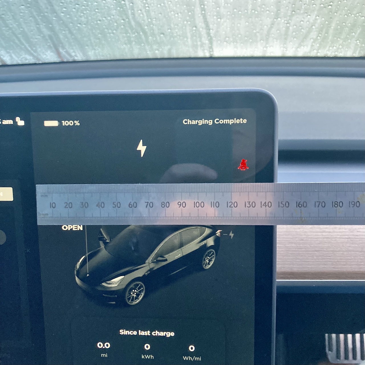
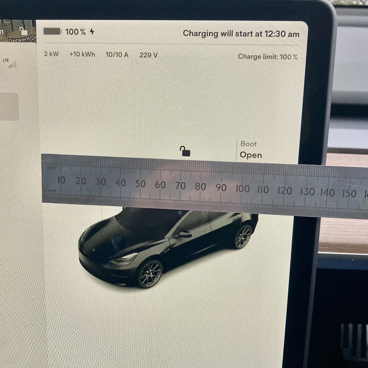
The driving visualisation section has been reduced in size, which I believe quite a few owners on here preferred.
Only reduced by 10mm though. I took some before and after measurements…..
Before:

After:

Only reduced by 10mm though. I took some before and after measurements…..
Before:
After:
Mr H
Active Member
I hate the fact you can't have a trip card on the screen anymore and the double tap to get the demister going, hopefully we can put demist icons on the bottom bar in future as there is plenty of room
Magstauk
South African in the UK
I totally agree with you, trip card on the screen was so much easier than it is now. Take up the whole screen!I hate the fact you can't have a trip card on the screen anymore and the double tap to get the demister going, hopefully we can put demist icons on the bottom bar in future as there is plenty of room
Advocate
Member
Does the 21 MiC M3 spell out Tesla with the lights? Haven’t been able to get mine in front of anything to check yet. But they should I think.Just had a dance off between a Fremont 2021 M3 lr and a 2022 mic M3 lr
The only noticeable difference was the mic cars boot danced the Fremont one didn't, they both have electric boots
Mark-R
Member
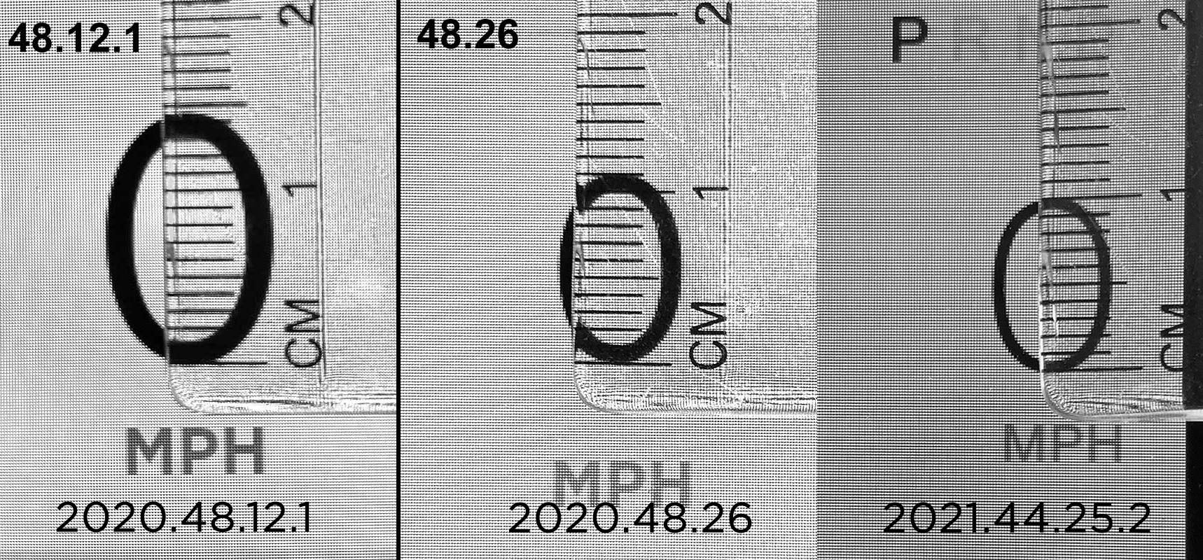
Whilst we have our rulers out...
The speedo font in V11 is a bit smaller than the previous version (10mm vs 11mm high). This reduction is nowhere near as big as we saw in the December 2020 UI change (2020.48.12.1 to 2020.48.26 saw a 25% reduction), but it is still heading in the wrong direction. Having said that, I prefer the new location i.e. up closer to the top right of the screen, so overall a small improvement for me.

The speedo font in V11 is a bit smaller than the previous version (10mm vs 11mm high). This reduction is nowhere near as big as we saw in the December 2020 UI change (2020.48.12.1 to 2020.48.26 saw a 25% reduction), but it is still heading in the wrong direction. Having said that, I prefer the new location i.e. up closer to the top right of the screen, so overall a small improvement for me.
Last edited:
Cnixon
Member
The browser has now got smaller. Android wheels (great AndroidAuto app by the way) now cannot function because bottom menu is off the screen. I am sure it will be fixed soon.
Similar threads
- Replies
- 467
- Views
- 30K
- Replies
- 177
- Views
- 11K
- Replies
- 478
- Views
- 41K
- Replies
- 169
- Views
- 14K


