I just received PTO this week and being a nerd I love to analyze the data I’m getting. I’m located in Phoenix.
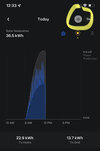
I just have a few days of data but I’m trying to comprehend energy usage the last 2 days compared to the first two. It seems that over the last 2 days I have this weird dome shaped usage curve that seems to increase and decrease with production that I didn’t have the first couple days. I know the spikes are related to my AC kicking on and off. The really large spikes are my car charging and AC use. Otherwise my house remains pretty constant temp. We were home all 4 days. My wife only used the electric oven once. The cooktop is gas and so is the water heater. I even unplugged the car to make sure it wasn’t the issue. What could be causing that constant usage that wasn’t there the two other days? The bottom graph is AC usage.
Link to graphs
Last edited by a moderator: