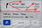
Does anyone know why the icons showing the exit number and the road/route number In navigation are so small? I frequently find it hard to read when navigating in an unfamiliar area and wind up having to look several times to make sure I’m taking the right exit. There is quite a bit of white space around them, so they should be able to use a larger font/icons relatively easily. Does anyone else find this annoying/frustrating?


-
Want to remove ads? Register an account and login to see fewer ads, and become a Supporting Member to remove almost all ads.
Navigation Icons for Exit & Road
- Thread starter BCCROC
- Start date