Welcome to Tesla Motors Club
Discuss Tesla's Model S, Model 3, Model X, Model Y, Cybertruck, Roadster and More.
Register

The new white space taking over screen is horrible

This site may earn commission on affiliate links.
I don't care about cars and people when I should be looking st the road.

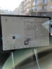
The map and media is tiny and way off center. There is no reason for this dead space. And I don't want to watch a cartoon..

Also the new model has a tiny car section go figure...
 

Attachments

  • Screenshot_20201230-134720_Google.jpg
    Screenshot_20201230-134720_Google.jpg
    150 KB · Views: 99
  • b01de9f6b5e28a438ea3d47a26a666c5fbf13478-14.jpg
    b01de9f6b5e28a438ea3d47a26a666c5fbf13478-14.jpg
    103.6 KB · Views: 84
I got my car in June 2019, and this is the first software update I've been disappointed with for the exact reason you're stating. Certainly geared towards those with FSD...

Ohh the other thing I don't like is seems they removed the playback speed toggles on Spotify so I can't speed up podcasts anymore, unless I'm missing something.
 
Excessive white space in a UI has been a common theme in software development over the past few years - it's not just Tesla. Look at Facebook's recent redesign! Larger text, more white space, more scrolling required... annoying.

Agree...many websites are almost unreadable due to large amount of whitespace and giant photos. Little space remains for content or to do so requires inordinate scrolling left/right and up/down. What is left of the print/magazine industry seems, in many cases, to follow the same design ethos.
 
  • Like
Reactions: TydalForce