You can install our site as a web app on your iOS device by utilizing the Add to Home Screen feature in Safari. Please see this thread for more details on this.
Note: This feature may not be available in some browsers.
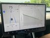
Look at the graph in this picture. After traveling about 100 miles the grey “predicted” consumption suddenly dropped to the same as actual. Is that normal?
SW 2020.20.12
Look at the graph in this picture. After traveling about 100 miles the grey “predicted” consumption suddenly dropped to the same as actual. Is that normal?
SW 2020.20.12
Completely normal especially since the car doesn’t have much info to go off of just yet. It’s an estimate as well. It’s possible and I’m just throwing stuff at the wall but maybe you decided to speed up and that made the computer adjust it’s estimate.
Agree that my consumption updates continuously based on actual driving conditions but shouldn’t the predicted one stay constant?
I have no picture of it but seem to recall leaving Childress supercharger with an estimated 18 percent arrival at Henrietta. Lots of headwind and a little bit of speeding brought the actual down to 7. However still strange to me that the original estimate (grey line) drop after 100 miles. Maybe I’m missing something.
You've got it backwards. The grey line is what the car is actually getting at the point on the trip. The colored line is the estimated consumption under ideal conditions (no rain or headwinds, no heavy acceleration, etc.).
The poster's graph shows he's doing better than predicted up to that point of his trip.
Nope, the grey line is the predicted and colors are what you're currently doing which can go up or down.
"Trip: monitor the amount of energy being used while navigating to a destination. You can track actual usage against the initial prediction. The green line represents the actual usage whereas the gray line represents predicted usage. To change the zoom level, touch the zoom icon located in the top right corner of the chart."
The OP was doing worse than expected and then the grey line, predicted usage dropped (I've never seen such a huge drop before) which the car finally matched at that point.