Welcome to Tesla Motors Club
Discuss Tesla's Model S, Model 3, Model X, Model Y, Cybertruck, Roadster and More.
Register
Install the app
How to install the app on iOS
You can install our site as a web app on your iOS device by utilizing the Add to Home Screen feature in Safari. Please see this thread for more details on this.
Note: This feature may not be available in some browsers.
-
Want to remove ads? Register an account and login to see fewer ads, and become a Supporting Member to remove almost all ads.
You are using an out of date browser. It may not display this or other websites correctly.
You should upgrade or use an alternative browser.
You should upgrade or use an alternative browser.
How can I create a graph with bars and lines for graphical representation of data?
- Thread starter Benz
- Start date
-
- Tags
- Site Feedback
tomy
Member
In Excel?
OK, that's right. But that is not what I meant to say.
I actually meant to do that without using an external program like Excel.
So, could I do that with what is available on the TMC website?
I guess that I really have to use Excel.
The graph I actually want to create has bars within bars (multiple times).
And I tried that, but I could not create what I wanted.
Maybe somebody could be my graph-mentor?
The graph I actually want to create has bars within bars (multiple times).
And I tried that, but I could not create what I wanted.
Maybe somebody could be my graph-mentor?
tomy
Member
I cannot figure out how to adjust the width of a vertical bar, so that other thinner vertical bars can be shown from within the wider vertical bar.
I guess that I really have to use Excel.
The graph I actually want to create has bars within bars (multiple times).
And I tried that, but I could not create what I wanted.
Maybe somebody could be my graph-mentor?
I recommend my favourite mentor :love:Google:love:.
I do not fully understand what sort of graph you wish to produce, but here is how I would approach a graphing problem.
If you wish to create a particular graph in excel (or any other graphing software) and struggle with the details, google has the answers. I normally just type in google 'how to do such and such in excel' and then research all the answers. There will likely be many video tutorials in the links.
It is possible that you might need more sophisticated graphing software than excel for your particular graph, but again google might help with answering that as well.
This will give you a better idea of what kind of graph I want to create:
I need some help.
I am trying to learn how to put data in a graph in Excel.
I have an idea of how I want the graph to look like, but I cannot transfer my idea on to the screen of my laptop.
I want to show bars of variable width in a graph. There must be 5 levels of width of the bars. Each type of width of the bars must be corresponding with: a quarter (thinnest bars), or a half a year, or a year, or a two years period, or a 4 years period (thickest bar).
The thinner bars must be within the thicker bars.
Here is the data for the graph:
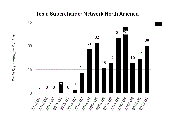
Tesla Supercharger Network North America
2012 Q1 0 2013 Q1 0 2014 Q1 32 2015 Q1 42
2012 Q2 0 2013 Q2 2 2014 Q2 16 2015 Q2 19
2012 Q3 0 2013 Q3 13 2014 Q3 19 2015 Q3 22
2012 Q4 7 2013 Q4 28 2014 Q4 35 2015 Q4 30
2012 H1 0 2013 H1 2 2014 H1 48 2015 H1 61
2012 H2 7 2013 H2 41 2014 H2 54 2015 H2 52
2012 FY 7 2013 FY 43 2014 FY 102 2015 FY 113
2012 + 2013 50
2014 + 2015 215
2012 + 2013 + 2014 + 2015 265
Here is a graph with bars that represent a quarter each.
And that's just one level.
I want to include bars that represent a time period of two quarters as well, and a year as well, and a time period of two years as well, and a time period of 4 years as well.
How will I insert those other bars into this same graph?

- - - Updated - - -
Why does it not show my graph?
- - - Updated - - -

And that's just one level.
I want to include bars that represent a time period of two quarters as well, and a year as well, and a time period of two years as well, and a time period of 4 years as well.
How will I insert those other bars into this same graph?
- - - Updated - - -
Here is a graph with bars that represent a quarter each.
And that's just one level.
I want to include bars that represent a time period of two quarters as well, and a year as well, and a time period of two years as well, and a time period of 4 years as well.
How will I insert those other bars into this same graph?

Why does it not show my graph?
- - - Updated - - -
tomy
Member
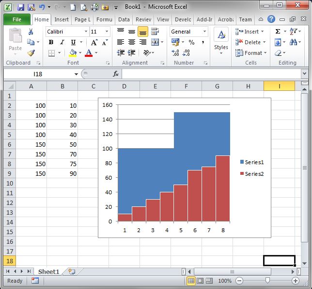
Sounds quite sophisticated. Quick solution might be this one

Since "with" and "overlap" applies to all bars in chart. Therefore I created 4 bars for the year (shown in blue) and for each quarter one bar (red in the example). Another solution might be to create an area chart combined with bars. Or for the quarters you could also use lines but instead of showing the line only showing the data point and for this you insert an icon. Sounds a bit complicated but have a look on chandoo.org. There you can find thousands of examples and step by step explanation.
Since "with" and "overlap" applies to all bars in chart. Therefore I created 4 bars for the year (shown in blue) and for each quarter one bar (red in the example). Another solution might be to create an area chart combined with bars. Or for the quarters you could also use lines but instead of showing the line only showing the data point and for this you insert an icon. Sounds a bit complicated but have a look on chandoo.org. There you can find thousands of examples and step by step explanation.
This will give you a better idea of what kind of graph I want to create:
I need some help.
I am trying to learn how to put data in a graph in Excel.
I have an idea of how I want the graph to look like, but I cannot transfer my idea on to the screen of my laptop.
I want to show bars of variable width in a graph. There must be 5 levels of width of the bars. Each type of width of the bars must be corresponding with: a quarter (thinnest bars), or a half a year, or a year, or a two years period, or a 4 years period (thickest bar).
The thinner bars must be within the thicker bars.
Here is the data for the graph:
Tesla Supercharger Network North America
2012 Q1 0 2013 Q1 0 2014 Q1 32 2015 Q1 42
2012 Q2 0 2013 Q2 2 2014 Q2 16 2015 Q2 19
2012 Q3 0 2013 Q3 13 2014 Q3 19 2015 Q3 22
2012 Q4 7 2013 Q4 28 2014 Q4 35 2015 Q4 30
2012 H1 0 2013 H1 2 2014 H1 48 2015 H1 61
2012 H2 7 2013 H2 41 2014 H2 54 2015 H2 52
2012 FY 7 2013 FY 43 2014 FY 102 2015 FY 113
2012 + 2013 50
2014 + 2015 215
2012 + 2013 + 2014 + 2015 265
Blue represents a period of 4 years
Red represents a period of 2 years
Yellow represents a period of a year
Green represents a period of 2 quarters
Purple represents a period of a quarter
Similar threads
- Replies
- 6
- Views
- 3K
- Replies
- 4
- Views
- 174
- Replies
- 8
- Views
- 798


