We have just updated the site with a new UI and features. Please note that we are still making some adjustments and configuring things. Please let us know if you see any issues or bugs.
[If you would like to continue to use the legacy "What's New" page, I have added the ability to add a "What's New" link to your primary navigation bar and mobile bottom navbar (only effects the non-pro 2022 styles, as the pro styles already have a "What's New" link there). You can turn this on by going to your Account Preferences.]
The main updates are the following:
1. New UI Style: We have new style/theme called "TMC 2022" and TMC 2022 Dark". These are very similar to our old styles, however they are a little more streamlined, should provide better performance on both desktop and mobile, and significantly improve readability (in particular for the dark style). There are some more consequential changes that you will notice, such as: the sub-navigation bar is no longer sticky on scroll-down; on mobile, the Conversations, Alerts and Account/Profile buttons are now merged into one in the top navigation bar; and on mobile the bottom navigation bar now has the navigation menu button as well as other useful links. If you are unhappy with any of the changes, please use the "TMC Pro 2022" and "TMC Dark Pro 2022" styles which are almost identical in function to the older style. You can change/specify your preferred style on your Account Preferences page.
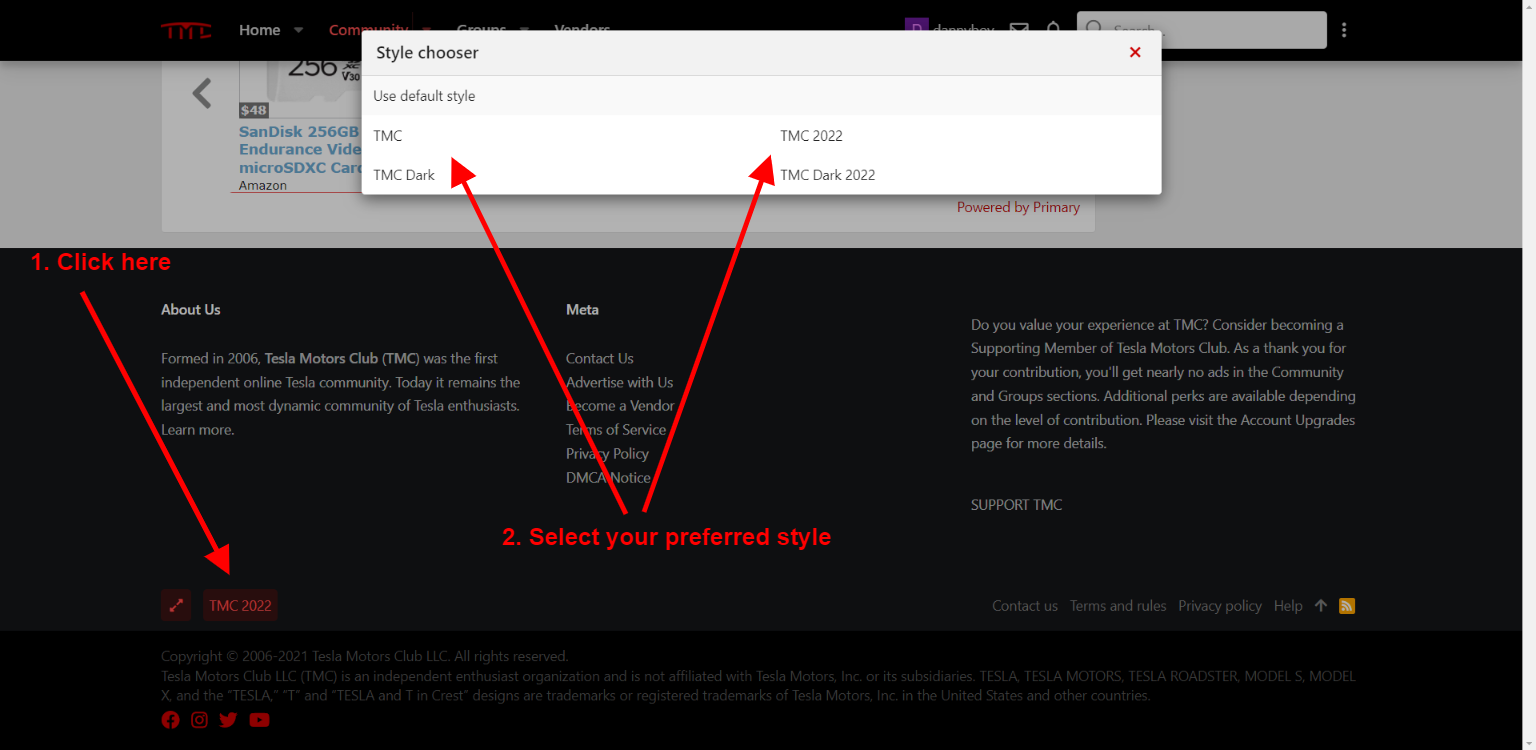
Or you can change it by scrolling down to the bottom of your screen:

2. New Feeds Feature: Feeds is our new way of making TMC's Community content more accessible and easier to navigate and filter. Feeds will ultimately be taking the place of the "What's New" section, as it provides the same functionality and much more. What's New will remain accessible for those who still prefer it, however we will be removing What's New from the navigation bar at some point, so please bookmark it if you really want to use it and not Feeds.
You will notice on the Community homepage, a tab bar which allows you to switch between the various feeds that we offer. By default, existing logged in users will be taken to the "Forum list", which hasn't changed. However, you can switch to other Feeds easily, and even change your default feed from "Forum list" to a feed of your preference. This can be done in your Accounts Preference page in the section entitled "Default feed". You can also set a feed as default by going to your preferred feed, and selecting the "Set as default" button as seen here:

3. Voting: We have added the ability to vote on threads. This affects a given thread's vote score, which can be used as a sort option for your thread. Vote scores are also used to help determine which threads make it into the "Hot" feed.
Below are sections from the new TMC Website Tutorial that cover Voting and Feeds.
Feed tabs:
On the Community homepage there are various feeds that you can view:
You can choose between two different formats for thread feeds:
There is also a “Set as default” button. This option allows you to change what feed is shown by default when you come to the TMC Community homepage. This option can also be adjusted within your account settings in the “Preferences” section.
Feed Filtration:
The “Filter” section allows you to drill down to the specific content that you’d like to see. You have many options for filtering, including:
Once you have specified your filtration options, you can select the “Save” button if you would like them to be saved and selected by default the next time you visit that specific feed.
Thread Voting: On any thread list page, such as a forum or a feed, you can up a thread. You can also up vote a thread on each thread's first post. The vote score is taken into account for curated feeds such as Blog and Hot. It also is a sort option that you can use in order to see threads with the highest vote score.
[If you would like to continue to use the legacy "What's New" page, I have added the ability to add a "What's New" link to your primary navigation bar and mobile bottom navbar (only effects the non-pro 2022 styles, as the pro styles already have a "What's New" link there). You can turn this on by going to your Account Preferences.]
The main updates are the following:
1. New UI Style: We have new style/theme called "TMC 2022" and TMC 2022 Dark". These are very similar to our old styles, however they are a little more streamlined, should provide better performance on both desktop and mobile, and significantly improve readability (in particular for the dark style). There are some more consequential changes that you will notice, such as: the sub-navigation bar is no longer sticky on scroll-down; on mobile, the Conversations, Alerts and Account/Profile buttons are now merged into one in the top navigation bar; and on mobile the bottom navigation bar now has the navigation menu button as well as other useful links. If you are unhappy with any of the changes, please use the "TMC Pro 2022" and "TMC Dark Pro 2022" styles which are almost identical in function to the older style. You can change/specify your preferred style on your Account Preferences page.
Or you can change it by scrolling down to the bottom of your screen:
2. New Feeds Feature: Feeds is our new way of making TMC's Community content more accessible and easier to navigate and filter. Feeds will ultimately be taking the place of the "What's New" section, as it provides the same functionality and much more. What's New will remain accessible for those who still prefer it, however we will be removing What's New from the navigation bar at some point, so please bookmark it if you really want to use it and not Feeds.
You will notice on the Community homepage, a tab bar which allows you to switch between the various feeds that we offer. By default, existing logged in users will be taken to the "Forum list", which hasn't changed. However, you can switch to other Feeds easily, and even change your default feed from "Forum list" to a feed of your preference. This can be done in your Accounts Preference page in the section entitled "Default feed". You can also set a feed as default by going to your preferred feed, and selecting the "Set as default" button as seen here:
3. Voting: We have added the ability to vote on threads. This affects a given thread's vote score, which can be used as a sort option for your thread. Vote scores are also used to help determine which threads make it into the "Hot" feed.
Below are sections from the new TMC Website Tutorial that cover Voting and Feeds.
Feed tabs:
On the Community homepage there are various feeds that you can view:
- Blog: A selection of curated article threads from our community.
- Hot: A curated list of some of the best and most recent threads created by TMC members.
- Discussion: A full list of all threads (similar in function to the older “New posts” page).
- Questions: Displays all Question threads. Each of these feeds can be filtered by forum and more. For example, you can display only threads with unread content by clicking here.
- Social: Shows the latest social status updates (AKA profile posts) from across the community.
- Forum list: Not actually a feed, but rather is a shortcut to jump to the traditional list of forums, which can also be accessed by clicking on the “Forums” link in the sub-navigation bar under “Community”. On this page you can select.
You can choose between two different formats for thread feeds:
- List: The classic, more condensed, view of the threads.
- Card: A richer layout which previews the actual content of the thread’s first post, allowing you to take actions such as reacting to the post.
There is also a “Set as default” button. This option allows you to change what feed is shown by default when you come to the TMC Community homepage. This option can also be adjusted within your account settings in the “Preferences” section.
Feed Filtration:
The “Filter” section allows you to drill down to the specific content that you’d like to see. You have many options for filtering, including:
- In forums: If you’d like to limit the feed to content only from specific forums that you select..
- Unread content: If you’d only like to see content you haven’t previously seen/read.
- Watched threads: If you’d only like to see threads you’ve created, interacted with, or manually watched.
- Watched forums: If you’d only like to see threads from forums you’re watching.
- Unanswered content: If you’d like to see content that doesn’t have any replies.
- People you follow: If you’d only like to see content from your members that you have followed.
- Order by: This option gives you a variety of sort orders such as:
- Promotion date - when the threads were promoted to the feed by TMC Staff.
- Last post date - when the latest reply to the threads were posted.
- Thread creation date - when the threads were first created.
- Vote score - the number of votes the threads received.
- First post reaction score - the reaction score (incl. Likes, Informative, Helpful, etc.) of the first post of the threads.
Once you have specified your filtration options, you can select the “Save” button if you would like them to be saved and selected by default the next time you visit that specific feed.
Thread Voting: On any thread list page, such as a forum or a feed, you can up a thread. You can also up vote a thread on each thread's first post. The vote score is taken into account for curated feeds such as Blog and Hot. It also is a sort option that you can use in order to see threads with the highest vote score.
Last edited:


