


Welcome to Tesla Motors Club
Discuss Tesla's Model S, Model 3, Model X, Model Y, Cybertruck, Roadster and More.
Register
Install the app
How to install the app on iOS
You can install our site as a web app on your iOS device by utilizing the Add to Home Screen feature in Safari. Please see this thread for more details on this.
Note: This feature may not be available in some browsers.
-
Want to remove ads? Register an account and login to see fewer ads, and become a Supporting Member to remove almost all ads.
You are using an out of date browser. It may not display this or other websites correctly.
You should upgrade or use an alternative browser.
You should upgrade or use an alternative browser.
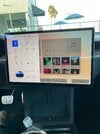
First look for V11!
- Thread starter Ahmedov
- Start date

Gizmo35
Member
I think it is a step in the right direction. Will wait and see how it carries over to Model 3. Thanks for the pics!
Candleflame
Active Member
Not really the v11 i was expecting which was more similar to the cybertruck with the fused AP/map.
It might just be anther V10/V11 hybrid. the Model 3 would struggle to display all of this with its smaller screen. 15" rather than 17" but the 3 loses 30% of the screen to the AP view.
In fact, this might just be the refreshed Model S V10. Like the only button located on the left is the menu which pops up in a way where the Model 3s AP view would be. that menu wouldnt really work in the 3 as it would obstruct the AP view. hence its on the main screen. the only real difference here is that the map sort of shares a screen with the music player. We were sort of expecting this as the S has more screen estate.
This looks terrible, why is there so much wasted space? What is the point of having a huge screen if so much of it is just going to be empty? Ever since V7 or so Tesla seems to be prioritizing style over substance.
Candleflame
Active Member
This looks terrible, why is there so much wasted space? What is the point of having a huge screen if so much of it is just going to be empty? Ever since V7 or so Tesla seems to be prioritizing style over substance.
i think part of the problem is just that 17" is huge and you have even more estate than in the 3 because you have the 2nd screen. There just isn't much to put on there even with music player and the the map at the same time.
Possible source link, or at least extra wordy info as well.

 electrek.co
Tesla v11 software leaks in look inside refreshed Model S test vehicle
Someone managed to get inside a refreshed Tesla Model S test vehicle and take pictures of the user interface that...
electrek.co
smogne41
Active Member
This does not really tell us about the 3/Y which is most interesting to me. That being said, not a fan of the flat low contrast choices. Not good when you need information and buttons to really 'pop'. Yeah, I prefer usability to the latest dumb UI fad. Hopefully this gets revised a hell of a lot before release but given Tesla these days, this is probably exactly what we will get.
diplomat33
Average guy who loves autonomous vehicles
I imagine that "smart shift" should be something that can be done with just a software update, right? So I wonder if the Model 3 will get the feature too. I hope so.
kpeng
Member
No UI will ever be good enough for you people so resistant to change, yet whining incessantly about the lack of change.
Drrobmiller
Member
I dont like it. I'm glad I got the model x with portrait view just before the refresh. I just feel that its a hugh ipad that's right in your face. I'm not into the games.
I just feel that the portrait view is more elegant, and not to obnoxious.
That being said,... if I didn't have a choice, I would still get it. I'm sure the faster CPU and other new features are fun...the wireless charger looks ok and the back screen for enviornmental controls are useful. Yolk looks fun also.
But when I initially saw the model y and 3 with the landscape view, I was turned off and got the X
R
smogne41
Active Member
Improvement implies change, but change does not imply improvement.No UI will ever be good enough for you people so resistant to change, yet whining incessantly about the lack of change.
Cheburashka
Active Member
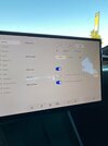
I think it looks ok. Unclear why nav is so microscopic. Lots of empty space for some reason. I guess I don't care too much for it - looks like widgets on an iPad or something.
IronCoffee_Max
Member
Some of the posts I've read say these are customizable "widgets". So you'll be able to choose what shows up on the screen and where. Might even mean you can make the nav bigger, smaller, etc… to your tastes. Will be interesting to see the reality. I would like some customizability (I want to see Nav/Music mostly).
Cheburashka
Active Member
Some of the posts I've read say these are customizable "widgets". So you'll be able to choose what shows up on the screen and where. Might even mean you can make the nav bigger, smaller, etc… to your tastes. Will be interesting to see the reality. I would like some customizability (I want to see Nav/Music mostly).
We already had this back until v8. Doubt Tesla will go back to that design philosophy.
We already had this back until v8. Doubt Tesla will go back to that design philosophy.
I wouldn't be so sure. At least on this screen (Parked/Charging), there are multiple pages to swipe through. If you look closely, you can see the page markers just under the widgets and above the climate controls.
HankLloydRight
No Roads
qdeathstar
Completely Serious
No UI will ever be good enough for you people so resistant to change, yet whining incessantly about the lack of change.
That looks pretty bad.
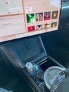
On reddit the man who took those pictures (and probably got someone at tesla fired) explains that the YOKE will be an opt-in - everyone will receive the regular wheel and the yoke will be a later retrofit.Did anyone notice that this refresh MS doesn't have the yoke wheel?
Similar threads
- Replies
- 3
- Views
- 408
- Replies
- 29
- Views
- 2K