Lindenwood
Active Member
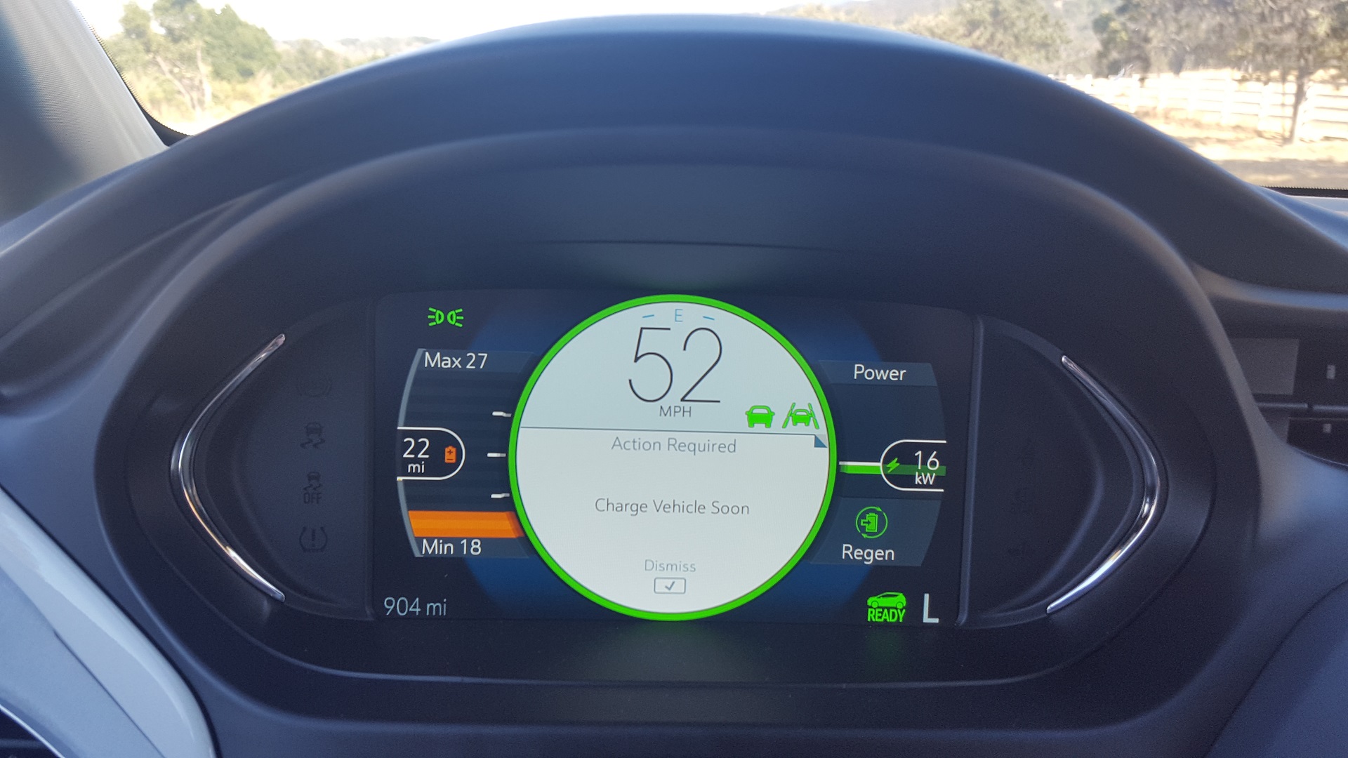
One user mentioned that they probably don’t want everyone driving around sharping at the screens for neat indicators that have no huge bearing on actual performance.It's mind boggling that they go out of their way to create confusion with their user unfriendly, unintuitive display.
Fifteen years ago, my hybrid had a graphic of an engine, battery, and wheels, with a big arrow between them that changed direction based on battery usage, or regeneration. Within 2 seconds anyone can understand what it represented
A thin line with a barely noticeable bold area doesn't tell the user anything.
What's wrong with making things easy to see and understand?
Additionally, I agree that the notiong of “wow, it is charging the battery from the wheels now!” has lost a lot of its excitement over the last decade. Most people who buy any HEV, PHEV, or BEV know that is how they work, so Tesla probably realized they don’t need to shove the idea in your face to prove that.
Finally, the numbers (or bright colors and arrow thicknesses, etc) indeed have no significant bearing on actual everyday-driving performance. In fact, seeing bigger and brighter indicators technically means more aggressive energy usage, which one would want to avoid if trying to maximize efficiency. In any case, accelerating a little faster than average or braking a little later than average won’t affect range as much as long as you are still one-pedal driving.