Personally, if you get a positive result, keep doing what you're doing. See if the positive change continues. I would think it's impossible to discern what reaction goes with what action, if you change your pattern constantly. Make a change, and then give it a little time to see the result.This is a tiny blip, but charging to 70% last night gave a little blip up on the battery report. Will keep reporting back. We have a larger trip tomorrow so I'm not sure if I'm going to charge to 95% or 100%. Kind of undecided at this point. I'm thinking I may be under 10% tonight so I may go all the way to 100% tonight to see what happens. Here is the current chart after the 70% last night. Could be the start of something, could just be nothing since there are natural ups/downs all over the chart. Will see what happens over time.
View attachment 479569


Welcome to Tesla Motors Club
Discuss Tesla's Model S, Model 3, Model X, Model Y, Cybertruck, Roadster and More.
Register
Install the app
How to install the app on iOS
You can install our site as a web app on your iOS device by utilizing the Add to Home Screen feature in Safari. Please see this thread for more details on this.
Note: This feature may not be available in some browsers.
-
Want to remove ads? Register an account and login to see fewer ads, and become a Supporting Member to remove almost all ads.
You are using an out of date browser. It may not display this or other websites correctly.
You should upgrade or use an alternative browser.
You should upgrade or use an alternative browser.
Battery degradation - 2019.32.2.2
- Thread starter cherrybomb
- Start date

I presume it's the trend that they worry about, AND the fact that people paid extra for the larger battery, right? So, they feel more entitled. If my ICE lost mileage, no one cares, because there's only one option of gas tank. With the Model 3, lots of us chose the LR battery, or the MR battery or the SR+ battery, so any drop in the battery capacity feels like a direct loss of that money we spent for that extra battery capacity.I guess I dont get all the "angst" over what amounts to about 10 miles.. that people absolutely are NOT using on a daily basis. Its not like anyone with this issue is driving the total miles the car will go in any given day. They are looking at a number on the screen, and stressing out because its 10 miles lower than "it used to be".
its about the equivalent of getting 1/2 "Mile per gallon" less in a person's gas car, but I would virtually guarantee that none of you tracked your gas car down to the last 1/2 mile per gallon.
My car religiously charged to 279 at 90% (I even posted about how I must have a unicorn car) as I had 15k and it was charging to 279 at 90%. About 2 weeks after I posted that, it dropped from 279 to 270, then back up to 272 where it sits now on a 90% charge. I drive 80-100 miles a day, so am no where near "272" driven miles.
I guess I just dont get the stress, because we all didnt track our gas cars to the 1/2 MPG. The car IS going to lose some top in range over time, its how batteries work. Why is everyone concerned if their number is 5-10 miles off from what "it used to be", especially when it appears to be related to an update?
(honest question on why the stress, not trying to start a flame war, or generate angry posts)
Sherlo
Member
I guess I dont get all the "angst" over what amounts to about 10 miles.. that people absolutely are NOT using on a daily basis. Its not like anyone with this issue is driving the total miles the car will go in any given day. They are looking at a number on the screen, and stressing out because its 10 miles lower than "it used to be".
its about the equivalent of getting 1/2 "Mile per gallon" less in a person's gas car, but I would virtually guarantee that none of you tracked your gas car down to the last 1/2 mile per gallon.
My car religiously charged to 279 at 90% (I even posted about how I must have a unicorn car) as I had 15k and it was charging to 279 at 90%. About 2 weeks after I posted that, it dropped from 279 to 270, then back up to 272 where it sits now on a 90% charge. I drive 80-100 miles a day, so am no where near "272" driven miles.
I guess I just dont get the stress, because we all didnt track our gas cars to the 1/2 MPG. The car IS going to lose some top in range over time, its how batteries work. Why is everyone concerned if their number is 5-10 miles off from what "it used to be", especially when it appears to be related to an update?
(honest question on why the stress, not trying to start a flame war, or generate angry posts)
Agree with your logic. But to be fair, Allistah has seen a rather steep decline of 22 rated range. I’m sure you would agree that’s worthy of reaching out for advice and to discuss with others. Seems reasonable and not necessarily “angst”.
Allistah
Member
Yeah, I know it is what it is. I'm really just trying to learn more about it - it's actually a bit of fun for me. But at the same time, if I find out there is a real issue, I'll have an appt set up right away. As others have stated, we did buy a LR car, and if the added range the LR provides vaporizes in the first five months, well - that's a problem. In the meantime, here is the data on every charge I've done on our car so far. I've noted a couple of interesting points in yellow. Seems like it was fine until I started charging it to a lower state at 70%. Take a look at the data.. What do you guys see? It really seems like that's what triggered it.. Link below in red goes to a Google Docs sheet with all my charge history.
Tesla Battery Info
Tesla Battery Info
rad1027
Member
I see what you mention that you were fine until you started charging at 70%; however, Id like to point out that on 08/09/2019 you charged to 71 % and you got 219.21 miles. Technically you should've gotten 220.1 miles. After that point you can see a small downward trend that becomes more apparent on 8-17-2019. Interesting enough you were on the same software that entire time versus me for instance, once I downloaded I believe 2019.32.2- ish, that is when I noticed the loss in mileage. I had always charged to 90% until recently when I started playing with the charge percentages.Yeah, I know it is what it is. I'm really just trying to learn more about it - it's actually a bit of fun for me. But at the same time, if I find out there is a real issue, I'll have an appt set up right away. As others have stated, we did buy a LR car, and if the added range the LR provides vaporizes in the first five months, well - that's a problem. In the meantime, here is the data on every charge I've done on our car so far. I've noted a couple of interesting points in yellow. Seems like it was fine until I started charging it to a lower state at 70%. Take a look at the data.. What do you guys see? It really seems like that's what triggered it.. Link below in red goes to a Google Docs sheet with all my charge history.
Tesla Battery Info
This thread makes me feel a little better to know I'm not alone. My rated full range went from 317 down to 304 in a single charge, and it's been sitting at 304 for about a week now. I think everybody's biggest concern is wondering if this means something went wrong with our batteries overnight. It's one thing to see a gradual estimated range decline, but when it's like 10-15 miles all of a sudden, it makes you think something went wrong with some of the cells in the battery pack or something.
But because it's hit so many of us, I think it's pretty clear there's something else going on
But because it's hit so many of us, I think it's pretty clear there's something else going on
hugh_jassol
Member
So for those that did this where it finally "corrected" at 70% charge. If you then charge to 90% is the range display correct there too?
I presume it's the trend that they worry about, AND the fact that people paid extra for the larger battery, right? So, they feel more entitled. If my ICE lost mileage, no one cares, because there's only one option of gas tank. With the Model 3, lots of us chose the LR battery, or the MR battery or the SR+ battery, so any drop in the battery capacity feels like a direct loss of that money we spent for that extra battery capacity.
I think that's key difference between EV and ICE. With ICE, there are no instances I can think of where cost differ across model trims because of range. You typically pay different prices because of interior/exterior features and performance related items. In just about every EV models out there, range difference is usually part of the reason for delta between model trims. As such, it's more of an issue when we see a rather fast deterioration in range over time. In my own case, I would have saved the money I spent on MR and got a SR or SR+ if I knew my 100% charge would only get to 240-ish miles I get now. I do still think it's a BMS calibration issue rather than a true battery degradation issue though...
Sherlo
Member
So for those that did this where it finally "corrected" at 70% charge. If you then charge to 90% is the range display correct there too?
Yes, it did correct back up 278 at 90% in my case.
Allistah
Member
Yes, it did correct back up 278 at 90% in my case.
That’s great. Just wish we knew what the secret is to what triggered that to happen. So elusive...
Allistah
Member
Saw this in another post on the Tesla company forums. Interesting...
“I have been experiencing range gain. I started with TeslaFi about 2 months after purchase about 3k on the car till now a year with 19k on the car. Beginning 100% was 304, along the way sometimes changing with FW have have been as low as 296, till today I am at 306. I have discovered that charging to 100% with DC does a better balance to true 100% then AC charges. I think the DC does better since it is more efficient like 100% no loss. Oh AWD LR BTW. I have done both down to 5% and 10% and found that 10% back to 100% provides more range then the full charges from 5%. I think this is because once the battery is below 10% more heat is generated on the initial slower charge back up. Further I have found that constant charges to 90% and not 70%-85% help hold the 100% range to a higher number. So not sure what the future will bring for my car 100% currently at 19k I have the highest recorded 100% range since the car was new. Really the only time I ever saw 310 or 279 @ 90% was when the car was new it almost immediately dropped to 270 @ 90% after a few charges.”
“I have been experiencing range gain. I started with TeslaFi about 2 months after purchase about 3k on the car till now a year with 19k on the car. Beginning 100% was 304, along the way sometimes changing with FW have have been as low as 296, till today I am at 306. I have discovered that charging to 100% with DC does a better balance to true 100% then AC charges. I think the DC does better since it is more efficient like 100% no loss. Oh AWD LR BTW. I have done both down to 5% and 10% and found that 10% back to 100% provides more range then the full charges from 5%. I think this is because once the battery is below 10% more heat is generated on the initial slower charge back up. Further I have found that constant charges to 90% and not 70%-85% help hold the 100% range to a higher number. So not sure what the future will bring for my car 100% currently at 19k I have the highest recorded 100% range since the car was new. Really the only time I ever saw 310 or 279 @ 90% was when the car was new it almost immediately dropped to 270 @ 90% after a few charges.”
Last edited:
I know that it doesn't affect me on a daily basis, but it is concerning for a couple of reasons: (i) I want to know what is causing it so I know if there is a problem with the car or not, (ii) there will be times when I expect to drive much longer distances where the actual range will matter to me, and (iii) I want to make sure I know how my car works under different conditions so I don't get caught somewhere where I unexpectedly run into a range issue and face the prospect of a "flatbed of shame" moment.
The "rated range" number will not help you avoid any range issue you might imagine. You want the energy graph for that. The rated range number does not go down in 1 mile increments so is basically useless in actually estimating how much actual range you can drive. It decreases by number of energy stored. The car doesnt store "miles" it stores energy, and lots of things effect how much energy you use to move a mile. HVAC settings, terrain, wind, speed, etc.
The car wont let you get stranded if you listen to it (by checking the energy graph, not the rated range number).
Learning how the car works is great, I totally agree with that. Thats not what most of the posts on this topic are though (not singling anyone out). Most of them are talking about the fact that the rated range number is somewhere between 3 and 15 miles less than "it used to be", and worrying that somehow this extrapolates out to battery loss that is bad, but not bad enough for tesla to replace the battery.
hugh_jassol
Member
I think all of this is only affecting the the displayed ranged.... it doesn't actually change the amount of range you have. It's just helping the car do a better job of estimating how much charge is in the pack.
Allistah
Member
Ok, I have some interesting info. I won't be spending any more time on this. I'm going to be setting our car to 90% going forward and leaving it there unless I need the extra for a trip, like tomorrow morning so I have it set to 100%. I ran our car down to about 2%. All the while I watched the "Range" max number in the Stats app (circled below in the screenshots). When the car had much more charge in it - up around 30-70%, that max number in the Stats app for Range fluctuated a bit. It would top out at 292 and then change to 288. What I noticed was that the lower the battery got, the wider that "max" range got. When I got down to 3% on the battery, fluctuations in the Stats Max Range number got huge! At the max right when I was down to about 2-3% left in the battery, it fluctuated from about 250 max to 350 max - all within a minute of each other. Here are some screenshots from my phone showing the weirdness.
I think I'm convinced that this truly is a bug within the cars software. So, I'm just going to move on and leave it at 90% for my day to day number. I couldn't believe the car was reporting that my max range was 350 miles (far right screenshot).. haha Wouldn't that be cool if it was true? lol. I know it's not, but it just further strengthens my theory and that of others, that this really is just a big bug.

I think I'm convinced that this truly is a bug within the cars software. So, I'm just going to move on and leave it at 90% for my day to day number. I couldn't believe the car was reporting that my max range was 350 miles (far right screenshot).. haha Wouldn't that be cool if it was true? lol. I know it's not, but it just further strengthens my theory and that of others, that this really is just a big bug.
Last edited:
It's the rounding error. Really.Ok, I have some interesting info. I won't be spending any more time on this. I'm going to be setting our car to 90% going forward and leaving it there unless I need the extra for a trip, like tomorrow morning so I have it set to 100%. I ran our car down to about 2%. All the while I watched the "Range" max number in the Stats app. When the car had a charge in it up around 30-70%, that max number for Range fluctuated a bit. It would top out at 292 and then change to 288. What I noticed was that the lower the battery got, the wider that "max" range got. When I got down to 3% on the battery, the max range width in its fluctuations got huge! At the max, it fluctuated from about 250 max to 350 max - all within a couple minutes of each other. Here are some screenshots from my phone showing the weirdness.
I think I'm convinced that this truly is a bug within the cars software. So, I'm just going to move on and leave it at 90% for my day to day number. I couldn't believe the car was reporting that my max range was 350 miles (far right screenshot).. haha Wouldn't that be cool?!
View attachment 479854
First image, 7 miles rated range, which is what the car display will also show, divide by SOC %, of 3%, gives you 233.33miles.
Second image, 10 miles rated range, divide by 3%, gives you 333.33miles.
Third image, 7 miles rated range, divide by 2%, gives you the 350 miles.
You're at the extreme end of the scale, the rounding errors are huge. It's why some people like to use km, rather than miles, as it's a fraction more precise.
This rounding error, is why I've, in the past, answered some people with slightly lower rated range and told them it's just a rounding error. I'm sure they all thought I was being flippant, but the rated range you can see will fluctuate as you drive. You can watch it, as the miles tick over and the SOC%age drops, the Rated Range calculation which is simple division, fluctuates. over a 6 mile range, typically, at normal SOC levels.
Allistah
Member
But what's interesting is that the max number would change up/down/up/down within a minute of each other. Ah ok, the rounding of the numbers makes sense when I do the math myself. I'm tired, been about a 16 hour day for me. I still think there's some sort of bug in their system. Going to set it to 90% and get on with it. But don't think I still won't be watching my battery report on TeslaFi and seeing if I can see some sort of thing/pattern that will help it out. lol. It really drives the OCD in me crazy. haha
Last edited:
H
hcdavis3
Guest
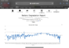
Morning Allistah. I’ve been charging to 70 % the last few months. I charged to 90% last night. Take a look at the attached and let me know what you think. My battery report looks like a seismograph, but the flat line of charges in the middle of the chart were during spring and summer.Saw this in another post on the Tesla company forums. Interesting...
“I have been experiencing range gain. I started with TeslaFi about 2 months after purchase about 3k on the car till now a year with 19k on the car. Beginning 100% was 304, along the way sometimes changing with FW have have been as low as 296, till today I am at 306. I have discovered that charging to 100% with DC does a better balance to true 100% then AC charges. I think the DC does better since it is more efficient like 100% no loss. Oh AWD LR BTW. I have done both down to 5% and 10% and found that 10% back to 100% provides more range then the full charges from 5%. I think this is because once the battery is below 10% more heat is generated on the initial slower charge back up. Further I have found that constant charges to 90% and not 70%-85% help hold the 100% range to a higher number. So not sure what the future will bring for my car 100% currently at 19k I have the highest recorded 100% range since the car was new. Really the only time I ever saw 310 or 279 @ 90% was when the car was new it almost immediately dropped to 270 @ 90% after a few charges.”
Attachments
Allistah
Member
Morning Allistah. I’ve been charging to 70 % the last few months. I charged to 90% last night. Take a look at the attached and let me know what you think. My battery report looks like a seismograph, but the flat line of charges in the middle of the chart were during spring and summer.
Interesting that you've maintained it so well like that. I've begun to give up on it.. What makes this really difficult is that you can't just try stuff. "Trying something" in this regard takes 2-3 weeks to really know if what you did changed anything which makes it nearly impossible for some and just leads to high levels of frustration. I can usually get things figured out given enough work on it but this one has me completely lost. I see that it happens for people and there doesn't seem to be any patterns to any of it - between what works for one person to another. I almost feel like this is the shampoo prank with the person trying to rinse the shampoo out of their hair but can't because someone is secretly putting more on their hair from above. haha (look it up on YouTube if you haven't seen it, funny for a minute or two..)
H
hcdavis3
Guest
I don’t know if I’ve maintained it to well. Just my charging habits.Interesting that you've maintained it so well like that. I've begun to give up on it.. What makes this really difficult is that you can't just try stuff. "Trying something" in this regard takes 2-3 weeks to really know if what you did changed anything which makes it nearly impossible for some and just leads to high levels of frustration. I can usually get things figured out given enough work on it but this one has me completely lost. I see that it happens for people and there doesn't seem to be any patterns to any of it - between what works for one person to another. I almost feel like this is the shampoo prank with the person trying to rinse the shampoo out of their hair but can't because someone is secretly putting more on their hair from above. haha (look it up on YouTube if you haven't seen it, funny for a minute or two..)
Don't let the short Y-axis fool you. Your Rated Range has varied no more than 7 miles, 320 to 327. It's barely more than a rounding error. If you set the Y-axis base to Zero, it'll look like a straight line!Morning Allistah. I’ve been charging to 70 % the last few months. I charged to 90% last night. Take a look at the attached and let me know what you think. My battery report looks like a seismograph, but the flat line of charges in the middle of the chart were during spring and summer.
Your last Rated Range figure is 324.5 miles, literally perfect.
Interestingly, my chart has a very similar shape. Alot of squiggles in Winter to Spring, then nice and flattish during the warm months, and then the beginning of squiggles again now that it's turned colder.
I put your chart on top of mine, and tried to normalize the scale a little bit. I put a red line in at 325 on yours and 310 on mine. Notice how similar the shapes are, and how the volatility of the squiggles increase as the weather gets colder.
In my opinion, it may be related to how the data is pulled from the API. When I typically get an outlier Rated Range figure, it's a colder night with more drain. The 3rd party app, in this case Stats, will show a higher SOC figure than the car or the Tesla app. If I use the car's SOC %age, and divide into the Range number, I'll get 308 to 312. The 3rd party app reads low on colder nights, presumably due to some drain, which shows up as a lower SOC in the car, but not in the 3rd-party app.
Here's a screenshot to illustrate:
You can see at the top the data from the Tesla app, 59% SOC. From Stats, I'm showing 60%. And the same from EV Watch. 3rd party apps, always lag behind the Tesla app and what the car will display.
If you take the Rated Range figure 184m, and divide by the 60% SOC, I get 306 miles, and that's what shows up in my graph, 306. But if I divide 184m by the correct 59% SOC that Tesla shows, then I get 311 miles.
Similar threads
- Replies
- 7
- Views
- 288
- Replies
- 11
- Views
- 626
- Replies
- 16
- Views
- 3K
- Replies
- 43
- Views
- 3K
- Question
- Replies
- 35
- Views
- 1K