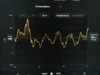
Please help me understand the left-most y-axis scale of the center console Consumption graph. It goes from -300 to +900 Wh/mi but does not scale when the interval changes. Lets say there is a consumption peak at the left hand side of a 30 mile window but during the most recent 25 miles the line bounces around 300Wh/mi. When the period is changed to the last 5 miles the graph seems to expand to fill the vertical space but the y-axis units remain unchanged and what was a 300Wh/mi peak is now over 900.
V17.11.0
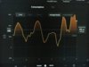
How do people actually make use if this graph, other than by watching the actual consumption try but fail to coincide with the rated or ideal range line?
V17.11.0
How do people actually make use if this graph, other than by watching the actual consumption try but fail to coincide with the rated or ideal range line?