Welcome to Tesla Motors Club
Discuss Tesla's Model S, Model 3, Model X, Model Y, Cybertruck, Roadster and More.
Register

Tesla app version 4.0.0 has app re design for both car and energy

This site may earn commission on affiliate links.
Tesla app v4.0.0 has been released, and one of the changes is there is no backup only mode anymore. I had my PW on backup only and now in new app version it shows it as self powered with 100% reserve. So my guess is that the new Powerwall gateway version removed backup only mode and now this new SOC is based on self powered implementation at 100% reserve.
 
Last edited:
It's quite a big interface/graphical update. I like the old simpler power distribution animation better.

IMG_3CC461C50C41-1.jpeg
 
Figured I would post this here for those who dont follow other parts of TMC.

I just got a new version (iOS) of the tesla app today, version 4.0.0-644. It has a pretty major re design for both vehicles and energy. Here are the app notes I captured:

IMG_0910.jpg


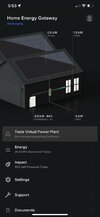
Related to tesla energy specifically, the app no longer has the power circles. For me, it looks like this:


Screenshot 2021-08-25 at 6.07.18 PM.jpg


I dont have a solar roof, I have panels. You can see the solar + home + powerwall + grid on there, but frankly, while "prettier" its less easy to see a snapshot of what is going on, for me. I will get used to it for sure.

The car screens got updated / changed as well, but I wont post those here (because this is tesla energy subforum lol)
 
Looking through this now, the BACKUP ONLY selection is gone. It seems you can only set time based control, or self powered. You can still change your reserve, so I guess you would want to set your reserve to 100%..

Clicking the "learn more" in there takes you to a page about modes, and "backup only" is conspicuously absent from any description in there.

I also can not see the daily information in a manner I want to any longer either. We dont seem to get the full picture of all 4 modes (solar, powerwall, home, grid) overlaid together like we did before.

You can get each separately, and you can click a little graph icon but that does not show the information in a manner I am used to looking at it.

I am trying very hard to not have "change rejection" here, but I am not currently happy with how this looks.
 
Tesla has info on the powerwall on their website which I have not seen before. One thing specifically in there is the "preconditioning mode" for powerwall+ which basically says after install but pre PTO, the system will only "generate energy for home usage and not backfeed to the grid"


Self-Consumption Only​


For Tesla solar systems with at least one Powerwall+:
After your system is installed, it is intelligently configured to Self-Consumption Only mode, producing only enough energy required to power your home and charge your Powerwall. In this mode, no energy flows to the grid until your utility grants your system Permission to Operate (PTO). After receiving PTO, your system is automatically configured to begin full production and allows energy to flow to the grid.
Back to Top


Link to these new powerwall mobile app screens etc:


the app is "prettier" but MUCH less useful information at a glance, to me. It feels to me like they have made it much harder for me to see granular data in the app such as how much energy I am using at a specific time in the day, etc. I am pretty unhappy with this, actually. As unhappy as I have been about any tesla software change. Hopefully I get used to it, but i really dont like this.
 
Last edited:
Have the same opinion on the energy graphs. More information and data, but harder to interpret overall. can’t see everything overlaid in 1 view.

I do like that SOC of the powerwalls is now shown over time, I always wondered why that wasn’t included.
 
I put the new version up on my iPad, and am comparing that to my iPhone running the 3.x app. Weirdly I like it, and I usually hate changes. Quick observations on the Powerwall screens:

The default Powerwall screen has a lot more information (like all of the power meters in addition to the charge level). In the animated power graphic on that screen, they swapped the position of the Powerwall and Grid.

The energy graph expresses the breakdown of where energy goes and comes from in kWh instead of % now, which I think is more useful.

I do like being able to see the Powerwall's charge level during the course of the day. I understand that you can't get all four of the meters overlaid at once...personally I always found that confusing so I never did it. But I get where losing it would be disconcerting.

The Impact screen gives you more information about usage during different TOU period.

In general it feels like it takes fewer taps to navigate around the app.

I presume that "Time-Based Control" now maps to "Cost Savings" in the old app? I wonder what happens if you were on "Balanced" before? Thank goodness they got rid of the gratuitous Storm Watch animation in the settings. They went from up/down buttons for e.g. reserve settings to a slider.

On the backup history: The old and new app are actually showing different data! The new app is showing several outages of "a few seconds" that the old app did not. The new app shows the starting and ending times, where the old app did not. The new app seems to show less history. This is weird.

Bruce.
 
How do you set power company and rate plan? I don’t see option in app.

It might depend on what power company you have / area. For me its:

Tesla App --- Energy Screens -- IMPACT

At the bottom of the IMPACT screen, it says "estimate based on" and you can tap that and pick a few different Utilities. The Utilities all appear to be CA based (SDGE / PGE / SCE / Sonoma Clean Power /Marin Clean Energy / Peninsula Clean Energy / Silicon Valley Clean Energy)

I suspect if you are not in those areas you likely wont see it.
 
I also can not see the daily information in a manner I want to any longer either. We dont seem to get the full picture of all 4 modes (solar, powerwall, home, grid) overlaid together like we did before.
I noticed this too. Where's my full day data so I can see what and how much went where with a glance? The data is a bit hard to read being gray on black. Obviously created by someone in their 20's!

Backup Only and TOU cost/balanced is now gone.
 
I put the new version up on my iPad, and am comparing that to my iPhone running the 3.x app. Weirdly I like it, and I usually hate changes. Quick observations on the Powerwall screens:

The default Powerwall screen has a lot more information (like all of the power meters in addition to the charge level). In the animated power graphic on that screen, they swapped the position of the Powerwall and Grid.

The energy graph expresses the breakdown of where energy goes and comes from in kWh instead of % now, which I think is more useful.

I do like being able to see the Powerwall's charge level during the course of the day. I understand that you can't get all four of the meters overlaid at once...personally I always found that confusing so I never did it. But I get where losing it would be disconcerting.

The Impact screen gives you more information about usage during different TOU period.

In general it feels like it takes fewer taps to navigate around the app.

I presume that "Time-Based Control" now maps to "Cost Savings" in the old app? I wonder what happens if you were on "Balanced" before? Thank goodness they got rid of the gratuitous Storm Watch animation in the settings. They went from up/down buttons for e.g. reserve settings to a slider.

On the backup history: The old and new app are actually showing different data! The new app is showing several outages of "a few seconds" that the old app did not. The new app shows the starting and ending times, where the old app did not. The new app seems to show less history. This is weird.

Bruce.

Really (really) appreciate the breakdown, @bmah . I am suffering through real change rejection here, and I normally dont mind changes much. I always used the 4 panel overlay, and I got used to how that was presented etc.

Im someone who still enjoys "micromanaging" my powerwalls on a daily basis, for me it doesnt get old. Glancing at the app, seeing at a glance solar generated, powerwall SOC, etc and saying " oh, I better bump up my reserve some because the solar generation is lower than I need it to be to fill the powerwalls..." tap.... is something I have been doing almost daily since Jan of 2020.

Especially as we transitioned to "WFH covid" and I was not moving around as much at the office but now was working from home in my office, looking at the power flow etc provided me a strange sense of "comfort" and connection with my home.

its still there, and its change, and I will get used to it, but right now i am definitely in "rejection" mode, so its helpful to have someone else give their impressions of it to help me get over this rejection.