Welcome to Tesla Motors Club
Discuss Tesla's Model S, Model 3, Model X, Model Y, Cybertruck, Roadster and More.
Register

Triple App Screen on v9!

This site may earn commission on affiliate links.
I really, really disagree with your last sentence there. It's fine to cite evidence in support of your point, but it's not fine to attack people by calling them entitled or lazy or liars, dismissing their concerns as invalid because you don't happen to care. I realize this sort of discourse is now practiced everywhere, but it needs some correction because it's really not OK..

Meh, I still think he is wrong. All the points I made are accurate. His vitriolic and hateful response unfortunately reflects poorly on the quality of his character.
 
The current UI trend is to be minimal. Often that also means functionality is not user-discoverable, which is unfortunate. Buttons that don't look like buttons but might do something if you pull on them in one particular direction are particularly bad. Only yesterday, after reading someone's post about the feature, did I discover you could swipe the Navigate box to the right and it would auto-select your work or home address. That just seemed like a box you would tap to initiate navigation, but hidden functionality lurked unnoticed. o_O

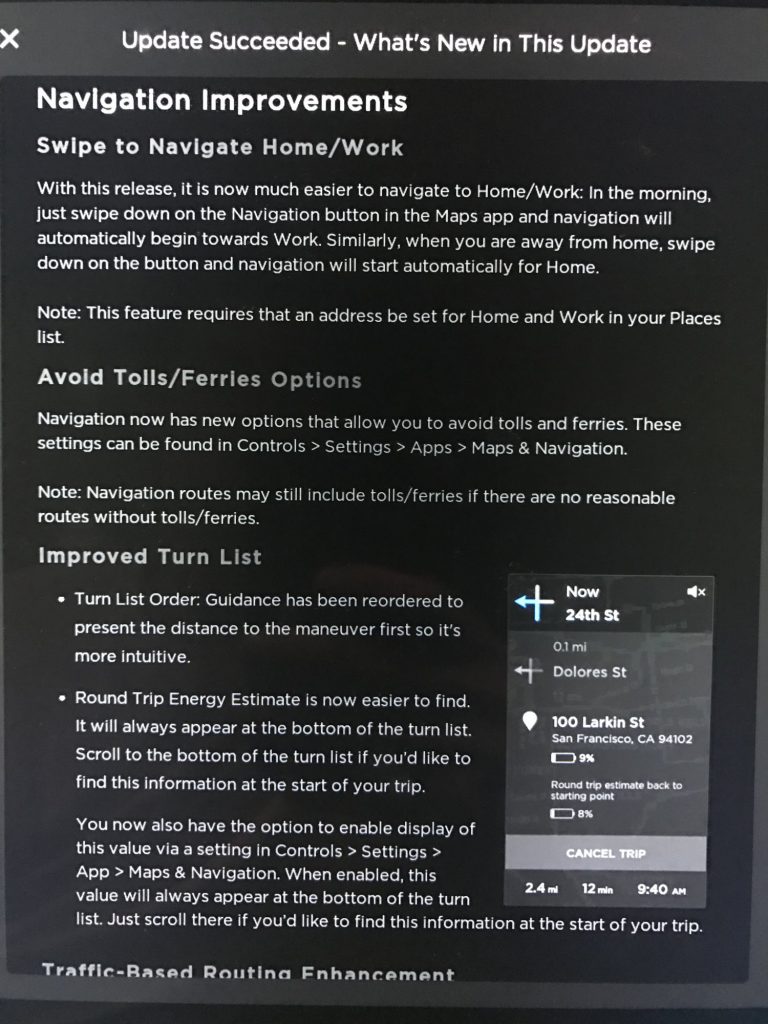
This feature was first enabled in v8.0 and specified in Tesla's release notes. You can also swipe down.

Tesla-Version-8-release-notes-10-768x1024.jpg
 
I really, really disagree with your last sentence there. It's fine to cite evidence in support of your point, but it's not fine to attack people by calling them entitled or lazy or liars, dismissing their concerns as invalid because you don't happen to care. I realize this sort of discourse is now practiced everywhere, but it needs some correction because it's really not OK.

It is absolutely true that it took 1 tap to toggle climate on/off prior to v9, and it now takes 2 taps to use the interface in the obvious way. There is also a new hidden "press and hold" gesture which is not intuitive or discoverable without being told about it or watching videos.

It is also true that switching to an app directly was previously possible if you didn't have Nav on top. Now that choice has been removed, so you do have to go through the popup app launcher now to display something other than Music and Nav.

Many UI control elements are becoming both tappable and swipable, and sometimes long-pressable (or what Apple calls "force touch"), but the behavior is not always obvious or consistent. That's fine for interacting with a smartphone or tablet where it can capture your full attention, but in a moving car, it would seem critical to reduce the complexity of interaction modes, not add more.

You make some valid points, but I would like to be clear. I did not call that person a liar, there was no name-calling. My point is — it's one thing to ask the forums how to do something new and it's another thing to project your own ignorance out into the internet slated as a fact. That's how bad ideas and fake news snowball. Lie-spreading needs to be cut off at the root. The way I found out about the tap and hold gesture was from Tesla's V9 notes, not anywhere else. Our cars are full of little easter eggs, tips and tricks. I agree with your point that things are not immediately intuitive, but that's a detriment of modern UI design in general, not necessarily Tesla. In fact, BMW has several hidden features like this even with their hardware buttons. For example, swiping your finger over the 1-6 radio preset buttons commits a different action, but nowhere does it label that those buttons are capacitive.

You, too, completely disregarded my second point and also stated something inaccurate. Swiping up on the launcher opens your last-used app, which means that in fact, Media, Nav, AND any one app of your choice (last-used app) are all one tap/swipe away. You do not need two taps to get to them anymore, and furthermore, the "launcher" is always visible, and not hidden beneath the top-nav maps like it used to be, further enhancing usability and discoverability.
 
Just found yet another way Tesla is forcing its nav+media player layout on people. Had the web browser open for Waze, using navigation. I hit the little gear icon next to turn by turn the directions so I could enable routing through HOV lanes, after exiting the nav options, freaking media player on screen again instead of the browser. :mad:
"Have you seen our Media Player? Check out our Media Player! Ohh!... You touched the screen... You must want our Media Player!! Have your friends seen our Media Player?! Just in case, look!... It's our Media Player!! You're starting to look frustrated... Maybe a nice song would help, from our Media Player!!" :confused:
 
The constant media player switching would be less infuriating if they had fixed it at least a little bit. The map does have some new things, I could see them being so excited over updating it that they made it mandatory - I don't agree wth them but I can understand their excitement. But the media player? That's as broken as it's ever been, why force it onto everyone? That just creates more dissatisfaction with v9.
 
You make some valid points, but I would like to be clear. I did not call that person a liar, there was no name-calling. My point is — it's one thing to ask the forums how to do something new and it's another thing to project your own ignorance out into the internet slated as a fact. That's how bad ideas and fake news snowball. Lie-spreading needs to be cut off at the root. The way I found out about the tap and hold gesture was from Tesla's V9 notes, not anywhere else. Our cars are full of little easter eggs, tips and tricks. I agree with your point that things are not immediately intuitive, but that's a detriment of modern UI design in general, not necessarily Tesla. In fact, BMW has several hidden features like this even with their hardware buttons. For example, swiping your finger over the 1-6 radio preset buttons commits a different action, but nowhere does it label that those buttons are capacitive.

You, too, completely disregarded my second point and also stated something inaccurate. Swiping up on the launcher opens your last-used app, which means that in fact, Media, Nav, AND any one app of your choice (last-used app) are all one tap/swipe away. You do not need two taps to get to them anymore, and furthermore, the "launcher" is always visible, and not hidden beneath the top-nav maps like it used to be, further enhancing usability and discoverability.
Thanks for the explanation. I appreciate the tone of your post.

It sounds like we are in agreement that many UI elements are not immediately intuitive, and it's a detriment of modern UI design in general. It's especially unfortunate when a car has UI that isn't obvious, because it requires more of your attention to use.

As to your second point, it feels like you are trying to conflate taps and swipes here. A tap is the "obvious" gesture; i.e. one that you do not need to read the manual to figure out. And even if you have learned that you can swipe up on the launcher icon, it only opens your last-used app. Assuming the app you want is not the last app used, it will still require two taps to open. Jumping on someone for pointing that out and calling it "lie-spreading" seems a bit extreme.

I also agree with you that the app launcher is more discoverable since it's not hidden beneath the Nav app anymore (and you don't have to wait an extra second for the map-shrinking animation.) That's definitely a good thing.
 
  • Like
Reactions: ironwaffle
Let's summarize and make life easy:

A quick swipe up on the app icon restores the last app if you drag past the menu bar.

And here is the easiest way to have all three "windows" on the screen:

While viewing only the app, use one hand at the menu bar with two fingers on the music and app icons, then drag both fingers all the way up to the navigation map.
We evidently have differing definitions of "easy". :(
 
I totally disagree..

Toggling climate on/off took 1 tap, now turning off takes two
Putting camera up use to take 1 tap, now takes two or a swipe (yeah that doesn't feel awkward)\
Switching to any app only took one tap, now you need to fumble through a pop up menu.

This UI is much more busy in terms of usage

This update diminishes safety, as it requires more user interaction than prior version, as mentioned above. Plus, turning on headlights requires three touches, not two as before. Please fix this.
 
I don't understand the issue with the loss of the review mirror displaying on the console. Having just traveled over 1,500 miles, using V9, I found the drivers console to be much more informative removing the need for a constant review mirror to be displayed. I can now see cars coming up behind me and in my blind spot. Much more useful than looking at the center console.

I rarely used navigation, but I understand Tesla's (Elon's) ambition is for a self-driving car. The navigation system and the car interacting is critical to achieving self driving. So, it was no surprise to me to see navigation being displayed at all times.
 
Clearly this arrangement was an oversight/bug, I suspect it will be 'fixed' in a quick turn release. I don't think the UI designer had this layout in mind when designing the interface. I wish they would return to the 2-panel/2-App interface, there was nothing wrong with it and this current implementation makes it overall less configurable.
Feeling the exact same way!
 
  • Like
Reactions: Dr_E
I don't understand the issue with the loss of the review mirror displaying on the console. Having just traveled over 1,500 miles, using V9, I found the drivers console to be much more informative removing the need for a constant review mirror to be displayed. I can now see cars coming up behind me and in my blind spot. Much more useful than looking at the center console.
You must not have an AP1 car, otherwise you might understand the issue. Note that not everyone gets the new blindspot detection
 
  • Like
  • Love
Reactions: JohnnyG and Reekdog
-- fixing something that isn't broken...making it less user friendly and losing functionality...

Couldn't agree more. Flabbergasted by this v9 release.Such a major UI overhaul. Why? Occasional updates and feature "enhancements" are OK. This crosses the line though (IMHO).

I thought the previous UI was slick looking and functional. I don't feel the same about V9. The bolded fonts, for example (weird). Or the new kludgy climate controls. Or the inaccessibility of the phone..

Is this what the Model-3 looks like? Perhaps they are trying to standardize on that look/feel/UI to cut costs?

Disappointed.