Welcome to Tesla Motors Club
Discuss Tesla's Model S, Model 3, Model X, Model Y, Cybertruck, Roadster and More.
Register

EU Market Data Visualization: student project, feedback welcome !

This site may earn commission on affiliate links.
Greetings,

I'm studying a NanoDegree in Data Analytics at Udacity (online platform).
Data Analyst Nanodegree | Udacity

One of the modules is Data Visualization and I chose the EU Sales Figures of Tesla Motors for the project, focusing on the top 12 countries.

Here's a screenshot.
Tesla_motors_dataviz.JPG


Please find below three links to different presentations of the data.

- Alphabetical order
https://bl.ocks.org/EricPerbos/raw/edb8eb38dd62bcbaa6ce91a8af767865/

- Population size, decreasing
https://bl.ocks.org/EricPerbos/raw/0158d4605671577792cbbf3e0d3e341a/

- 2016 Q1->Q3 Sales per 1 million habitants, decreasing
https://bl.ocks.org/EricPerbos/raw/3c11acdcc679694bd6ba6c822dbdc0ef/

Feedback is most welcome !

T.
 
Greetings,

I'm studying a NanoDegree in Data Analytics at Udacity (online platform).
Data Analyst Nanodegree | Udacity

One of the modules is Data Visualization and I chose the EU Sales Figures of Tesla Motors for the project, focusing on the top 12 countries.

Here's a screenshot.
View attachment 202209


Please find below three links to different presentations of the data.

- Alphabetical order
https://bl.ocks.org/EricPerbos/raw/edb8eb38dd62bcbaa6ce91a8af767865/

- Population size, decreasing
https://bl.ocks.org/EricPerbos/raw/0158d4605671577792cbbf3e0d3e341a/

- 2016 Q1->Q3 Sales per 1 million habitants, decreasing
https://bl.ocks.org/EricPerbos/raw/3c11acdcc679694bd6ba6c822dbdc0ef/

Feedback is most welcome !

T.

Nice, looks pretty and is informative at the same time!
 
  • Like
Reactions: Taipan
The use of different diameter circles to signify volume is pretty clear, but I have to wonder if it would've been just as informative if you had used bar charts instead of circles? It might help distinguish between 2 or 3 similiarly sized circles.

I think that the circles are an effective use of real estate given how many countries are listed and the marked differences in sales in each. If one were to compare Norway's sales to Italy, the real estate used on the graph by Norway would push Italy off the page. The circles, in my mind's eye, are essentially looking at the bar graph from above. The bigger the bar, the closer it is to me, and larger and easier to see.

I like how at the end, @Taipan does use the bar chart to show sales per million inhabitants. It provides a nice juxtaposition of the bar graph in relation to the circles.

Overall I found the graphic very informative and useful to show how government incentives and changes affect Tesla sales in Europe (see Denmark).
 
  • Informative
Reactions: Taipan
Thinking about it a bit more, I think the strength of this dot graph is to show much more data points at the same time without losing track of which data point represents a certain country, like you do for regular graphs with that many curves. Then again, if I wanted to compare just a few countries but quantitatively, I would prefer curves. Hard to tell from the dots if a country has 2x or 3x more than another (btw, does the diameter of area of a dot scale with number of cars?). Maybe you could make a hybrid plot - add check boxes or something to the countries and if they are checked, the corresponding data appears in a regular plot at the bottom of the page?
 
This is great feedback, thank you all.
Before I answer in details: I realize that one key-feature of the chart, the mouse-over function on country names that transforms the circles into actual sales figures, isn't obvious at first glance.
I'll add a more direct legend.

The use of different diameter circles to signify volume is pretty clear, but I have to wonder if it would've been just as informative if you had used bar charts instead of circles? It might help distinguish between 2 or 3 similiarly sized circles.

Thank you ! I started with bar charts indeed but I found it too obscure.

From my report:
""Bar/column and line charts are useful to compare sales over time between several regions of similar size.
But if you have more than five regions or the min-max values are disparate (ex: factor 1 to 10), they become overloaded and difficult to read.

In this project, we strongly exceed those limits with 12 countries with min-max values of 2 (Finland Q4-2013) and 2,086 (Norway Q1-2014).

Here's an exemple of column chart which demonstrate the issue.""
2n0k8s2.jpg


I think that the circles are an effective use of real estate given how many countries are listed and the marked differences in sales in each. If one were to compare Norway's sales to Italy, the real estate used on the graph by Norway would push Italy off the page. The circles, in my mind's eye, are essentially looking at the bar graph from above. The bigger the bar, the closer it is to me, and larger and easier to see.

I like how at the end, @Taipan does use the bar chart to show sales per million inhabitants. It provides a nice juxtaposition of the bar graph in relation to the circles.

Overall I found the graphic very informative and useful to show how government incentives and changes affect Tesla sales in Europe (see Denmark).

That's super cool !
I love your explanation of the circles in your mind's eye btw, I'll quote it in my final report if that's OK ;-)

Thinking about it a bit more, I think the strength of this dot graph is to show much more data points at the same time without losing track of which data point represents a certain country, like you do for regular graphs with that many curves. Then again, if I wanted to compare just a few countries but quantitatively, I would prefer curves. Hard to tell from the dots if a country has 2x or 3x more than another (btw, does the diameter of area of a dot scale with number of cars?). Maybe you could make a hybrid plot - add check boxes or something to the countries and if they are checked, the corresponding data appears in a regular plot at the bottom of the page?

Thank you again for letting me use the data you are collecting with the team.

- I will hit the same issue with curves than with bars/columns (cf. example above).
One turn-around would be to split the countries into sub-graphs of similar market sizes but we'd lose the bird's-eye view of Europe as @GoTslaGo mentioned.

- Technically the radius of the circle scales with the square root of the data values, ie. unit sales.
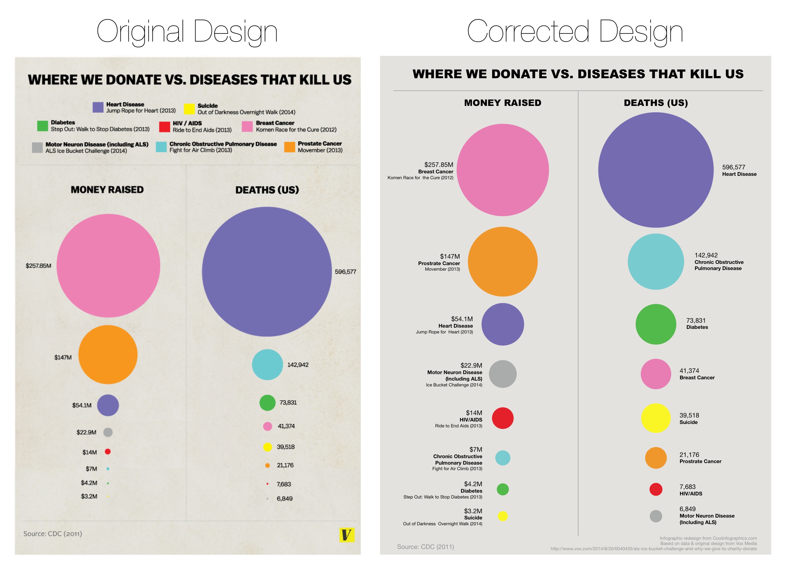
I'll paste a section of my report below.

""(...)although with one potential pitfall due to the formula used to calculate its size or more accurately its area = Pi * r².
For example, a data value of 4 will create a circle with an area 16π.
A data value of 5 will create a circle with an area of 25π.

This was brought to our attention during Udacity Data Visualization class, Lesson 8.23 "How to lie with circles" and the article False Visualizations: When Journalists Get Data Viz Wrong | The Huffington Post

We followed the same principle by using d3.scale.sqrt() to get the square root of data values to determine the radius of each circle.""

The DataViz in question before/after correction is this one.
2014-08-29-Donating.vs.DeathGraph.REVISED.jpg


Thank you all again, that's very helpful.

Cheers,

T.
 
Last edited:
  • Like
Reactions: GoTslaGo
Excellent chart, and I'm glad you did the data visualization for the circles *correctly*. It's very important for sales to be proportional to the area of the circle, not the diameter.

You can see steady growth in most countries; a big jump in the UK in Q4 2015; fairly flat sales in Norway, Belgium, and the Netherlands; and the crash in Denmark resulting from the removal of tax credits.

I think it would be extremely valuable if you did a few other countries too. Being able to look at US, Canada, China, and Australia sales in the same picture for comparison would be very informative.
 
The latest European deliveries of Model S were about 61% of the total deliveries: there were 459 MS and 298 MX delivered in October. It is interesting to note that current estimated delivery shows end of February for MS, while showing March for MX. This might be an indication that not only MX finalized orders reached parity with MS demand in Europe, but might be running ahead, which manifests in longer estimated wait time for delivery.

Another possibility is that there are some issues with parts specific to MX and therefore production mix favors MS, but this would have been carried over to the situation with US orders, which is not the case as US estimated delivery time for both MX and MS is the same - end of December.