Welcome to Tesla Motors Club
Discuss Tesla's Model S, Model 3, Model X, Model Y, Cybertruck, Roadster and More.
Register

Installing the TMC PWA (Progressive Web App) on your mobile device

This site may earn commission on affiliate links.
We will be shutting down our native TMC iOS and Android apps soon. As such, I wanted to take this opportunity to encourage users to install our PWA for both iOS and Android (the iOS PWA is actually necessary in order to receive push notifications on iOS).

iOS PWA Installation:
You can install TMC as a PWA on your iOS device by utilizing the Add to Home Screen feature in Safari. Instructions for this can be found on the following Apple support page: Bookmark a website in Safari on iPhone
screenshot-support.apple.com-2023.09.18-19_47_40.png
iOS Push Notifications:
iOS 16.4 finally introduced push notifications for iOS devices. To facilitate this, you should first make sure that notifications are turned on in your Safari advanced settings. This can be done using the following steps:​
  1. Open the Settings app on your iPhone​
  2. Scroll down and find Safari, and tap on it​
  3. Scroll down to the bottom and tap advanced​
  4. Tap on Webkit Feature Flags (also called Experimental Webkit Features on some versions of iOS)​
  5. Scroll down and turn on the toggle beside "Notifications".​
screenshot-cdn.discordapp.com-2023.10.05-16_13_52.png
Here is a video which shows this process.​
Then you need to install the TMC PWA (instructions in the section above). When you access the PWA and log in, you should be presented with a prompt that says "TMC would like your permission to enable push notifications". You will be able to click on the "enable push notifications". If you do not see that prompt, then push notifications can also be enabled in your TMC account Preferences. You should then be presented with the default iOS prompt for notifications wherein you can "Allow Notifications" for TMC. If you don't see that, then go into your iOS Settings and tap on the Notifications submenu, then tap on the TMC PWA app listed there, and make sure "Allow Notifications" is turned on for the TMC PWA. There may be some additional options there that you can configure there if you like.​

Android and Chrome on desktop PWA Installation:
When browsing with Chrome on desktop or Android, the app can be installed via the address bar on both mobile and desktop devices. On supported mobile devices, we also display an "Install" button at the bottom of the off-canvas menu, which is accessed by clicking the hamburger menu icon on the bottom right of your mobile navbar (on our default style).​
Android and Chrome on desktop Push Notifications:
On most devices running Chrome, you will be presented with a banner at the bottom of the screen which says "Tesla Motors Club would like your permission to enable push notifications." You can tap on the clickable area to turn it on. Alternatively, you can go directly to your TMC account Preferences and enable it there. After one of the mentioned steps, Chrome may also present you with a browser permission popup asking if you would like to "Allow" TMC to send you push notifications.​

Once the app is installed, it is readily available in exactly the same way as a native app. On mobile devices, that means it can be opened via an icon on the home screen. On desktop devices, it can be opened by searching your system or even pinning the app to your taskbar or dock.

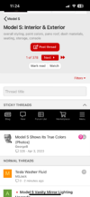
For most devices, we set the app to display a minimal interface. The elements of this interface also vary by browser, but most importantly include navigation controls, including pull down to refresh, and in some cases a floating back button.

Chrome-based apps support application badging, which allows the app to indicate unread messages or alerts directly on its icon.

Please let us know if you have any questions.
 
Last edited:
Is there any way to display in dark mode on iOS with chrome browser?
From the website tutorial:
Styles, and Light & Dark modes: There are multiple style options which allow you to view the site in either and light or dark mode. There is also a "Pro" style which has some UI features often appreciated by power users (such as a sticky secondary navbar on desktop, and Alerts and Conversations accessible directly in the bottom mobile navbar on mobile). You can set your style in your Account Preferences or at the bottom left of the page, below the "About us" section.
 
  • Helpful
Reactions: SoCal Buzz
This new method gives exactly the browser interface which I am not too happy about.

Specifically:

- the unread alerts count gets reset to zero as soon I click on the alerts icon and it lists the unread posts, even if you have not read any unread new posts. The app though will maintain the count accurately. It will list for example say, 11 unread posts, and if I read one of them, the count reduces to 10. Perfect behavior.

- next, the browser lists both unread and read posts. The App though only lists unread posts at any time, which is great.
Ok so we can actually make it work like this. Let me test it out and see if we think it makes more sense.
 
Is there something wrong with my phone or is this expected behavior:

ED7C1198-9A7C-473F-B03B-7AC2A3167487_1_101_o.jpeg F28E8AC6-A617-4526-A8C3-EA23BD2B6459_1_101_o.jpeg

I would expect the menu bar at the bottom to stay fixed, like I would expect the title bar at the top to remain fixed as it does on my Mac. That would be a good place to put a back button so people don't have to write in for tech support to figure out how to go back a page instead of going up the forum structure which is the left arrow button does we get now just below the ads

Not sure how other web apps do it, as I can't think of a SINGLE web app that survived the creation of the App Store.
 
  • Like
Reactions: Electroman
Is there something wrong with my phone or is this expected behavior:

View attachment 976552 View attachment 976553

I would expect the menu bar at the bottom to stay fixed, like I would expect the title bar at the top to remain fixed as it does on my Mac. That would be a good place to put a back button so people don't have to write in for tech support to figure out how to go back a page instead of going up the forum structure which is the left arrow button does we get now just below the ads

Not sure how other web apps do it, as I can't think of a SINGLE web app that survived the creation of the App Store.
I have seen that bottom bar float up into the middle. Only happened twice. I had to kill the thing and restart it to go back to normal.
 
That worked, how do I customize the buttons at the bottom, all I wanna see is the Watched Forums, but the buttons are for blog, new, forums, and marketplace. I would only rarely use the New button and none other. Would be great to have a Watched button down there so I don't have to open the menu, open the community and scroll down to Watched as I have to with this web app
 
That worked, how do I customize the buttons at the bottom, all I wanna see is the Watched Forums, but the buttons are for blog, new, forums, and marketplace. I would only rarely use the New button and none other. Would be great to have a Watched button down there so I don't have to open the menu, open the community and scroll down to Watched as I have to with this web app
You can customize the New feed to only show threads that are watched, or are from watched forums. Please have a look at the filters there and let me know how it goes.

I will respond to the other messages properly when I have a chance.
 
Very nice job on this PWA, slick and very functional!

In settings, what’s the difference between Push and Mobile app push notification?
Mobile App refers to the native app that we plan on shutting down soon. Push Notifications refer generally to browser notifications.

When are you pulling the plug?
We're just trying to make sure we are accounting for anything that users may miss from the native app which we can reproduce on the Web app. Probably in a week or so
 
I have seen that bottom bar float up into the middle. Only happened twice. I had to kill the thing and restart it to go back to normal.
So that is not normal and shouldn't happen. If that becomes a consistent complaint then we can look into it, but I don't believe we have seen that happen on our end.

Is there something wrong with my phone or is this expected behavior:

View attachment 976552 View attachment 976553

I would expect the menu bar at the bottom to stay fixed, like I would expect the title bar at the top to remain fixed as it does on my Mac. That would be a good place to put a back button so people don't have to write in for tech support to figure out how to go back a page instead of going up the forum structure which is the left arrow button does we get now just below the ads

Not sure how other web apps do it, as I can't think of a SINGLE web app that survived the creation of the App Store.
So from my understanding, the guidelines for iOS app design (I'm not a iOS user FYI) were such that developers were to include a back button in the UI of their apps. I believe this has gone away since Apple added a back button into their general OS navigation. Android on the other hand used to have an actual back button in the OS' UI, Google and Apple (I believe) have replaced such methods of going "back" with a back gesture which requires users to swipe from the left or right edge of the screen. So, AFAIK Apple no longer asks its developers to include a back button in their apps. I assume you no longer see a back button in your Safari or Chrome for iOS browser, right? If so, that is probably why, as it is now baked into the general OS UI. So we could in theory add a redundant back button there, or we can trust users to learn that their phones work differently today than they did a few years ago and start using their phones back gesture. (Please feel free to correct me on anything I said above which may be in error)

In terms of web apps surviving the creation of the App Store, that has been the opposite experience for us, as very few members migrated from the Web app to the Native App. This is partly due to us not putting in that much effort to encourage such a migration, but even besides that, many users who knew about it didn't bother. The reason many web apps probably don't survive the creation of their app store counterpart, is probably due to the fact that the app store counterpart in many (if not most) cases is vastly superior. We don't believe our native app to be vastly superior in its performance, design, or functionality. We license the base version of the Native App from a development company, and if they offer us a new version of the native app that is a significant upgrade over the web app, then we will use it again.
 
This new method gives exactly the browser interface which I am not too happy about.

Specifically:

- the unread alerts count gets reset to zero as soon I click on the alerts icon and it lists the unread posts, even if you have not read any unread new posts. The app though will maintain the count accurately. It will list for example say, 11 unread posts, and if I read one of them, the count reduces to 10. Perfect behavior.

- next, the browser lists both unread and read posts. The App though only lists unread posts at any time, which is great.
So we have updated our Alerts system with some new code which adds a few new features, the main ones being:
  • Multi-select ability to mark alerts as read or unread.
  • Alert summarization - users can turn on alert summarization which groups certain types of alerts together to avoid clutter. So if you get 20 likes on a post, you won't get 20 separate alerts. Users can set the threshold for when such grouping takes place, and can also disable this feature.
  • If an alert was explicitly marked as unread, skip marking that alert as read when the alert pop-up is touched.
  • Unread alerts now display above read alerts in pop-up
  • User Option to prevent marking as read when accessing the alerts pop-up (the bell icon), and Per-alert 'Pop-up auto-read' configuration
Those last two should be of most interest to you. The alert pop-up should now show the unread alerts at the top. Also, now when you now click on the bell icon to get the alerts popup, you can set it so that it either always marks alerts as read, never marks alerts as read, or uses per-alert configuration. If you use per-alert configuration then you will want to go to the "Settings by notification" section, select "Use custom", turn off the "Pop-up auto-read" for the alerts that you don't want to be marked as read just from seeing it in he alerts pop-up. If you leave that last section as "Use defaults" then all Alerts and Pushes will be on, but all Pop-up Auto-reads will be off - that is how we currently have the defaults set in the backend (unless we all of a sudden get a ton of users complaining about why they aren't getting automatically marked as read when viewing the pop-up, lol.
screenshot-teslamotorsclub.com-2023.09.25-00_35_13.png


These settings can be accessed here:

So hopefully we have addressed your concerns, which really were more about how a specific features was designed differently in the native app vs. the web app. But since this difference is not related to native vs. web, we were able to replicate the behavior of the native app in our web app.

Let me know if you have any questions.
 
Last edited:
  • Love
Reactions: Electroman