Welcome to Tesla Motors Club
Discuss Tesla's Model S, Model 3, Model X, Model Y, Cybertruck, Roadster and More.
Register

Installing the TMC PWA (Progressive Web App) on your mobile device

This site may earn commission on affiliate links.
We will be shutting down our native TMC iOS and Android apps soon. As such, I wanted to take this opportunity to encourage users to install our PWA for both iOS and Android (the iOS PWA is actually necessary in order to receive push notifications on iOS).
iOS PWA Installation:
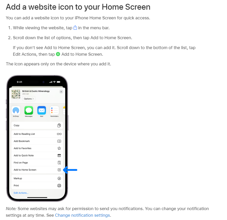
You can install TMC as a PWA on your iOS device by utilizing the Add to Home Screen feature in Safari. Instructions for this can be found on the following Apple support page: Bookmark a website in Safari on iPhone
screenshot-support.apple.com-2023.09.18-19_47_40.png
iOS Push Notifications:
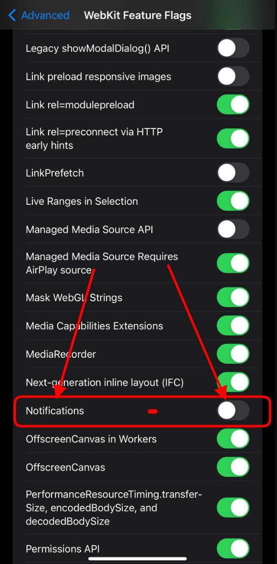
iOS 16.4 finally introduced push notifications for iOS devices. To facilitate this, you should first make sure that notifications are turned on in your Safari advanced settings. This can be done using the following steps:​
  1. Open the Settings app on your iPhone​
  2. Scroll down and find Safari, and tap on it​
  3. Scroll down to the bottom and tap advanced​
  4. Tap on Webkit Feature Flags (also called Experimental Webkit Features on some versions of iOS)​
  5. Scroll down and turn on the toggle beside "Notifications".​
screenshot-cdn.discordapp.com-2023.10.05-16_13_52.png
Here is a video which shows this process.​
Then you need to install the TMC PWA (instructions in the section above). When you access the PWA and log in, you should be presented with a prompt that says "TMC would like your permission to enable push notifications". You will be able to click on the "enable push notifications". If you do not see that prompt, then push notifications can also be enabled in your TMC account Preferences. You should then be presented with the default iOS prompt for notifications wherein you can "Allow Notifications" for TMC. If you don't see that, then go into your iOS Settings and tap on the Notifications submenu, then tap on the TMC PWA app listed there, and make sure "Allow Notifications" is turned on for the TMC PWA. There may be some additional options there that you can configure there if you like.​

Android and Chrome on desktop PWA Installation:
When browsing with Chrome on desktop or Android, the app can be installed via the address bar on both mobile and desktop devices. On supported mobile devices, we also display an "Install" button at the bottom of the off-canvas menu, which is accessed by clicking the hamburger menu icon on the bottom right of your mobile navbar (on our default style).​
Android and Chrome on desktop Push Notifications:
On most devices running Chrome, you will be presented with a banner at the bottom of the screen which says "Tesla Motors Club would like your permission to enable push notifications." You can tap on the clickable area to turn it on. Alternatively, you can go directly to your TMC account Preferences and enable it there. After one of the mentioned steps, Chrome may also present you with a browser permission popup asking if you would like to "Allow" TMC to send you push notifications.​

Once the app is installed, it is readily available in exactly the same way as a native app. On mobile devices, that means it can be opened via an icon on the home screen. On desktop devices, it can be opened by searching your system or even pinning the app to your taskbar or dock.

For most devices, we set the app to display a minimal interface. The elements of this interface also vary by browser, but most importantly include navigation controls, including pull down to refresh, and in some cases a floating back button.

Chrome-based apps support application badging, which allows the app to indicate unread messages or alerts directly on its icon.

Please let us know if you have any questions.
 
Last edited:
So we have updated our Alerts system with some new code which adds a few new features, the main ones being:
  • Multi-select ability to mark alerts as read or unread.
  • Alert summarization - users can turn on alert summarization which groups certain types of alerts together to avoid clutter. So if you get 20 likes on a post, you won't get 20 separate alerts. Users can set the threshold for when such grouping takes place, and can also disable this feature.
  • If an alert was explicitly marked as unread, skip marking that alert as read when the alert pop-up is touched.
  • Unread alerts now display above read alerts in pop-up
  • User Option to prevent marking as read when accessing the alerts pop-up (the bell icon), and Per-alert 'Pop-up auto-read' configuration
Those last two should be of most interest to you. The alert pop-up should now show the unread alerts at the top. Also, now when you now click on the bell icon to get the alerts popup, you can set it so that it either always marks alerts as read, never marks alerts as read, or uses per-alert configuration. If you use per-alert configuration then you will want to go to the "Settings by notification" section, select "Use custom", turn off the "Pop-up auto-read" for the alerts that you don't want to be marked as read just from seeing it in he alerts pop-up. If you leave that last section as "Use defaults" then all Alerts and Pushes will be on, but all Pop-up Auto-reads will be off - that is how we currently have the defaults set in the backend (unless we all of a sudden get a ton of users complaining about why they aren't getting automatically marked as read when viewing the pop-up, lol.
View attachment 976874

These settings can be accessed here:

So hopefully we have addressed your concerns, which really were more about how a specific features was designed differently in the native app vs. the web app. But since this difference is not related to native vs. web, we were able to replicate the behavior of the native app in our web app.

Let me know if you have any questions.
Love everything you wrote here.

My minimal testing with chrome on desktop, looks great. Haven’t tested in iPhone web app yet.
 
  • Like
Reactions: danny and brkaus
Any chance to get the bottom menu bar expanded a bit? This is how it looks on my iPhone 15 Pro Max, tough to pick Account or Conversations options due to the iOS home indicator View attachment 977001
OK, I see. You are using one of the TMC 2022 Pro" styles.

I can look into getting a few pixels added at the bottom there to push those items up a little. This issue of course won't happen on the normal non-pro styles, which we do prioritize, as we are essentially making legacy UI elements available on the Pro styles. We did this at the time of our last major redesign, in order to appease users who preferred the previous UI. This is kind of why websites prefer not to offer multiple versions of the UI, as it creates more points for things to break.
Got it. I switched over to a non pro theme for now :)
 
  • Like
Reactions: danny
So we have updated our Alerts system with some new code which adds a few new features, the main ones being:
  • Multi-select ability to mark alerts as read or unread.
  • Alert summarization - users can turn on alert summarization which groups certain types of alerts together to avoid clutter. So if you get 20 likes on a post, you won't get 20 separate alerts. Users can set the threshold for when such grouping takes place, and can also disable this feature.
  • If an alert was explicitly marked as unread, skip marking that alert as read when the alert pop-up is touched.
  • Unread alerts now display above read alerts in pop-up
  • User Option to prevent marking as read when accessing the alerts pop-up (the bell icon), and Per-alert 'Pop-up auto-read' configuration
Those last two should be of most interest to you. The alert pop-up should now show the unread alerts at the top. Also, now when you now click on the bell icon to get the alerts popup, you can set it so that it either always marks alerts as read, never marks alerts as read, or uses per-alert configuration. If you use per-alert configuration then you will want to go to the "Settings by notification" section, select "Use custom", turn off the "Pop-up auto-read" for the alerts that you don't want to be marked as read just from seeing it in he alerts pop-up. If you leave that last section as "Use defaults" then all Alerts and Pushes will be on, but all Pop-up Auto-reads will be off - that is how we currently have the defaults set in the backend (unless we all of a sudden get a ton of users complaining about why they aren't getting automatically marked as read when viewing the pop-up, lol.
View attachment 976874

These settings can be accessed here:

So hopefully we have addressed your concerns, which really were more about how a specific features was designed differently in the native app vs. the web app. But since this difference is not related to native vs. web, we were able to replicate the behavior of the native app in our web app.

Let me know if you have any questions.
The iPhone Web App alert notification works just as you had described, which is the same the App behavior - This is great. Thanks for making this happen. This was my no 1. per peeve on the browser and now this is fixed. I haven't test the alert grouping yet, which was my 2nd complaint. I will check it out and confirm here on how it works.

Another suggestion. Can you please bring the Alerts icon down below (same place on where it is now in the TMC App). See picture below. From an ergonomics perspective I think any icons on the button is better.. I think.

1695839210060.png
 
The iPhone Web App alert notification works just as you had described, which is the same the App behavior - This is great. Thanks for making this happen. This was my no 1. per peeve on the browser and now this is fixed. I haven't test the alert grouping yet, which was my 2nd complaint. I will check it out and confirm here on how it works.

Another suggestion. Can you please bring the Alerts icon down below (same place on where it is now in the TMC App). See picture below. From an ergonomics perspective I think any icons on the button is better.. I think.

View attachment 977632
That's a pretty packed bottom bar already... Would be nice if the "New" or "What's New" buttons included unread.
 
  • Like
Reactions: israndy
Another suggestion. Can you please bring the Alerts icon down below (same place on where it is now in the TMC App). See picture below. From an ergonomics perspective I think any icons on the button is better.. I think.
You can use the "TMC Pro 2022" style if you want either Alerts or Conversations in your bottom mobile nav bar. BTW, you really don't need the "What's New" link. The New feed does all the same things and more, you just need to configure the filters to your liking.

That's a pretty packed bottom bar already... Would be nice if the "New" or "What's New" buttons included unread.
The "New" feed already has an option to filter for unread content only. Please test the filter options and hit save when you have it configured to your liking. You can also set it as your default feed so it is your homepage when you visit TMC.
 
  • Like
Reactions: Electroman
You can use the "TMC Pro 2022" style if you want either Alerts or Conversations in your bottom mobile nav bar. BTW, you really don't need the "What's New" link. The New feed does all the same things and more, you just need to configure the filters to your liking.


The "New" feed already has an option to filter for unread content only. Please test the filter options and hit save when you have it configured to your liking. You can also set it as your default feed so it is your homepage when you visit TMC.
Thanks for the tips and instruction! Forum software is a complicated beast.
 
  • Like
Reactions: danny
Odd case... but I installed it on the toolbar of my MacBook.

Mostly works, but I cannot figure out a refresh and a back.
Yeah, many desktops allow for PWAs to be installed, however they generally aren't designed with desktop in mind, so the original developers of the software will leave out a refresh and back button as those would be redundant on iOS and Android, however clearly they would be helpful for desktop PWAs, which is why I wouldn't necessarily recommend recommend using it there, unless you have a computer with a back button and refresh button built into the keyboard like Chromebooks have for example.
 
I am using both the app and the web app. I feel that there is a lot more latency with the web app.
That's interesting...we consistently find the complete opposite.

The native app is certainly faster in terms of loading certain native UI elements, but it still has to fetch the data from the website, and our sense is that that takes longer. Also certain pages have to load via a web view in any case, and such pages do not benefit from any theoretical native performance advantages.