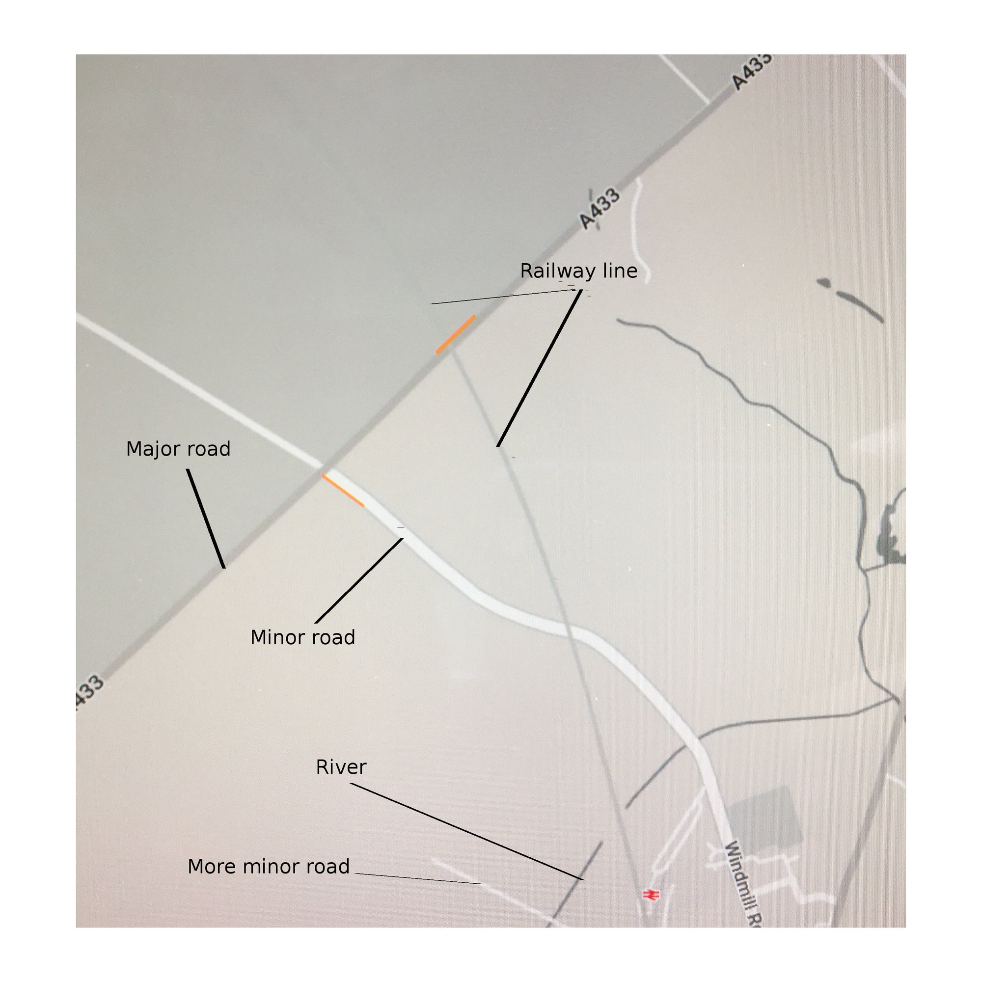
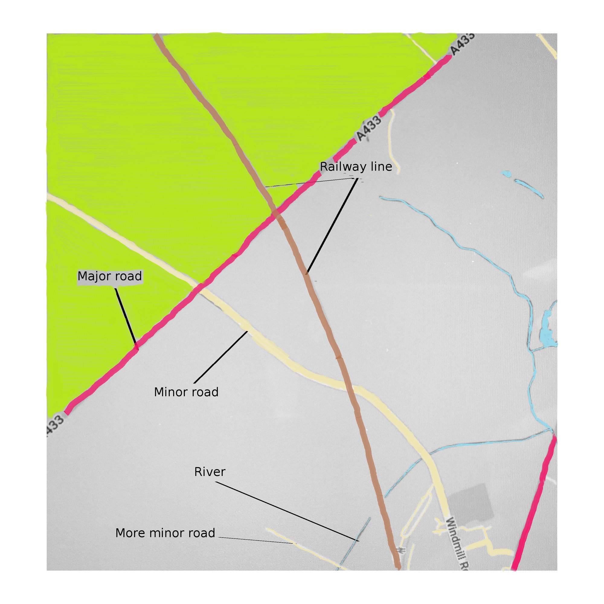
Since I've had my Model 3, I have puzzled over the design decisions that Tesla took for the sat nav map. It is magnificently larger than any map that I have had in other cars, but more difficult to read at a glance. Firstly it is in several shades of grey. I don't know how many - less than 50. That at least makes it the same for colour blind people as the rest of us. But why are major roads so obscure, compared to minor roads? Why are railway lines so faint that they are almost invisible, especially in darker coloured countryside? Why are waterways shown so similarly to roads?

Surely some colour would enhance easier glancing and understanding?
 Don't comment on the artwork - I couldn't find a child to do the colouruing in! I am interested in your views on my general comment, though.
Surely some colour would enhance easier glancing and understanding?


