Welcome to Tesla Motors Club
Discuss Tesla's Model S, Model 3, Model X, Model Y, Cybertruck, Roadster and More.
Register

Center screen.. Why not flush?

This site may earn commission on affiliate links.
Mind if I post to my Instagram?

Be my guest.

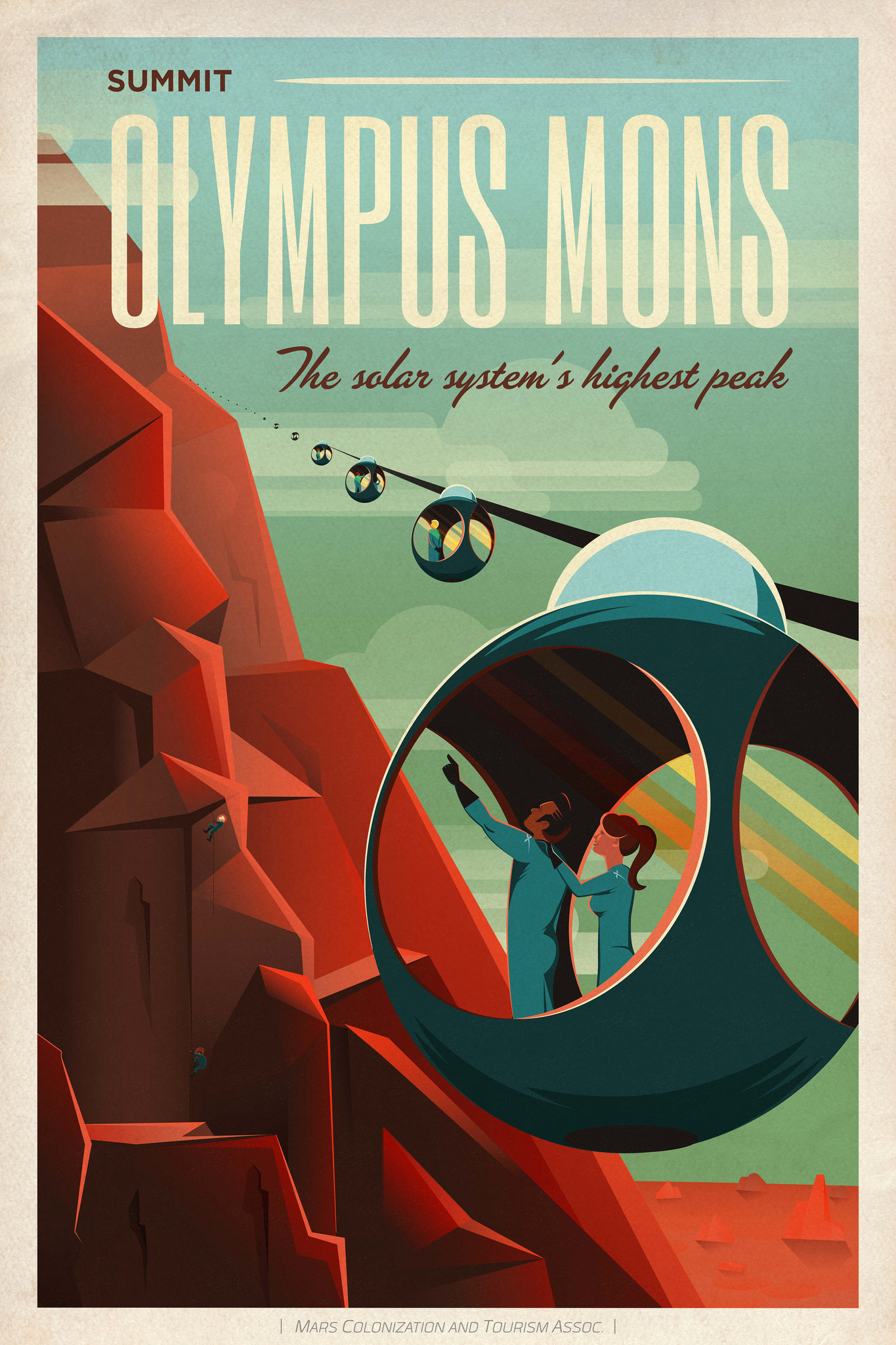
Currently writing up a post about how Elon's/Tesla's design ethos is undeniably retro futurism along with hints of relentless optimism.

For Example:

Supercharger has 1930s futurism

Tesla_bennett700firechiefreverse.jpg


h2-140729978.jpg


Or even his Rocket Designs. This has been well noted but still amazing.

505.jpg


38ecc9eb43a7dc2f9282b6f9397da794.jpg
 
  • Love
Reactions: AssortedBread
I think the display is where it is for passengers, in what is a small autonomous car ideally full of people. It needs to be there for a comfortable view from the rear seats. This kind of forces HUD for focal distance reasons.

That precludes dash integration just for visual weight reasons.

It is illegal right now to have entertainment in the front console. I'm sure that law will change... about 15 years from now.

It would be insane to build a car right now to take advantage of a yet to materialize scenario (which even if it does, will be bettered served by whatever tablet computer you can buy for $29.95 from Amazon by then).
 
Here is my concern.

First they need all indicators if the person driving is deaf. You cannot rely on sounds alone. In addition in the current photos of the 3 I think the screen is too busy with the map in place to quickly see necessary information without getting distracted by all the other stuff on the screen. Typically the screen behind the wheel is a good place to put info that you can glance at quickly and get info WITHOUT other info that can distract. Now this is changing and I see the main gauge cluster getting more and more cluttered on some cars. (AUDI I am looking at you...)

The following data is currently on the Model S guage cluster that I think is absolutely necessary. Can they fit this all on the center screen, maybe... I just would prefer if they do it is possible to see without getting distracted by anything else. Right now in the photos of the Model 3 center screen I only see items 1, 4, and 5 in the box but 6 might be there but not engaged so we don't know.
1. Bold speed indicator
2. Battery indicator
3. Drive Mode (P, R, N, D)
4. Cruise Control Set Speed and engaged indicator
5. Autopilot self steering engaged indicator
6. Turn single indicators

The following is also there that I think would be helpful on autopilot cars (cars without full autonomy or people who choose not to use it at the time). Hopefully they would be there and easily identified somehow. Personally I think they are necessary:
1. Current road speed limit
2. Indication of lines and status of if the car is tracking them or not. This also changes depending if autopilot is being used to change lanes
3. Indication of other cars which might be helpful if you trust the car to change lanes or break or not.

Then of course there are the side panels you can change or not. I think it would be nice to have a side panel available so you can get a quick glimpse of things you would normally dig for on the center screen just to keep you more focused on the road. Personally for me I would want to see the battery status and trip computer information so I know how much energy I am burning etc...

This info really needs to be separated somehow. If it is a box in the center screen then fine but then that really limits what else you can see on that screen. The screen is already smaller than the model S screen and if you start putting the autopilot and items I put above segmented so they are less of a distraction then you trade of the other info you can have on the center screen. It will be interesting to see what Tesla comes up with.
 
  • Like
Reactions: CCWgr and N5329K
I agree with ummgood: There is some information which is important for the driver to be able to see quickly, and easily, without having to search for it. Eliminating the instrument cluster (or equivalent) directly in front of the driver would be a very big mistake. Having never seen an HUD I don't know how I'll feel about it, but considering the possibility of its being hard to see in some lighting conditions, and the possibility that it could obstruct the view of the road, I'd really like to have a conventional cluster in the normal place, and be able to turn the HUD on or off until I decide if I like it or not.

It cannot hurt to have information in more than one place. Eliminating the information from the usual place just to give the car a "futuristic" appearance would, in my opinion, compromise safety for no good reason.
 
One reason it is mounted out from the dash is ease of reach and equal usability by passengar and driver. Passengar usablility is also why it is not angled toward the driver. I would like to see it be hinged, so that you can angle it toward you if wanted.

To be flush mounted and still reachable, the center console would have to be built out so it would be closer.

I don't mind the way it is mounted out from the console, but would like for it to be hinged.
 
  • Like
Reactions: AssortedBread