Welcome to Tesla Motors Club
Discuss Tesla's Model S, Model 3, Model X, Model Y, Cybertruck, Roadster and More.
Register
Install the app
How to install the app on iOS
You can install our site as a web app on your iOS device by utilizing the Add to Home Screen feature in Safari. Please see this thread for more details on this.
Note: This feature may not be available in some browsers.
-
Want to remove ads? Register an account and login to see fewer ads, and become a Supporting Member to remove almost all ads.
You are using an out of date browser. It may not display this or other websites correctly.
You should upgrade or use an alternative browser.
You should upgrade or use an alternative browser.
Firmware 7.0 Beta Discussion
- Thread starter ThreadAbort
- Start date
jcaspar
Member
I agree with most here and really do not like this new dash display. It looks really dumbed down, nearly as bad as the Toyota Prius, displaying much less information than the current dash. I will definitely avoid this "upgrade" unless it is accompanied by something really spectacular like the increased acceleration of the P85's.
The clock and toy car are really bad... IMHO.
The clock and toy car are really bad... IMHO.
Looks like you have a software update pending.. I am guessing that is a downgrade..
I wonder if it can be ignored or if it'll be forced at some point
doctorwho
Active Member
I'm much ;less concerned by the cosmetic changes than I am by the lack of reported functionality improvements. No changes whatsoever to the poor audio player?
To add, no release notes. Didn't appear to have any radical functionality adds but we haven't drilled in.
gg_got_a_tesla
Model S: VIN 65513, Model 3: VIN 1913
gizmoboy
Member
i'm a total Tesla newbie (only about 15 hours behind a wheel), but that MCU UI looks the same as the old UI but with dark theme instead of light.
The IC UI has obviously changed, as some have noted.
The IC UI has obviously changed, as some have noted.
TexasEV
Well-Known Member
What a waste of center screen real estate. Now I have to look left to see the range on the battery and right for the gear and power.. Even worse is I will have to look at the center screen for this time, because I'm not going to waste one of the two dashboard spaces on a clock. I preferred as much as possible to be directly in front of me.
What possible reason would there be to remove the rated range line from the energy graph? I can compare the number shown to what I know the rated Wh/mile is for a 60, but the visual comparison is much easier.
- - - Updated - - -
What possible reason would there be to remove the rated range line from the energy graph? I can compare the number shown to what I know the rated Wh/mile is for a 60, but the visual comparison is much easier.
- - - Updated - - -
It's a flatter design. No borders around the A/C controls, for example.i'm a total Tesla newbie (only about 15 hours behind a wheel), but that MCU UI looks the same as the old UI but with dark theme instead of light.
Looking at the pictures Cattledog added (great pictures) I can't stop wondering what the toy car accomplishes in MS versions that don't have autopilot sensors. It can't show what is around you or the lane markings on the road, yet it shows the toy car in the middle. At some point they need to switch to different software versions that is best for that specific hardware.
R²B
All Star
i'm a total Tesla newbie (only about 15 hours behind a wheel), but that MCU UI looks the same as the old UI but with dark theme instead of light.
The IC UI has obviously changed, as some have noted.
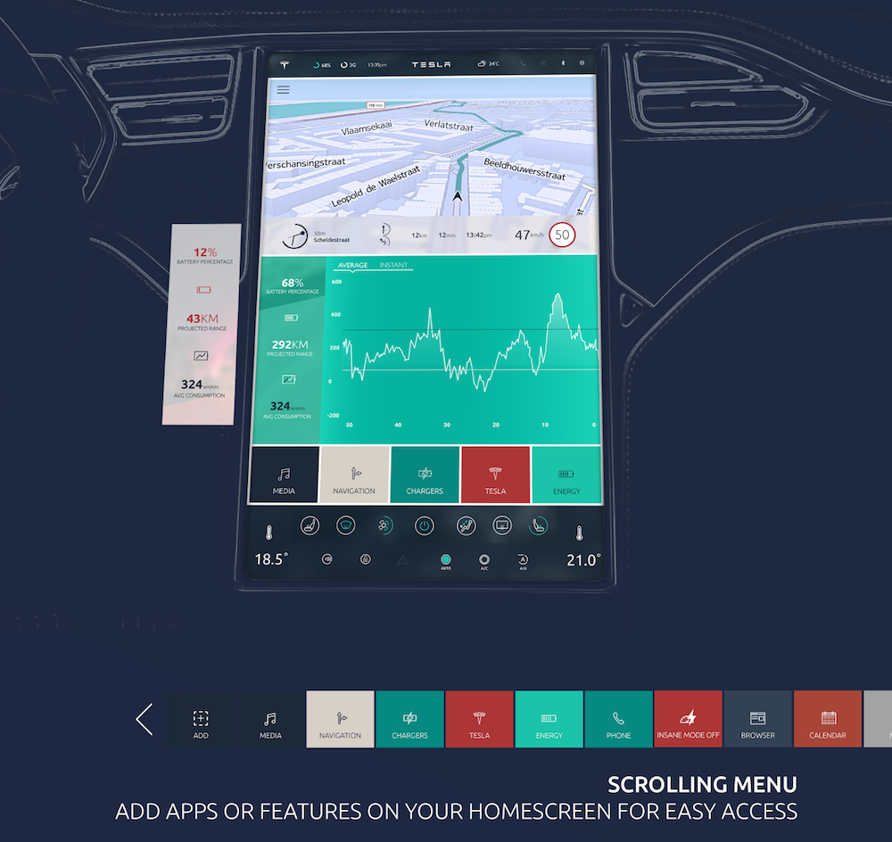
The touchscreen UI is similiar but certainly different. For one thing, it already improves upon a big pet peeve of mine with the current UI. It doesn't use all the screen real estate. I hate UI that's the have needless margins and large gaps between the elements. The map on the current UI can easily cover another inch of display around the borders after doing away with the embossed borders and gradients.
The lack of an accurate power meter is probably the only real loss of functionality I see here. That's kind of a deal breaker for me for long trips. I like to know exactly how much power I'm pulling on acceleration. Keeping acceleration under ~40kW maximizes capacity, and I see no way to do that based on the images I've seen so far.
Nothing seems missing on the IC as far as I can tell, and everything else seems identical, functionality wise, on the 17". The charge button on the top missing might take a little getting used to, but that's fine. Odd they'd remove it.
Nothing seems missing on the IC as far as I can tell, and everything else seems identical, functionality wise, on the 17". The charge button on the top missing might take a little getting used to, but that's fine. Odd they'd remove it.
R²B
All Star
And I'm firmly in the camp of minimalist UI and progressive disclosure of information (the act of progressively revealing more detailed information rather than providing it all at once). I work in UI design for unmanned aircraft and I can tell you there's a limited amount of information a person can discern and decipher at one time (and it's pretty small). I like the clean(er) look of the new UI and I'm excited overall with where Telsa is headed with these changes. Hopefully over time we'll see even further refinements and tweaks.
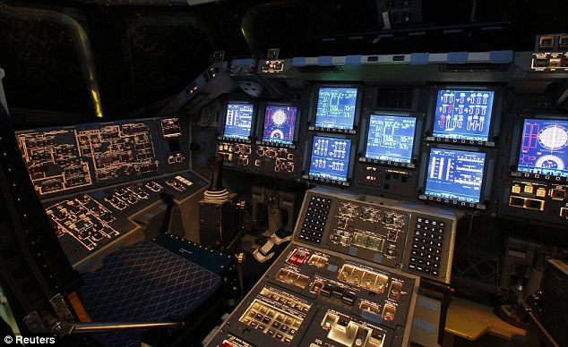
I'd much rather drive this:

than this...

Cattledog - Can you take the car for a drive and send more pics and video of the UI while driving?
I'd much rather drive this:
than this...
Cattledog - Can you take the car for a drive and send more pics and video of the UI while driving?
Soolim
Member
I am also disappointed that there is still no tire pressure readingI'm much ;less concerned by the cosmetic changes than I am by the lack of reported functionality improvements. No changes whatsoever to the poor audio player?
I speculate that the speedometer simplified display and toy car is reserving room for the lane keeping graphics, while minimizing clutter in that area. Non AP car should have the option to keep present style display.
Last edited:
R²B
All Star
If you look at Cattledogs 3rd picture (the one with the power graph on the right of the spedometer, isn't the outside dial going to show you instantaneous power? Looks like it's an instantaneous power meter to me...
I am also disappointed that there is still no tire pressure reading
That's probably one of my big disappointments also, but as I always sing to my kids:
You can't always get what you want
But if you try sometimes well you might find
You get what you need
(courtesy of THE ROLLING STONES)
Spacela
Member
If you look at Cattledogs 3rd picture (the one with the power graph on the right of the spedometer, isn't the outside dial going to show you instantaneous power? Looks like it's an instantaneous power meter to me...
It is an instantaneous power meter, but the complaint is that it's no longer part of the speedometer that's always shown on instrument cluster.
Soolim
Member
Maybe not on UI, but certainly room for improvement on NAV and supercharger route planning.Based on the pictures, it seems like 6.2 might be the last major release for non-AP owners. We'll still get new updates, but it'll be all cosmetic.
I can't see any new functionality thus far.
Thats not a fair comparison.
The Tesla equivalent of taking the start button out would be taking the steering wheel out.
And to top it all, Microsoft insisted that nobody used the start button.
Hey Tesla engineers, if you're reading this - GOOD JOB ON THE UI. Get the functionality done, and release it. UI can be tweaked later too. You'll never please everyone! Just focus on pleasing me, and I'm happy with the UI

As usual, I'm a nobody. I'm still with Windows 7 and use the Start button all the time. I have never used desktop icons.
bollar
Disgruntled Member
Similar threads
- Replies
- 25
- Views
- 4K
- Replies
- 11
- Views
- 3K
- Replies
- 5
- Views
- 2K


