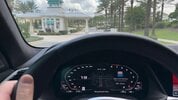
I'm pretty sure I know the answer to this, but is there a way to move the car control icon on the main screen? It seems hard to believe that the Tesla engineers made it so that all of the car's control functions go through one small button, and they placed that button in a spot where the driver can't see it behind the wide yoke, and also didn't make the button moveable. My car was made before the screen tilt option was added, but I can't imagine it helps that much. I have to lean way over to see where it is, which is less than ideal. It should at the very least be able to be placed anywhere on the screen (with tapping it causing a fan of control options) and have the ability to have permanent tabs on the left side with features easily accessible.
Sorry to gripe, but I feel that if no one talks about these things, nothing will ever change. If a Tesla engineer or CEO looks at this, improvements could be made.
While I'm at it, if Tesla wanted to save 50 cents own their $100K+ car by ditching the turn signal, couldn't they have at least put the left turn signal button on the left side of the yoke and the right turn signal button on the right side?
And since there's no HUD, they should add customization options for the dash screen. There should be a way to have the music showing on one side, a way to have a larger, less bland, central speedo, a map even when there's no active nav, etc. I frequently turn nav on even when I don't need it because I can't stand having the empty screen.
Last edited: