Not only implies, but that is precisely what it means (for this particular emissions measure).
The effect does inflate Wyoming's numbers somewhat, but the transfer is negligible in places like California whose net energy imports of energy generated from coal and oil are minimal:
2022 Total System Electric Generation
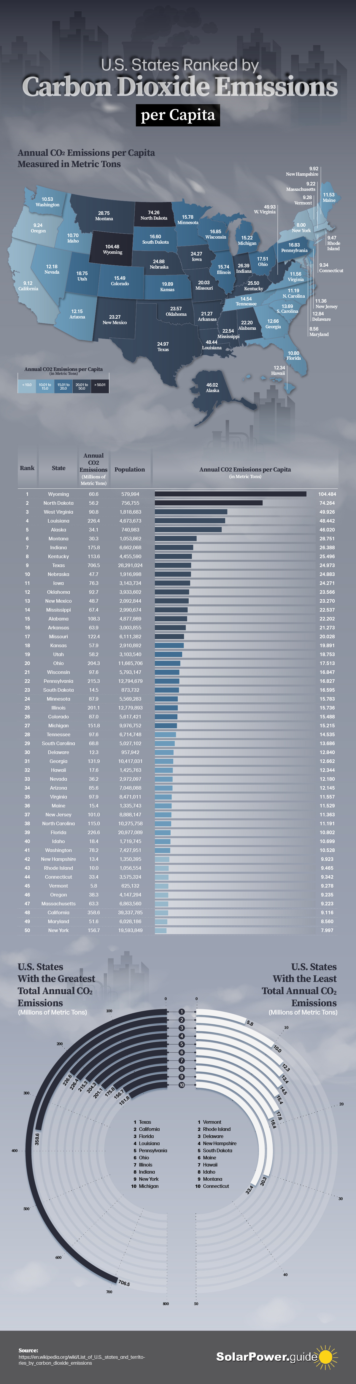
I don't have the EIA data in front of me on this one, but have parceled the State level data in the past including on attributing footprint to generation. Wyoming still has a much higher per capita footprint than California. Due to climate and population density effects, the difference would make Los Angeles look even better.
State totals are listed in the chart (3rd column). Compare Wyoming's similar population to Vermont and the difference in CO2 emissions is stark.
Was trying not to get too heavy into politics, but there is an unmistakably strong correlation between red/blue and State CO2 footprints.
Disclaimer: I posted this graphic because what often gets reported is that a particular country or State generates so much CO2 and that is a lot more misleading and less useful than per capita footprint.
CA/TX are the two most populous States and have the highest total State footprints, as the second graphic shows. But that fact alone misses the big picture and doesn't tell us which locations are actually leaders or laggers.
We need to looks at several useful metrics, like per capita, to see where things are going right/wrong and where most of the work needs to be done.
I am going to push back a little here.
The third column only tells us the state population, not where the energy is used, regardless of where it is used. Wyoming is a large net exporter, Vermont, as far as I know, is not. So you cannot compare the two with this sort of data.
Perhaps I am wrong about California, but I am not wrong about Idaho. Half of Idaho's energy comes from hydro, but the other half (less some wind and even less solar) comes from burning fossil fuels. The state has effectively no coal, oil or NG. So it is imported, and it is Idahoans who are burning fuel either in Wyoming, or purchased and transported from there. You are implying I am wrong about that, but the graphic doesn't account for that at all from what I can tell.
As for imports, your link shows CA imports
83,962 GWH. That may be small on a
per capita basis, but it's still a huge chunk of energy.
This image tells us what happens to Wyoming when you go from your graphics to one showing residential use of electricity. Wyo goes from the very top high use, to the same as all of the northwest states including blue states like Oregon and Washington.
Not as good as California, but pretty close to par.
In addition, most Californians live in a much warmer and moderate climate than Wyoming. So when it's -40 degrees F in Wyoming, and the 40 mph wind that never stops wicking away heat from your house, of course they are using more energy than someone in LA, where it is always 72 degrees (I've heard
")
). That has nothing to do with politics.
Not that I disagree about Red State politics, but I think carbon footprint may be more about Rural vs Urban use. Urban is more compact, and therefore efficient, and rural is spread out. A state with large urban centers, or a state that is relatively tiny in geographical size, can be more efficient in power distribution and associated losses and therefore reduce it's footprint through that alone.
According to the EIA, less than a tenth of the energy produced in Wyoming is consumed there.
Again, not saying we all couldn't do better, but the results in your visuals are more nuanced than politics. I agree with
@Raffy.Roma that we should be looking at what we as individuals are doing, rather than casting stones.