Welcome to Tesla Motors Club
Discuss Tesla's Model S, Model 3, Model X, Model Y, Cybertruck, Roadster and More.
Register

Superchargers visited 3.0

This site may earn commission on affiliate links.
I use the Sheets app to add my visits. It's actually better than using the spreadsheet on a Laptop or Desktop because the app goes right back to the position on the sheet where you left off. It also doesn't seem to need to reload the entire thing each time like a web browser.

As for a wish list, I'm probably asking way too much. I'd love to have a way that it looks where I am, automatically picks the Supercharger nearest to me and adds it to my visited list. Again, this is not what a spreadsheet is capable of, but that would be awesome.
The next best thing would be a way to have a script look at my Teslafi.com data and see where I was charging and add my visits based on that. Probably also pretty involved.
There is a full and robust scripting language for Sheets. It can do a ton. If anyone could figure it out, @tes-s can. But, this is all volunteer work we do so don't expect anything. Glad the Sheets app is working for you. None of us have much luck on mobile so take it while it works for you.
 
  • Like
Reactions: David99
Thought for the admins here and of supercharge.info:
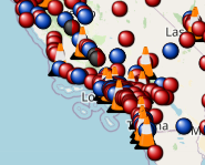
I'm on the road on the east coast, in the MidAtlantic, and doing some on-the-fly route planning. The Jersey turnpike pairs gave me fits. I saw an unvisited dot on my map during the evening planning session and said, "Sure, let's get that one." I didn't realize the dot was really two as the sites are really right across the highway from each other. I know the same happens in CT. I'm guessing it could also happen out west where there have been expansions, like Mt. Shasta.
I'm wondering if it's worth having a different pin color to designate the sites are close. I know there's currently a red/grey pin for limited hours, I believe. Could even be two shades of red, just to catch your eye to investigate further.

In my case, I plugged the site in and wondered why it had me getting off the road, turning around, and heading back south. Then I remembered the pairs.

I also realize it's contingent on the amount of zoom you use on the map, as the sites do separate as you increase the granularity.

Just a brainstorm I had while driving today; I won't cry if it gets shot down.
Thanks
Bill
I could visualize it but we'd need another entry in the status category. However, I use that category extensively to manage the visualizations and it would be quite a lot of work to make sure the maps continue to work correctly. I'd suggest we not muck with it. I always try to zoom in and make sure I'm not missing something. Or, I use the lasso function to export to a spreadsheet all of the unvisited superchargers I intend to hit.
 
Thought for the admins here and of supercharge.info:
I'm on the road on the east coast, in the MidAtlantic, and doing some on-the-fly route planning. The Jersey turnpike pairs gave me fits. I saw an unvisited dot on my map during the evening planning session and said, "Sure, let's get that one." I didn't realize the dot was really two as the sites are really right across the highway from each other. I know the same happens in CT. I'm guessing it could also happen out west where there have been expansions, like Mt. Shasta.
I'm wondering if it's worth having a different pin color to designate the sites are close. I know there's currently a red/grey pin for limited hours, I believe. Could even be two shades of red, just to catch your eye to investigate further.

In my case, I plugged the site in and wondered why it had me getting off the road, turning around, and heading back south. Then I remembered the pairs.

I also realize it's contingent on the amount of zoom you use on the map, as the sites do separate as you increase the granularity.

Just a brainstorm I had while driving today; I won't cry if it gets shot down.
Thanks
Bill
Funny you should mention this, and even funnier that I didn't see your post before I wrote code for it:
 
  • Like
Reactions: theflyer
Funny you should mention this, and even funnier that I didn't see your post before I wrote code for it:
I can add any filters we'd like to any of the maps to help reduce clutter. We could, for instance, only show superchargers opened since <a date> or by the number of stalls or by the version or any other field tracked in the spreadsheet. This would be trivial to add to the not-yet-visited map if that'd be hepful.
 
  • Helpful
Reactions: cpa and PLUS EV
An observation from a participant:

By way of introduction, my wife claims with ample evidence, that I cannot discern minute differences in hue. I think two colors are identical, while she correctly points out no, they are not. Your color is lavender, while I want the lilac color. We stipulate as such. Life is good.

I noticed on my "visited" listing that the color for 2022 seems (to me) to be identical to 2014. Am I correct, or shall we stipulate that my depth of shade differences remains hopeless?
 
  • Like
Reactions: israndy
An observation from a participant:

By way of introduction, my wife claims with ample evidence, that I cannot discern minute differences in hue. I think two colors are identical, while she correctly points out no, they are not. Your color is lavender, while I want the lilac color. We stipulate as such. Life is good.

I noticed on my "visited" listing that the color for 2022 seems (to me) to be identical to 2014. Am I correct, or shall we stipulate that my depth of shade differences remains hopeless?
cpa,

Tableau automatically selects those colors. It does its best to differentiate them but when you get to where we are now, it has limited choices. On the visited map, there are two useful ways to see which dots belong to which years. I hope one or both of these will help.

Option 1:
On the right side of the page, select only the years you want to see. You can also hover over the hear number next to the color and select "Keepy only". That will downselect the map to just the year(s) you want to see.

1649018684206.png

Option 2, use the "Highlight Year of Visit Date" to shade all years except the one you are hovering over. When you click into that field, it will show a list of years, just mouse across them.

1649018864368.png
 
An observation from a participant:

By way of introduction, my wife claims with ample evidence, that I cannot discern minute differences in hue. I think two colors are identical, while she correctly points out no, they are not. Your color is lavender, while I want the lilac color. We stipulate as such. Life is good.

I noticed on my "visited" listing that the color for 2022 seems (to me) to be identical to 2014. Am I correct, or shall we stipulate that my depth of shade differences remains hopeless?
I've created some pretty complicated (and interesting) Excel files and I've used colors to try and be a roadmap for what I did for both myself and folks that came after me. I was continually stymied because once you get past the 5 or 6 base colors, shades start to look the same.
 
  • Like
Reactions: Big Earl and cpa
I've created some pretty complicated (and interesting) Excel files and I've used colors to try and be a roadmap for what I did for both myself and folks that came after me. I was continually stymied because once you get past the 5 or 6 base colors, shades start to look the same.
I'm colorblind so obviously have a different perspective on this, but yeah anything more than 5 or 6 colors is worthless to me. What gets me is why they don't use the obvious colors first. Black, white, and the 3 primary colors seem totally obvious first choices! Usually a green or a brown is fine for a 6th color as long as they don't pick some weird neon green (looks too similar to yellow for me).

As an example, even the 7 colors on theflyer's post above are too similar in shade to be useful to me. Had they started with bright red, royal blue, yellow, black, then maybe green, orange, and grey, it might have worked. I can see why they don't want to do white on white or even white on off-white, but not using black at all is totally inexplicable to me.
 
Thanks to all.

I was showing my wife where I had meandered over the past nigh on eight years, and I noticed the duplication.

I have seen other presentations that also use stripes or polka dots or other indicators to discern differences that might be indistinguishable if we solely relied upon color.

As Calvin Coolidge once exclaimed, "If someone presents you with a horse, don't give him a dental exam." (It may have been Wilbur Post; I always confuse those two great philosophers.)
 
  • Funny
Reactions: GHammer
I cannot discern minute differences in hue.
Before I met my wife I only ever thought of 16 colors in the world. Sure some are bright or dark, but they are still that color, then she brings home the Pantone book and asks me what I think about colors for the living room. She actually painted each wall a different color but it all looks the same to me until you get to the corner where the darkest and the lightest are next to each other.

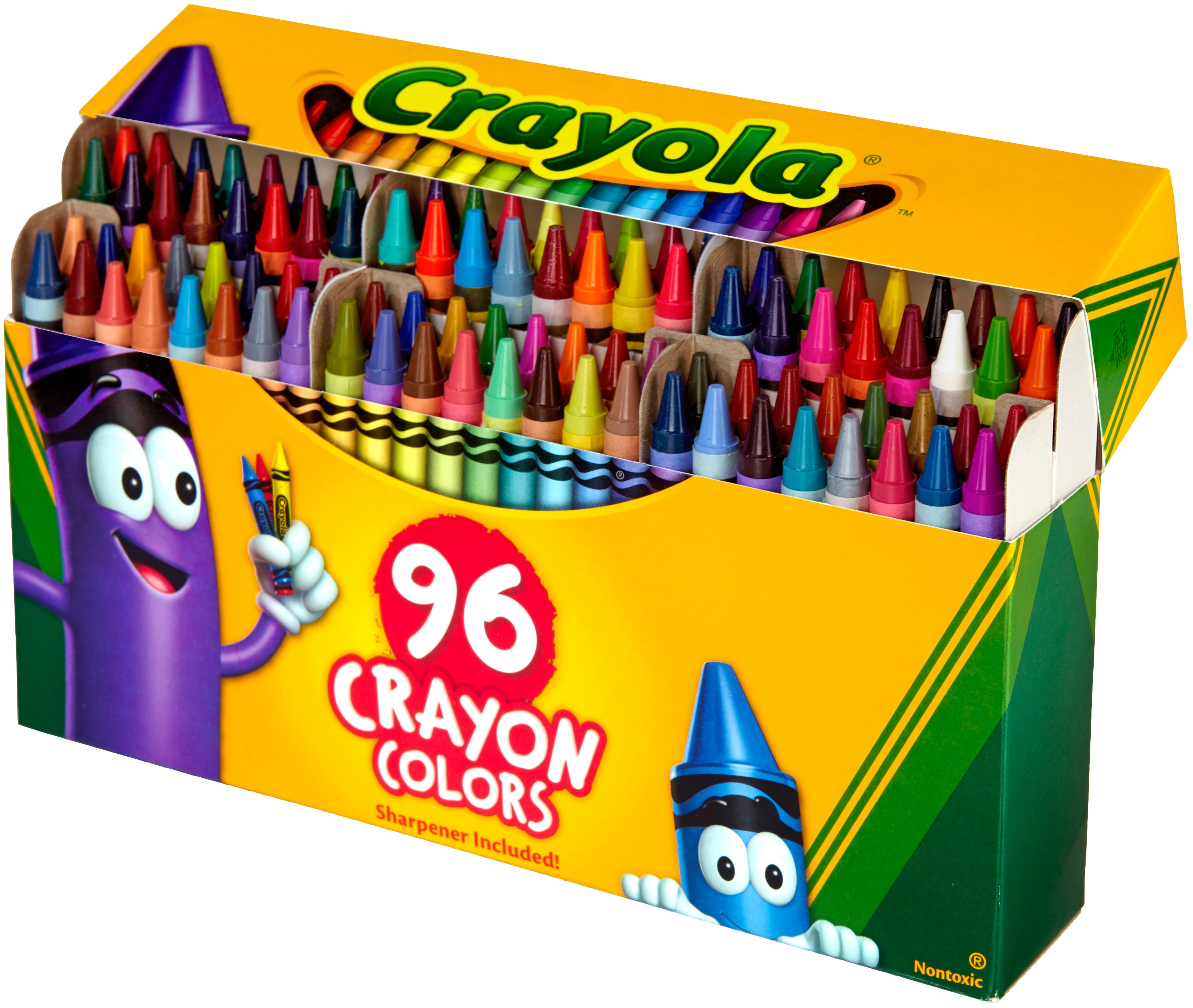
I am not colorblind, in fact a good friend is and I got thru high school electronics class by reading resistor codes for him and him giving me answers on tests. Symbiotic relationship. Just never thought of more colors than the common named ones, I always balked at the stupid names on the big Crayola box. "Burnt Umber"??

c565bf69-ffad-4fdb-b503-ef521f8f4b5d_2.07a7d67e9e5c20e8c2e2e6f359a8b1ef.jpeg


Pink Red Orange Yellow Green Blue Purple Brown... Uh
Ok, maybe 16 is too high a number, is Gold a color? I don't think Grey is.
 
Last edited:
Before I met my wife I only ever thought of 16 colors in the world. Sure some are bright or dark, but they are still that color, then she brings home the Pantone book and asks me what I think about colors for the living room. She actually painted each wall a different color but it all looks the same to me until you get to the corner where the darkest and the lightest are next to each other.

I am not colorblind, in fact a good friend is and I got thru high school electronics class by reading resistor codes for him and him giving me answers on tests. Symbiotic relationship. Just never thought of more colors than the common named ones, I always balked at the stupid names on the big Crayola box. "Burnt Umber"??

c565bf69-ffad-4fdb-b503-ef521f8f4b5d_2.07a7d67e9e5c20e8c2e2e6f359a8b1ef.jpeg


Pink Red Orange Yellow Green Blue Purple Brown... Uh
Ok, maybe 16 is too high a number, is Gold a color? I don't think Grey is.
Yeah, anything beyond Roy G. Biv and they are all the same.... :)
 
Before I met my wife I only ever thought of 16 colors in the world. Sure some are bright or dark, but they are still that color, then she brings home the Pantone book and asks me what I think about colors for the living room. She actually painted each wall a different color but it all looks the same to me until you get to the corner where the darkest and the lightest are next to each other.

I am not colorblind, in fact a good friend is and I got thru high school electronics class by reading resistor codes for him and him giving me answers on tests. Symbiotic relationship. Just never thought of more colors than the common named ones, I always balked at the stupid names on the big Crayola box. "Burnt Umber"??

c565bf69-ffad-4fdb-b503-ef521f8f4b5d_2.07a7d67e9e5c20e8c2e2e6f359a8b1ef.jpeg


Pink Red Orange Yellow Green Blue Purple Brown... Uh
Ok, maybe 16 is too high a number, is Gold a color? I don't think Grey is.
I believe the colors are "raw umber" and "burnt siena." My mom got me the 64 color crayola box in 1st grade before she realized I was colorblind. I ended up having to memorize what all the colors were!