Steveohkb24
New Member
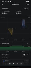
The y axis got fixed, better now. Now the only thing I miss is the net usage from grid without needing to calculate it myself
Net grid usage is back!


You can install our site as a web app on your iOS device by utilizing the Add to Home Screen feature in Safari. Please see this thread for more details on this.
Note: This feature may not be available in some browsers.
The y axis got fixed, better now. Now the only thing I miss is the net usage from grid without needing to calculate it myself
Good to see that the information is back. Probably could be presented somewhat better, but at least it's there again.View attachment 958496
Net grid usage is back!
Yeah, all the information was already there in the servers so they just pushed out the update through the ‘server side’ in txt format.Good to see that the information is back. Probably could be presented somewhat better, but at least it's there again.
Also interesting that no app update was needed to get a change like that.
Between the graph y-axis adjustments and net usage being back, it sounds like they just need to bring back the peak/off-peak shading.Yeah, all the information was already there in the servers so they just pushed out the update through the ‘server side’ in txt format.
Rather than go through all the bureaucracy of the app stores.
I do agree that it could be neatened up and better designed in the following updates they push out through the app stores.
Wish you could enter your billing period, and save (like enphase does) so you can compare to your bill.OMG! They finally added a date picker so you can instantly jump to a date in the past. We've been waiting for this functionality for years!
They also added Net Usage back in on the Grid screen.The y axis got fixed, better now. Now the only thing I miss is the net usage from grid without needing to calculate it myself
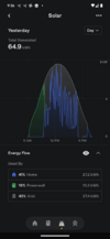
We do see data errors where some months of solar generation are missing.Has anyone noticed a data discrepancy between the new version of the app and an older one? I updated the app on only one of my devices, curious to try out the new charts, but the historical data is very different between the two somehow. It's as if there are two different data sources or the new app isn't pulling from all of the correct sources.
If I go to the year view, in the new app, it thinks for the entire month of May and June this year, all solar production has gone to the home with zero net export to the grid, but in the old app, I see reasonable home consumption and net export to the grid. For some other months like Jan and Feb of this year, home production is way off in the new app, and even total monthly solar production is off by as much as +/- a few % depending on the month. It goes both ways, with the new app sometimes reporting more solar production on some months and lower on the others by a few %, but the net so far for the year has the new app a few 10s of kWh higher than the old app out of about 3600kWh or so, so in aggregate not too far off, but strange there would be a difference at all.
Since the home usage is completely all over the map, that means the net grid data must somehow be completely wrong, which is odd since I thought it should come from the Neurio CTs placed on my main power input. The solar being off is also weird since I thought that solar generation comes from the inverter, though at one point Tesla did come by and put a CT on the solar line for revenue grade metering to get their SRECs so maybe that could explain some of the solar differences? Still doesn't explain why net grid consumption is off, or how month-to-month the solar could be off by so much.
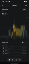
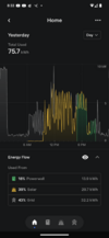
I monitored mine yesterday and noticed the same early during peak. But I then thought the algorithm might be hedging it's bet on getting me to my reserve at the end of peak. During the hottest days lately I barely made it to end of peak with my reserve. And this behavior also stopped about an hour into peak where the algorithm probably decided I would make it OK.looks like there is a bug in teh new app. It is showing solar + PW going to house during Peak which I have defined as 5pm to 9pm. Its also showing PW partially sending to grid during Peak. The PWs should power house during Peak with any solar going only to grid
I have my reserve set pretty high at 75%. Therrre should not be any PW going to grid as it is showing in the graphI monitored mine yesterday and noticed the same early during peak. But I then thought the algorithm might be hedging it's bet on getting me to my reserve at the end of peak. During the hottest days lately I barely made it to end of peak with my reserve. And this behavior also stopped about an hour into peak where the algorithm probably decided I would make it OK.
Sorry. I miss read your post anyway. I was thinking solar and not the PW.I have my reserve set pretty high at 75%. Therrre should not be any PW going to grid as it is showing in the graph

Yes, I've seen that too. Looks like something is wrong in the graph on the updated App. Actual data is okay.I'm still seeing solar (yellow) along with PW (green) in the home usage graph during peak and after my solar production is low or stopped. The "Used by" numbers look correct but not the graph. Phone is Android. Is anyone else seeing this?
good to know its not just meYes, I've seen that too. Looks like something is wrong in the graph on the updated App. Actual data is okay.
Wow! Although I don't see it on my end, it is great to see the graphs will track vehicle usage.Here is a link to the "learn more" info that tesla has for these energy graphs:

Energy Data | Tesla Support
The Tesla app provides you with insight into your home's solar energy generation and usage. Use the energy graphs to observe your home’s energy data over time and learn how to maximize the benefits of your renewable energy.www.tesla.com
We've discussed this in a different thread: Has anyone else derived in the internal power flows in a Solar/PW2 system?The PWs should power house during Peak with any solar going only to grid
Not sure I'm following that. The idea of the PW powering the house during Peak is so that any Solar production can go to grid and get credits at the high rates assuming the PWs can 100% meet the house load which in my case is true. It does not make sense for some solar to power the house when the PWs can meet the house demand as this would reduce credits. If I click on the Solar graph, it shows miniscule energy going to the house during Peak which is not consistent with the House graph. Also, I never saw this behavior before the new version of the appWe've discussed this in a different thread: Has anyone else derived in the internal power flows in a Solar/PW2 system?
Basically, if both the PWs and PV are producing energy, and both the house and grid are consuming energy (net export to grid), then it is not well defined to say whether the PWs are powering the house, the PV is powering the house, or both are powering the house. All you can say is that the sum of the sources equals the sum of the loads; any assignment of a particular load to a particular source is arbitrary. [I guess if either the PW or the PV alone are not producing as much energy as the house is using, you can say that source alone is not powering the house.]
So I don't think it's necessarily a bug. If the designers have a particular way they would like to do the assignment, and the graphs don't match their intention, that would be a bug. But the choice of assignment, within the physical limits, is arbitrary.
Cheers, Wayne
OK, there's a couple potentially different things going on here:Not sure I'm following that.