Accumulation/Distribution, somewhat resembling an On Balance vol indicator, but using OHLCV to attempt to measure the subtle changes when there are slightly more buyers or sellers based upon a volume multiplier.
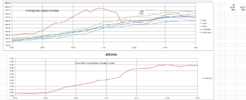
First, here is Tesla since the beginning (or the beginning of my data, 6/29/2010 with a logrythmic Y axis vs a linear axis. Log axis doesn;t like negative numbers so the Accum/Dist was negative, meaning more selling than buying, but a casual look says interest perked up around mid 2014, for the second time, drifted down, then Mark B Spiegel gave a talk at the Ron Baron "RobinHood" conference, 200 or so slides about "why Tesla is a zero", and the Accum/Dist line took off for the next 4 years until the S&P inclusion
You may notice on the SP graph, 3 years of sideways, stairstep up, then 6 years of sideways, stairstep up and here we are
Exact same data, with a linear Y axis
Last 2 years with log Y axis (a linear regression line is curvy on those)
Last 1 year with the S&P inclusion at the left side
Last 6 months
All of these have a positive slope, and the 6 month linear regression slope looks steeper then the 1 year.
I am unsure if we have finished the "stairstep up" or are in the beginning or middle, but from the positive press, the rapidly increasing number of eyeballs and pocketbooks, the interest in EV's 'n such, i'm quite comfortable HODl'ing
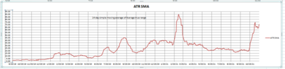
the "tail wagging the dog" of the options volume i'm unsure if there will be some wild "crack the whip's" since volatility has tripled in the last month as measured by Average True range
this is just musing and observations that may mean nothing, but I started doing TA in the mid 1980's and gave up
-(no easy spreadsheets except AceCalc for Apple, than Lotus 123)(and electric pencil for the trs80)