


Welcome to Tesla Motors Club
Discuss Tesla's Model S, Model 3, Model X, Model Y, Cybertruck, Roadster and More.
Register
Install the app
How to install the app on iOS
You can install our site as a web app on your iOS device by utilizing the Add to Home Screen feature in Safari. Please see this thread for more details on this.
Note: This feature may not be available in some browsers.
-
Want to remove ads? Register an account and login to see fewer ads, and become a Supporting Member to remove almost all ads.
You are using an out of date browser. It may not display this or other websites correctly.
You should upgrade or use an alternative browser.
You should upgrade or use an alternative browser.
ahkahn
Active Member
HankLloydRight
No Roads
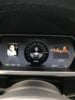
All non-AP hardware equipped cars still have the classic instrument cluster.
All non-AP hardware equipped cars still have the classic instrument cluster.
It's really ugly. Wish they could change it
HankLloydRight
No Roads
And a lot of us want it back. It's elegant and functional.
AmpedRealtor
Well-Known Member
I disagree. I think it's gorgeous, eminently usable, and clear. It's much better than the Autopilot display, in my opinion.It's really ugly. Wish they could change it
Several years ago, Musk indicated we'd get increased user interface customization in the next major release.
What we got was the disappearing menu bar on the console display, which isn't configurable.
The center of the dashboard isn't configurable at all. Non-AP cars get a traditional speedometer. AP cars get an avatar for the car on a lane, showing nearby vehicles.
And with AP2 - the lane dances continuously back and forth - which is probably why AutoSteer ping pongs between the lane lines - because they are constantly jumping around on the dashboard display.
Since the dashboard and console displays are all digital, Tesla could provide much more customization of the display and the features.
But providing improved easter egg support is a higher priority than usability - or fixing the media player bugs introduced as part of the "improvements" introduced in the 8.0 release last year.
Bound466
Member
I like ye ole' dash.
Granted, its a personal choice. Some like it, some don't. To me, it's the ONE GOOD THING that the classic cars have that the AP1 and AP2 cars don't have. Oh, and a couple cancelled colors (brown and green). So two good things. Or would that be counted as three?
Granted, its a personal choice. Some like it, some don't. To me, it's the ONE GOOD THING that the classic cars have that the AP1 and AP2 cars don't have. Oh, and a couple cancelled colors (brown and green). So two good things. Or would that be counted as three?
doubleohwhat
Member
I prefer the old dashboard as well. I don't need the video game animation when I'm not using TACC or AP.
thecloud
As rhythm raced inside, the ship came alive
I wish there was an easter egg where you could press a sequence of buttons (when driving manually) to switch back to the “classic” speedometer on any AP-equipped Model S or Model X. If you then activated TACC/Autosteer, the speedometer would shrink and appear to fade off in the distance down the perspective road.
Wouldn't that be a nifty trick to show off to all your friends and potential new Tesla owners!
(Note that I'm framing this request as an easter egg, since those are cool and seem to get implemented in every major release.)
Wouldn't that be a nifty trick to show off to all your friends and potential new Tesla owners!
(Note that I'm framing this request as an easter egg, since those are cool and seem to get implemented in every major release.)
AnxietyRanger
Well-Known Member
The classic speedmeter (together with the rest of the dash display) on 6.2 was even better. No pointless toy car, no odometer wasting prime realestate, instead lots of useful information right there like range...
Indeed, the way Tesla handled that one is just really too bad. Their AP hubris got the better of them.
(Also that on Earth is going on with the new(ish) center console windowing logic... It used to be so logical to operate, nowadays the "apps" go into the wrong windows all the time with little logic.)
HankLloydRight
No Roads
Everyday I'm hating the top icon bar auto-hiding more and more.
I often want to switch apps, but I have to tap the damn map first, then wait... wait..wait. OK, there's the icon bar.. NOW I can finally open the app I need (usually the parking camera which I need ***RIGHT NOW***).
I often want to switch apps, but I have to tap the damn map first, then wait... wait..wait. OK, there's the icon bar.. NOW I can finally open the app I need (usually the parking camera which I need ***RIGHT NOW***).
AnxietyRanger
Well-Known Member
Everyday I'm hating the top icon bar auto-hiding more and more.
I often want to switch apps, but I have to tap the damn map first, then wait... wait..wait. OK, there's the icon bar.. NOW I can finally open the app I need (usually the parking camera which I need ***RIGHT NOW***).
It's not just that. The logic on which window the "apps" select as the window to open into is just twisted.
It used to be so that a new app always goes to top window. Clear enough. Now some apps go to the downmost window and some to the upmost window. E.g. music goes down, if map is up. But suddenly opening rear camera goes up, over map...
Just insane. I'd pay money to get 6.2 UI back.
doubleohwhat
Member
Yep. This is frustrating when parking. I have to use the camera to park in my garage. I wish I could just have the camera pop up when the car automatically opens the garage door.I often want to switch apps, but I have to tap the damn map first, then wait... wait..wait. OK, there's the icon bar.. NOW I can finally open the app I need (usually the parking camera which I need ***RIGHT NOW***).
AnxietyRanger
Well-Known Member
Tesla could easily make hiding the icon bar optional.
They should make many things just user-selectable.
I would like the old logic back to how the app selects which window it goes to. I would like a new app to always go to the top window as it used to in 6.x and before.
They should make many things just user-selectable.
I would like the old logic back to how the app selects which window it goes to. I would like a new app to always go to the top window as it used to in 6.x and before.
It appears Tesla doesn't take usability into account when designing or testing the user interface.
It's pretty easy to design interfaces that look good AND are easy to use - minimizing the number of interface interactions for typical functions. Not only is this a convenience issue, since the interface is typically used by the driver (who is still required to be driving the car), the extra interactions increase driver distraction.
For example, we used to be able to switch media player sources from the steering wheel right scroll button - allowing the source to be changed without moving attention to the center console display. And the new source typically remembered the previous station/song from the last time it was selected.
Now...
Source selection requires using the console display:
But how can anyone believe this is more usable???
It's pretty easy to design interfaces that look good AND are easy to use - minimizing the number of interface interactions for typical functions. Not only is this a convenience issue, since the interface is typically used by the driver (who is still required to be driving the car), the extra interactions increase driver distraction.
For example, we used to be able to switch media player sources from the steering wheel right scroll button - allowing the source to be changed without moving attention to the center console display. And the new source typically remembered the previous station/song from the last time it was selected.
Now...
Source selection requires using the console display:
- Touch somewhere on the display to bring up the hidden menu bar
- Quickly (before the menu bar is hidden again) find and press the media player icon
- Look at and then select the tab for the source on the media player
- Scroll through the list of favorites (which may require several screen interactions if the list is long) to find the station you want to listen to - on the band you wish to listen to OR if USB (since it completely forgets what song was playing), click on the display to bring up the categories list, click on the songs item, scroll through the list (multiple screen swipes) to find the song you were last listening to, and then click on that song to begin playing
But how can anyone believe this is more usable???
Everyday I'm hating the top icon bar auto-hiding more and more.
I often want to switch apps, but I have to tap the damn map first, then wait... wait..wait. OK, there's the icon bar.. NOW I can finally open the app I need (usually the parking camera which I need ***RIGHT NOW***).
I have taken to keeping the media tab in the top half vs the map for that reason. The menu bar stays up when you do that. It's annoying to have the map at the bottom though.
Similar threads
- Replies
- 24
- Views
- 618