Welcome to Tesla Motors Club
Discuss Tesla's Model S, Model 3, Model X, Model Y, Cybertruck, Roadster and More.
Register

Software update 2020.48.26.x update, font size problems

This site may earn commission on affiliate links.
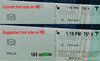
First off, I'll admit I'm not a 20 something. More like a 70 something. The fonts ARE too small for my old eyes. Fonts on every computer I've ever owned are scalable. For the price of a Model 3, theirs should be too. Second complaint (may be also age related). Why are the screen fonts shades of grey? Grey on grey is very hard for me to read. If I take my eyes off the road, that's bad. If Tesla were really on the ball, they'd have a speach enable along the lines of "Say Time." or "Say temperature." The car is smart enough.

Ditto! Hard to read. It makes no sense!
 
I am 58 with only one working eye and that eye requires a pretty heavy corrective lense. The new font is big enough and frankly not any smaller than the ICE vehicle that I also own (2013 IS250 with "dials"...). I am in the software industry so a couple of comments from my 20 years: A font increase or decrease option is a good idea as a user preference. I imagine it is not there at present because as someone else points out all of the newly created empty space is in preparation for something else in future releases and at some point, font increases create screen sizing issues that have to be accounted for. The idea of "classic" UI is not a good idea - those are a bitch to maintain and almost always tossed out within a release or two or anyway. One of the big reasons I purchased an M3 in March was the idea of software updates and improvements as I own the car. The concept of change is built into the brand. Could the UI be better? Yes is the visual improved with this release? I think so; understanding some do not. But I think these issues will continue to evolve with future releases. Honestly, I was tired of the UI already..... ;-)
 
  • Like
  • Disagree
Reactions: CT3PO and lardog
Ditto! Hard to read. It makes no sense!
Seems like many of us are in the same situation. My wife is always asking: "What time is it?" and "What is the temperature." She is also over 65 and can't see this information because it is too small on the display. There is plenty of room to increase the font size!
 

Attachments

  • Tesla display.jpg
    Tesla display.jpg
    651.6 KB · Views: 698
Anyway,

As far as i'm concerned; i've opened a formal ticket in the app, asking for a rollback ; to bother them as much as they bother me.
I suggest we all do. Nothing will happen if we just rant here .

Opened a ticket myself for a rollback.
Driving safety compromised, as far as i'm concerned, they have to accept the request.
I join the suggestion to reclaim the rollback and let them know what a mess they did.

And remember, never install a new update unless previously documented by the community.
 
Also ...

I bought my Model 3 in June 2018 including “Enhanced Autopilot”. It included Navigate on Autopilot, Auto lane change, auto park, summon and advanced summon. The Full Self-Driving Capability list on my upgrade tab in the app includes lists all these features with the addition of Traffic Light and Stop Sign Control and coming soon: Autosteer on city streets. The price is $5300. Since I already have 4/6 features it should be a lot cheaper. It’s too bad I just couldn’t get the improved visualization as I don’t think autosteer on city streets will happen (at least in Canada) for at least 5 years. In other words can early adopters of the model 3 or anyone with HW2.5 upgrade to 3.0 minus the mythical autosteer on city streets?
 
I am 58 with only one working eye and that eye requires a pretty heavy corrective lense. The new font is big enough and frankly not any smaller than the ICE vehicle that I also own (2013 IS250 with "dials"...). I am in the software industry so a couple of comments from my 20 years: A font increase or decrease option is a good idea as a user preference. I imagine it is not there at present because as someone else points out all of the newly created empty space is in preparation for something else in future releases and at some point, font increases create screen sizing issues that have to be accounted for. The idea of "classic" UI is not a good idea - those are a bitch to maintain and almost always tossed out within a release or two or anyway. One of the big reasons I purchased an M3 in March was the idea of software updates and improvements as I own the car. The concept of change is built into the brand. Could the UI be better? Yes is the visual improved with this release? I think so; understanding some do not. But I think these issues will continue to evolve with future releases. Honestly, I was tired of the UI already..... ;-)
the model 3 is a completely different display...it is landscape......the Model s dash screen is the one we look at for driver information.....im my opinion, the font change is just too damn small
 
I'm old and it's very difficult to read the new font.

I'm a millennial and it's difficult to read with my great vision. It's just not in the peripheral any more at all, and there seems to be way less contrast which is more difficult for the brain to interpret faster. Of course it's still readable for me but I find myself taking my eyes off the road for longer now.

My wife had a difficult time seeing the gear selector which is now microscopic on the Model S.
 
I really hate the new layout. Having a smaller map and backup cam really sucks since I use those features daily. Seeing more of the car area is pointless.
One of the issues I have with the new screen layout is the turn signal arrows. My suggestion is to get rid of the background of arrow and just make the arrow bigger to fit the same area.
 
One of the issues I have with the new screen layout is the turn signal arrows. My suggestion is to get rid of the background of arrow and just make the arrow bigger to fit the same area.
I agree...even though it looks cool. One thing I'd like to see added is a 360 view. I rented a car recently that had the 360 and I loved it, especially when backing up.
 
gear selector which is now microscopic

not in the peripheral any more

Gear selection indicator is indeed microscopic. Just a single big letter, one character that changes to indicate selected gear would be fine. Why show the gears which are NOT selected?

And having speed display big enough for easy peripheral vision is really important.

Also, since comments here relate to all vehicles, it is worth making it clear exactly which car and what issue is being discussed (if not obvious).

Model S / X IC display seems inexcusable and dangerous.
 
lol inexcusable and dangerous? I have a 2008 M3 with smaller fonts both on the digital and analog parts of the dash and I've almost never died driving it

Model S only: (should have used bigger font?)

Model S / X IC display seems inexcusable and dangerous.

Inexcusable.... give me a good reason?

Dangerous..... My distant vision is great with glasses, but the display distance is just on the point of blurring. For me, the adjustment time is the issue so having the font big enough to allow me to keep focused on the road and see the speed in peripheral vision is a safety 'plus'.

Take it away, becomes a negative.
 
Last edited:
  • Like
Reactions: Transformer
I have a Model X with this update. You may have forgotten by now, ha, but, there were cars made before 2018 and some of them were called M3, and a lot of them had really tiny writing on the instrument clusters and/or the LCD's embedded in them

It's obviously half-baked ( we were told before/as it was releasing it wasn't even finished yet, by the ceo of the company, in between meme-tweets) as they haven't made use of any real-estate they've freed up, no changes whatsoever to the two side "screen" areas yet. I assume this is going to iterate and the infinite public beta continues, it's what we all signed up for unless we were so ill-informed to think we were receiving a finished software package when we got the car.

I don't know what I was expecting.
 
  • Informative
Reactions: CT3PO
I have a Model X with this update. You may have forgotten by now, ha, but, there were cars made before 2018 and some of them were called M3, and a lot of them had really tiny writing on the instrument clusters and/or the LCD's embedded in them

It's obviously half-baked as they haven't made use of any real-estate they've freed up, no changes whatsoever to the two side "screen" areas yet. I assume this is going to iterate and the infinite public beta continues, it's what we all signed up for unless we were so ill-informed to think we were receiving a finished software package when we got the car.

Do you feel the X is worse than the 3?

I have a 2008 M3

Confused me!
 
I am 58 with only one working eye and that eye requires a pretty heavy corrective lense. The new font is big enough and frankly not any smaller than the ICE vehicle that I also own (2013 IS250 with "dials"...). I am in the software industry so a couple of comments from my 20 years: A font increase or decrease option is a good idea as a user preference. I imagine it is not there at present because as someone else points out all of the newly created empty space is in preparation for something else in future releases and at some point, font increases create screen sizing issues that have to be accounted for. The idea of "classic" UI is not a good idea - those are a bitch to maintain and almost always tossed out within a release or two or anyway. One of the big reasons I purchased an M3 in March was the idea of software updates and improvements as I own the car. The concept of change is built into the brand. Could the UI be better? Yes is the visual improved with this release? I think so; understanding some do not. But I think these issues will continue to evolve with future releases. Honestly, I was tired of the UI already..... ;-)
I decided to go take a short drive to see what all the fuss was about. I'm not exactly young, I do wear bi-focal glasses.

- First thing I noticed was the speed position has moved. Will take a little while getting used to it.
- Visualization and other changes look good.
- If I had not read about the font size change, I would not have noticed it.

I'm not trying to minimize the real issues others might be having - but it is hardly universal. I also wonder whether its the change in position (combined with reduction in size) that is making it more difficult to read - because we are so used to seeing the speed at a particular place. One more thing - I use AP a lot - and as such pay attention to the AP speed limit. That font size is smaller than the speed font - I'd like that to be bigger - probably same as the speed font.
 
I have only had my MY for 4+ weeks. Just when I got used to where stuff is....this happens. Already thinking about one of the aftermarket instrument clusters. I am quite used to changes, but on the MY it is too much at once without a clear reason for most of it.
 
Adding to the list of setbacks on this update
  • Speed adjustment is now undiscoverable, you must memorize right scroll wheel for this. Following distance too
  • Ditto voice command - press right scroll wheel. Memorize memorize memorize.
  • For those with presbyopia, the status bar that shows regen power is now mere pixels and light gray on white. Can barely see it let alone tell where the line is dotted.
  • And of course, font decrease renders just about everything unreadable for people with presbyopia
On the plus side, I think the gray battery is an improvement. Best practices for visualization call for using color only when something requires your attention.

I do want to say what while unhappy, I don’t think it is right to slam the developers.