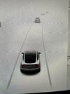
Today I drove 1,000km (Oslo to Sandnessjøen) mainly on winding, icy, mountainous roads with an average temp of about -15C (5F) and the update very nearly led me to crash.
Surprisingly it wasn't the seat warmers, defrost, or consumption card changes. It was the removal of the button on the map to see the supercharger locations. They no longer even show up on the map with the new "points of interest" button. Does Tesla not want us to use their chargers anymore?
I do a lot of long drives and 80% of the time I will change the location of at least one charging stop (either I don't like the suggested charger station, I want to push on to the next charger, or have to stop for a toilet break). Before it was one button on the edge of the screen to pull up all supercharger locations. Now it is 3 precision button pushes in the middle of the screen. Trying to do this, i drifted a little too far to one side (no autopilot when the road is covered in snow/ice). If i crashed it would 100% be my own fault for fiddling with with screen while driving, however, it just would not have happened before the update. I feel like the interface designers have never actually tried using the screen while driving.
But at least they added a quick access button for the music equaliser. That is something I use all the time