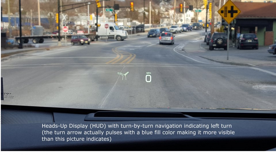
Perhaps that cut out is the hud mount or some other type of display?Has no one considered that he will put basic dials in a very narrow dash display? Those aren't "screens" but display the required data. They could fit in that small cutout above the steering wheel.
But I hope it includes a HUD with the center screen.


Welcome to Tesla Motors Club
Discuss Tesla's Model S, Model 3, Model X, Model Y, Cybertruck, Roadster and More.
Register
Install the app
How to install the app on iOS
You can install our site as a web app on your iOS device by utilizing the Add to Home Screen feature in Safari. Please see this thread for more details on this.
Note: This feature may not be available in some browsers.
-
Want to remove ads? Register an account and login to see fewer ads, and become a Supporting Member to remove almost all ads.
You are using an out of date browser. It may not display this or other websites correctly.
You should upgrade or use an alternative browser.
You should upgrade or use an alternative browser.
AustinPowers
Total Smeghead
......I think I played that video game in the early 80s, I just can't remember what it's called!
Out Run!
On the Commodore 64 of course...
JeffK
Well-Known Member
Has no one considered that he will put basic dials in a very narrow dash display? Those aren't "screens" but display the required data. They could fit in that small cutout above the steering wheel.
But I hope it includes a HUD with the center screen.
Perhaps that cut out is the hud mount or some other type of display?
Do you mean the AC vent?
It appears that the Mirai has no display in front of the driver. Everything is in the center of the car. See the images displayed as a result of this Google search: toyota mirai dashboard - Google Search:I hate to mention this as I may be blackballed from TMC, but is there anything directly in front of the driver in a Mirai?
Apparently, starting with the 2016 model Prius, a HUD was offered. See Toyota quietly zips even further ahead of the competition with the 2016 Prius
Quote: "Toyota also now offers a color head up display with speedometer, navigation, and hybrid system information."
On PriusChat in this thread 2016 Heads up Display some photos of the HUD display were posted by member BigFan (text description of the photo added by BigFan, I assume):
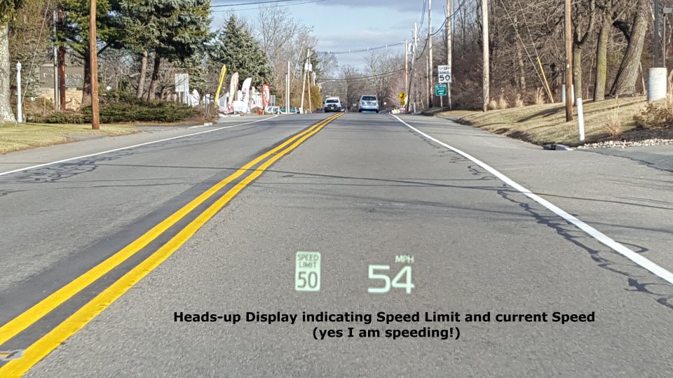
This video shows what the HUD looks like while driving. Not bad at all. Read the thread discussion for comments pro and con about it.
Apparently, starting with the 2016 model Prius, a HUD was offered.
Since 2012, Toyota has offered a HUD on the Prius. It's not that novel of a feature in a mass-produced car, but the Model 3 is obviously Tesla's first mass-produced car, too.
They're more common in upper-end sedans (2013 Cadillac ATS, Buick LaCrosse, Lexus GS, BMW 3, Ford Fusion even). Here's a fun list of 285 base model cars that come with HUDs: some old hats here, like the 2002 Buick Park Avenue and the 2002 Pontiac Aztek.
shrspeedblade
Rideshare Monkey
Out Run!
On the Commodore 64 of course...
I wish I could say, "What is this Commodore 64 you speak of? Did it have 64 gigs of RAM?"
Unfortunately I know EXACTLY what you're talking about! All too well.
And I wonder if we will start to see more manufacturers going to just a center screen with a HUD display for manufacturing simplicity between LHD and RHD markets? That actually speaks well for the possibility of the Model 3 having a HUD!
Thanks for the correction and the list. In reading online comments about HUDs in various car models, it seems they have mixed appeal. I'm sure some implementations work better than others. Whether Elon considers having a HUD "feels like a spaceship" I have no idea. But I would think, knowing Elon, that whatever it is he is going to reveal it will go beyond whatever is currently in use.
Since 2012, Toyota has offered a HUD on the Prius. It's not that novel of a feature in a mass-produced car, but the Model 3 is obviously Tesla's first mass-produced car, too.
They're more common in upper-end sedans (2013 Cadillac ATS, Buick LaCrosse, Lexus GS, BMW 3, Ford Fusion even). Here's a fun list of 285 base model cars that come with HUDs: some old hats here, like the 2002 Buick Park Avenue and the 2002 Pontiac Aztek.
Since 2012, Toyota has offered a HUD on the Prius.
Correction, HUD has been available in Gen 3 Prius since 2009.
Last edited:
Night Driver. Knight Rider was a TV show.I believe that car game was knight rider!
View attachment 216859
Chris L
Member
Elon said Model 3 controls/cockpit would look like a spaceship. Anyone think about what that actually means? Science fiction spaceship or real spaceship? NASA spaceships had mixtures of mechanical and touchscreen controls, but SpaceX's Dragon 2 manned spaceship has mostly LCD touchscreens in front of the astronauts. Something to think about.
Dragon V2 Interior | SpaceX


Dragon V2 Interior | SpaceX
Last edited:
N5329K
Active Member
I've always thought Mr Musk was speaking metaphorically. As in, "Model 3's controls will make all other cars (equipped with electromechanical doodads) look like they're stuck in the past. Model 3 arrives from the future."
It's a fine idea if it doesn't strip away necessary functionality in the name of design purity. For one, I will need to know what the autopilot is seeing and responding to. For another, I will not drill down through layers of onscreen menus to raise or lower cabin temperature. You know. Like resetting the time on an old IHome, where a certain arcane combination of buttons must be employed (in the right sequence) to change the time. Buttonology- whether physical buttons or onscreen- should be simple, direct and obvious to the operator. Done right and you have something simple, elegant and intuitively functional. Do it wrong and you end up with spaceship controls courtesy of Spacely Sprockets.
Designing displays for an autonomous vehicle world is fine for an autonomous vehicle world. Which this one isn't yet.
Robin
Last edited:
Yes. I have often pondered that question since he made that tweet almost a year ago. And I still don't know what he meant. Nor does anyone else outside of the relatively small number of Tesla employees who have direct knowledge of the Model 3 driver interface.Elon said Model 3 controls/cockpit would look like a spaceship. Anyone think about what that actually means?
That is certainly a possibility.I've always thought Mr Musk was speaking metaphorically.
N5329K
Active Member
Here's a couple of examples of displays. One that is very limited but works simply and very well, and another that does the same job but is vastly more powerful, shows tons more data, and requires a lot of care and study to not lead you into the cumulo granite.
I flew behind this simple localizer glideslope head (two of them, plus an RMI actually), for many years. The bars show precisely where the airplane is relative to a narrowing signal cone (defined by the up/down glideslope, and the side-to-side localizer) that's transmitted from an airport runway. Keep the bars centered and you can land in zero zero conditions and never see the runway until the wheels are about to touch. That's no exaggeration, though it's only to be done in an emergency. But I have done it. It's simple, and it works.

Now, that display head is simple and elegant, but it won't show your position on a moving map (you needed an approach plate on your lap for that), or countdown distance to the airport (you needed a separate radio- the DME), or when civil twilight begins, or how you should fly the missed approach procedure, or where the nearest airport with better weather might be found. This box does all of that and far, far more:

Kind of looks a little like the Model 3 display, doesn't it? Only it has way too many buttons that must be operated in precisely the correct sequence in order to work at all. It's a fantastic- not elegant and not simple- resource that can easily lead you straight to the runway, or, if you've invoked one procedure while thinking you called up another, to anywhere but the airport.
I know. I did that once or twice early on. Fortunately, you could channel all the blizzard of data you see up there onto the old, reliable ILS head and fly on unbothered by the pretty twinkling lights (unless you needed them).
Kind of like the setup on the Model S. Tons of stuff on the big screen. But the vital elements right in front of your eyes.
Now cars are a lot simpler, or should be. My long-winded point is just this: adding layers of data, adding tons of features, throwing up different tasks onto a single screen with multiple menus and options, can seem like great engineering solution. You have one screen. One box. One electrical connection to power, another to ground, a third to an antenna. What could be simpler?
But that leaves the user entirely out of the equation. And when your need for a specific piece of information is vital and immediate (speed limit, how fast am I going, is there a car in the adjacent lane about to overtake me when I'd like to change lanes), it should be instantly available at a glance. Not enmeshed in maps and entertainment, videos and environmental controls and who knows what all.
Seems that way to me, anyway.
Robin
I flew behind this simple localizer glideslope head (two of them, plus an RMI actually), for many years. The bars show precisely where the airplane is relative to a narrowing signal cone (defined by the up/down glideslope, and the side-to-side localizer) that's transmitted from an airport runway. Keep the bars centered and you can land in zero zero conditions and never see the runway until the wheels are about to touch. That's no exaggeration, though it's only to be done in an emergency. But I have done it. It's simple, and it works.
Now, that display head is simple and elegant, but it won't show your position on a moving map (you needed an approach plate on your lap for that), or countdown distance to the airport (you needed a separate radio- the DME), or when civil twilight begins, or how you should fly the missed approach procedure, or where the nearest airport with better weather might be found. This box does all of that and far, far more:
Kind of looks a little like the Model 3 display, doesn't it? Only it has way too many buttons that must be operated in precisely the correct sequence in order to work at all. It's a fantastic- not elegant and not simple- resource that can easily lead you straight to the runway, or, if you've invoked one procedure while thinking you called up another, to anywhere but the airport.
I know. I did that once or twice early on. Fortunately, you could channel all the blizzard of data you see up there onto the old, reliable ILS head and fly on unbothered by the pretty twinkling lights (unless you needed them).
Kind of like the setup on the Model S. Tons of stuff on the big screen. But the vital elements right in front of your eyes.
Now cars are a lot simpler, or should be. My long-winded point is just this: adding layers of data, adding tons of features, throwing up different tasks onto a single screen with multiple menus and options, can seem like great engineering solution. You have one screen. One box. One electrical connection to power, another to ground, a third to an antenna. What could be simpler?
But that leaves the user entirely out of the equation. And when your need for a specific piece of information is vital and immediate (speed limit, how fast am I going, is there a car in the adjacent lane about to overtake me when I'd like to change lanes), it should be instantly available at a glance. Not enmeshed in maps and entertainment, videos and environmental controls and who knows what all.
Seems that way to me, anyway.
Robin
Correction, HUD has been available in Gen 3 Prius since 2009.
Oh, oh, right. I was looking at the USA variants of Prius, where 2012MY was the first. I didn't know in Japan/Europe, they'd been including the HUD since 2009 in Priuses.
It can't be that complicated and it's like a useful feature for those of us who would prefer it.
\\
They discussed the possibility/concerns of the HUD in The Tesla Show podcast yesterday (highly recommend the whole podcast to anybody who's not been listening). It mostly highlights the same questions and thoughts we have here.
Skip to 1:14:00.
Personally I really want to see some sort of central instrument cluster but I could live without it. What concerns me is the way the central screen isn't built into the dash. I have 2 kids and they will rip that screen off for certain. It must be built into the dash in the final design surely?
DeweyVT03ic
Member
Do you mean the AC vent?
Yes, that area- surely it isn't vents all the way across. The area right behind the steering wheel could have some simple limited data displayed without considering it a "screen." Someone else had the same point- that this is an option no one is talking about; probably because it wouldn't be a popular alternative. Me personally, I am hoping for an awesome HUD, but this is another take on his statement.
http://imgur.com/rRtBND5
N5329K
Active Member
I'd be fine with that.Yes, that area- surely it isn't vents all the way across. The area right behind the steering wheel could have some simple limited data displayed without considering it a "screen." Someone else had the same point- that this is an option no one is talking about; probably because it wouldn't be a popular alternative. Me personally, I am hoping for an awesome HUD, but this is another take on his statement.
http://imgur.com/rRtBND5
Robin
I'm afraid that on the picture would be considered "a screen". But with at least the waring lamps in there would help. And the speedometer could be analog - and don't have to be round.
Edit: But I would be glad if they did what you had in that picture
Yes, that area- surely it isn't vents all the way across.
Actually, it is supposed to be!
The area right behind the steering wheel could have some simple limited data displayed without considering it a "screen." Someone else had the same point- that this is an option no one is talking about; probably because it wouldn't be a popular alternative.
You can call it a "display" rather than a "screen", but it still boils down to why they elect to do a single screen for Model 3 in the first place?
That vent "display" would defeat the purpose of a single screen design, as it won't be much cheaper or less complicated than putting a simple instrument panel second screen behind the steering wheel.
Similar threads
- Replies
- 2
- Views
- 350
- Replies
- 0
- Views
- 213
- Replies
- 3
- Views
- 401
- Replies
- 4
- Views
- 925